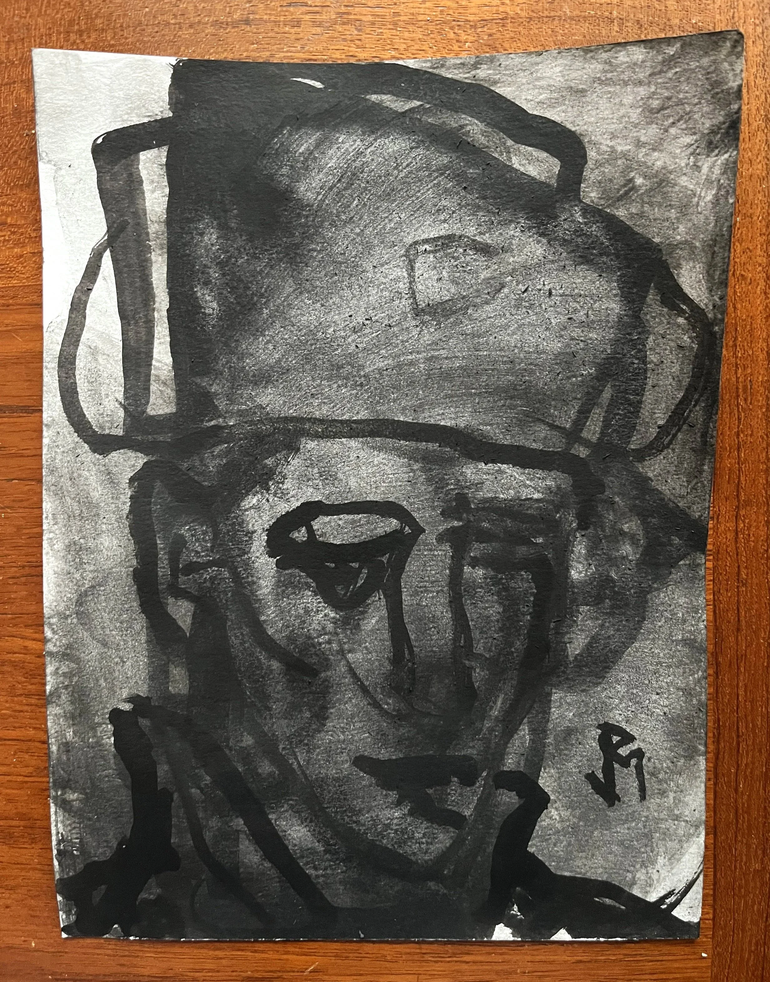
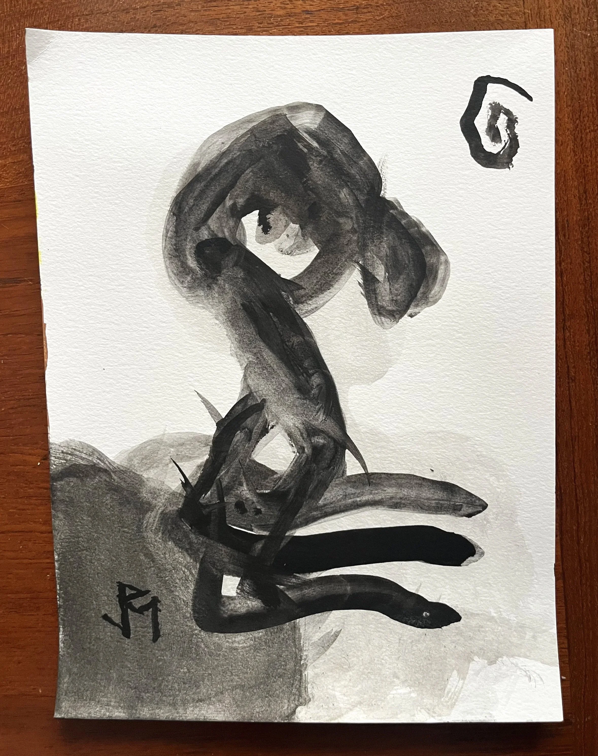
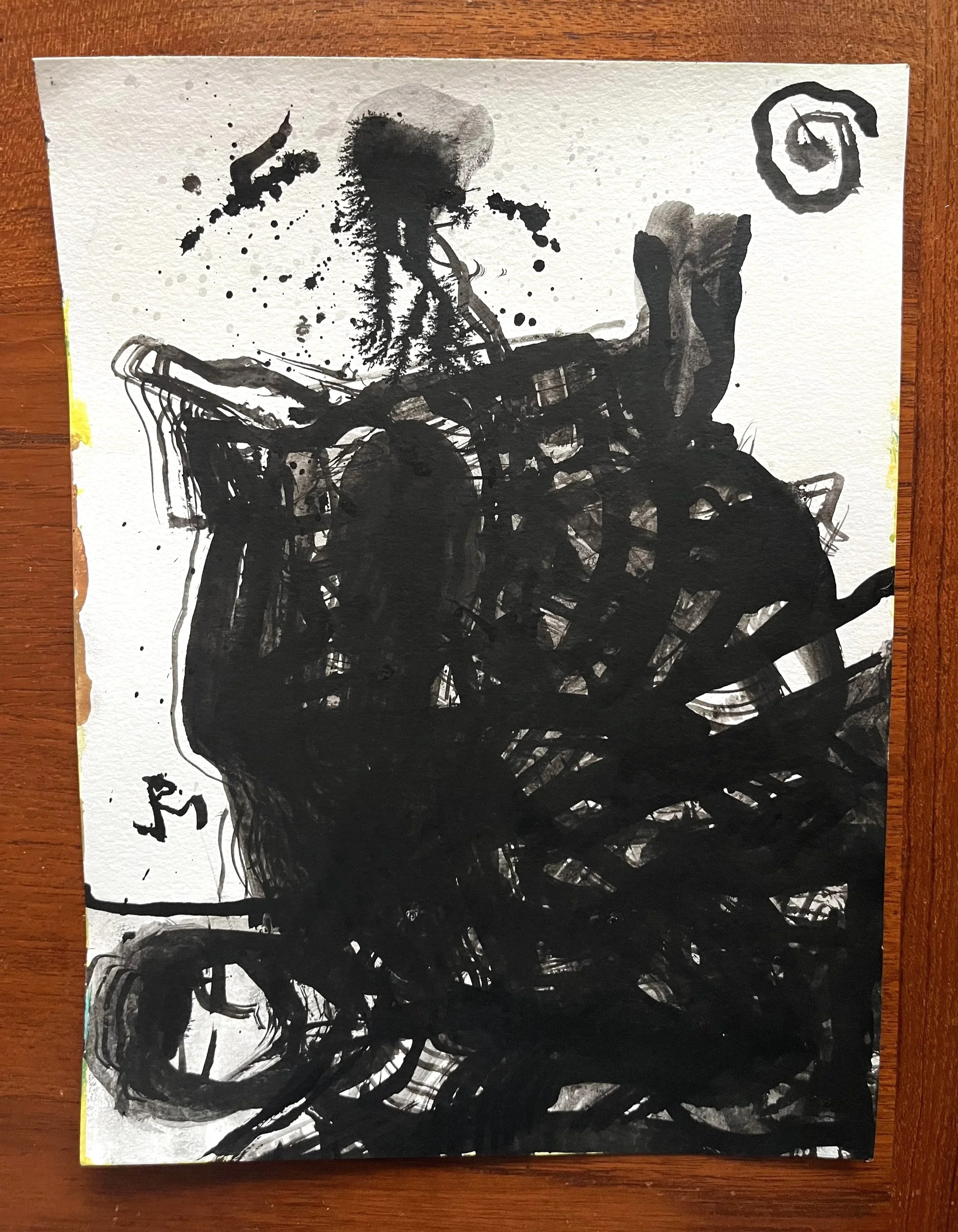
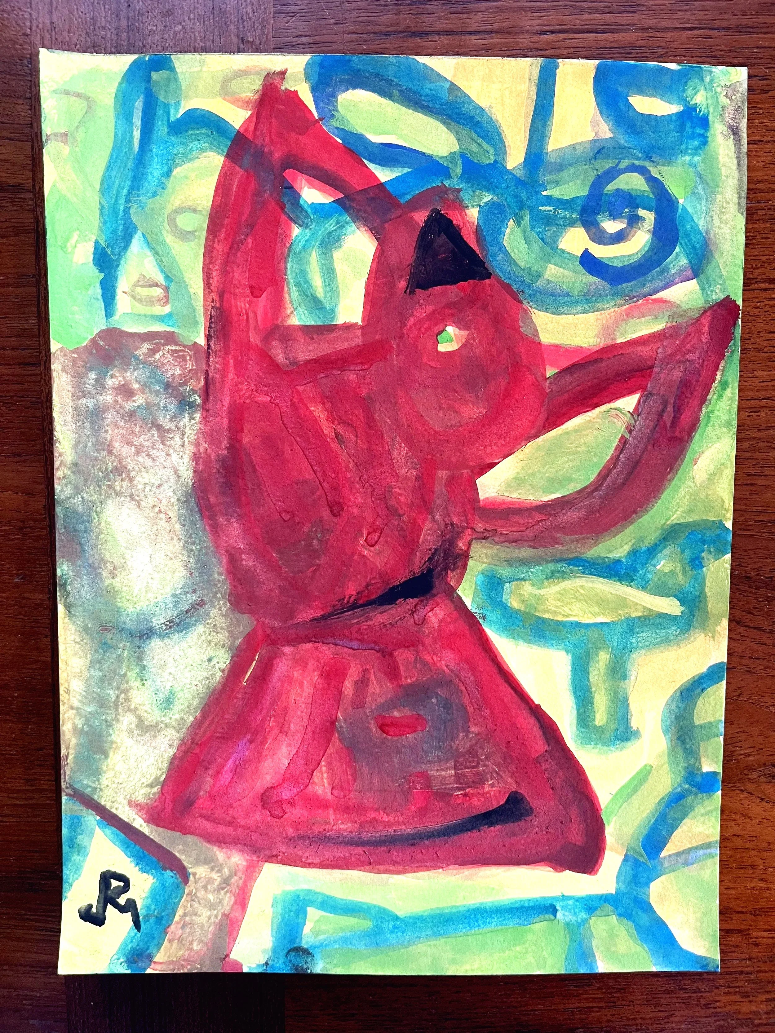
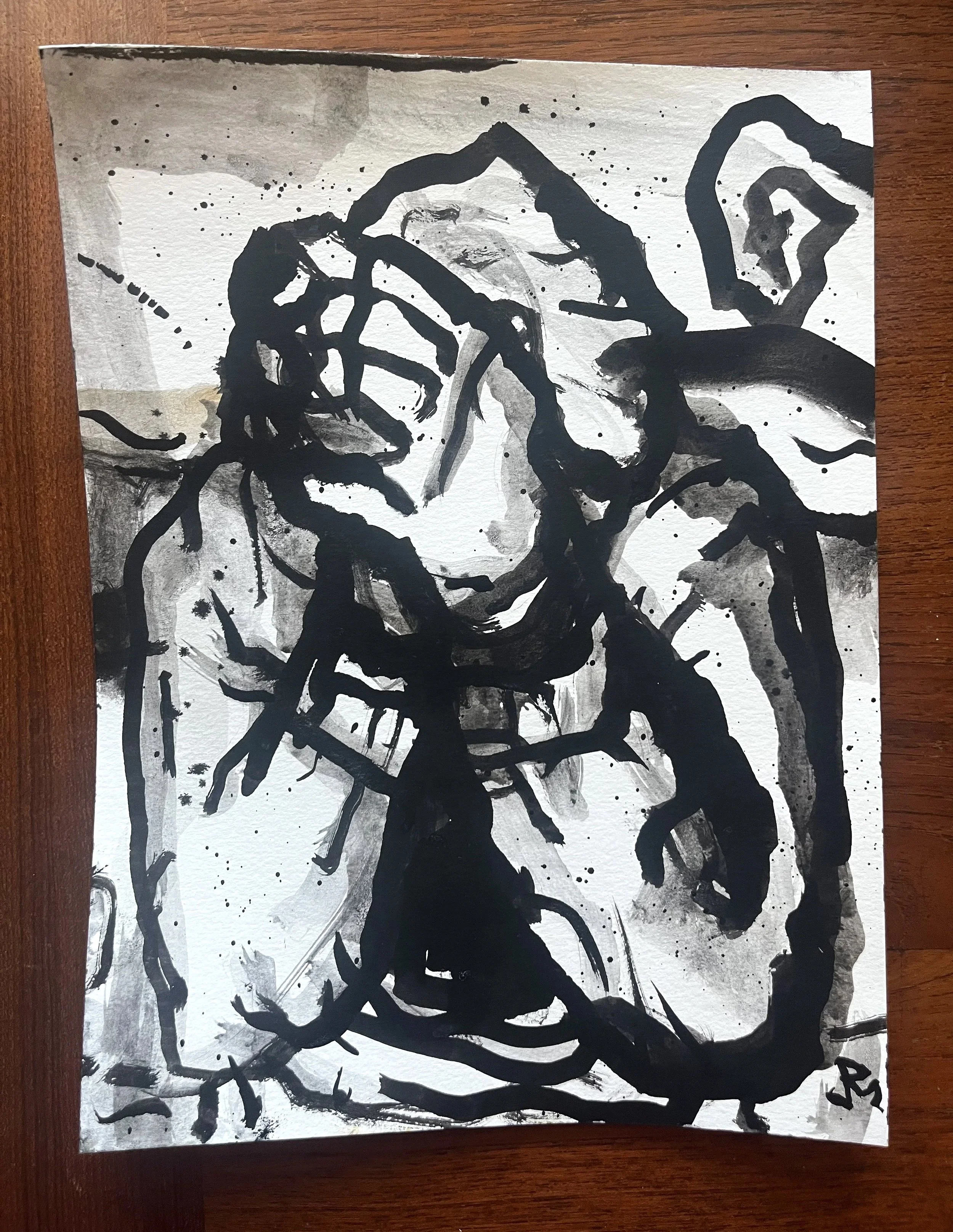
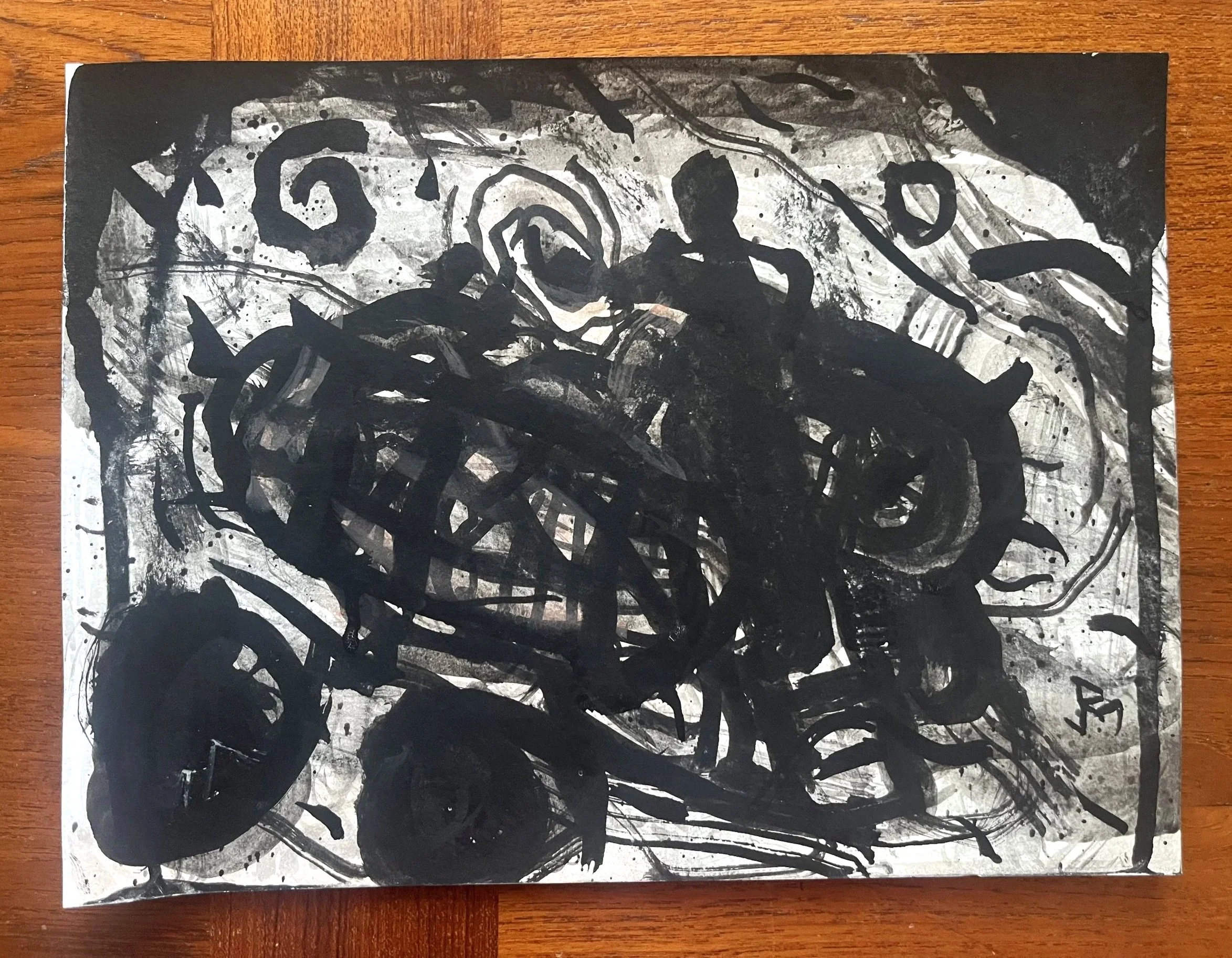
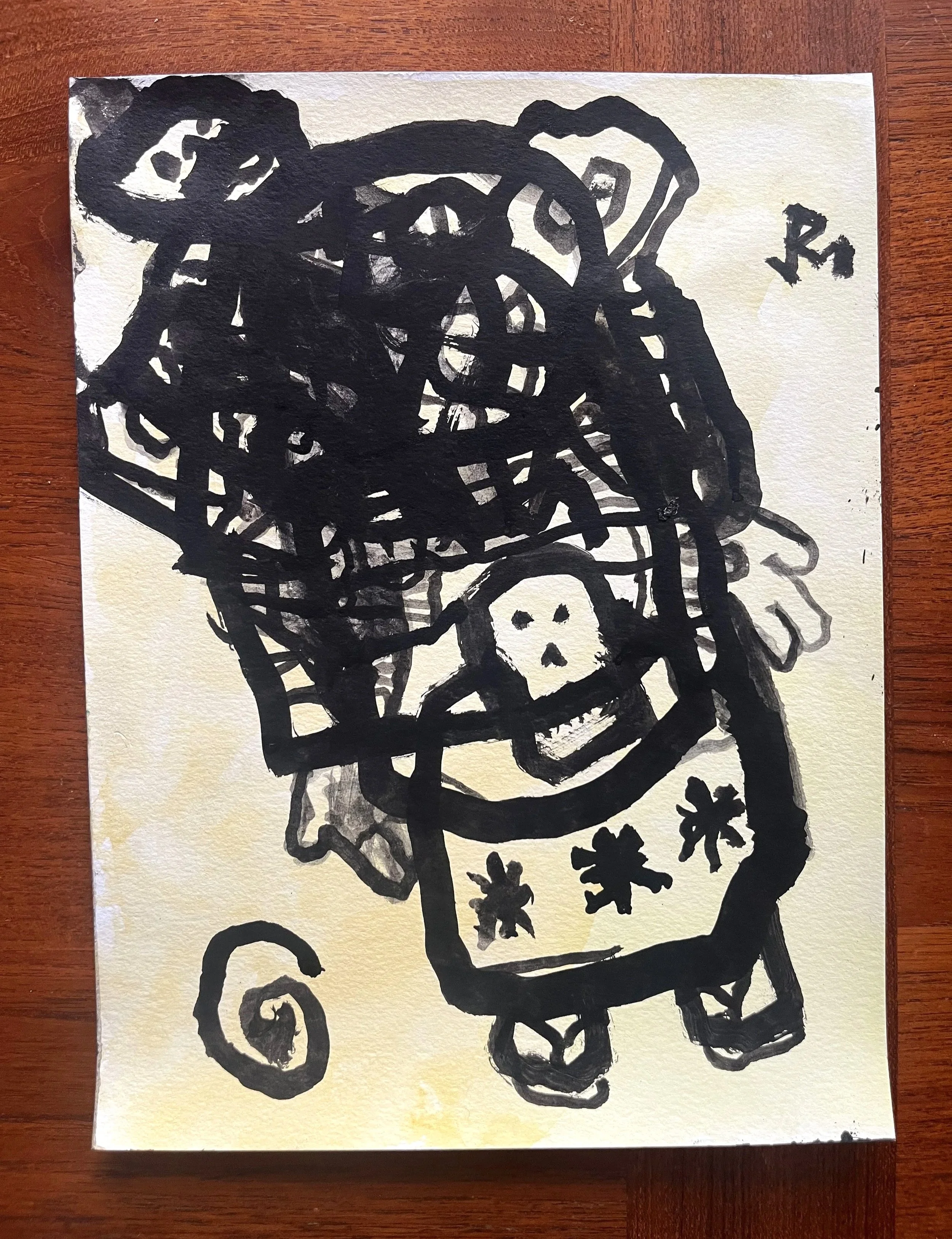
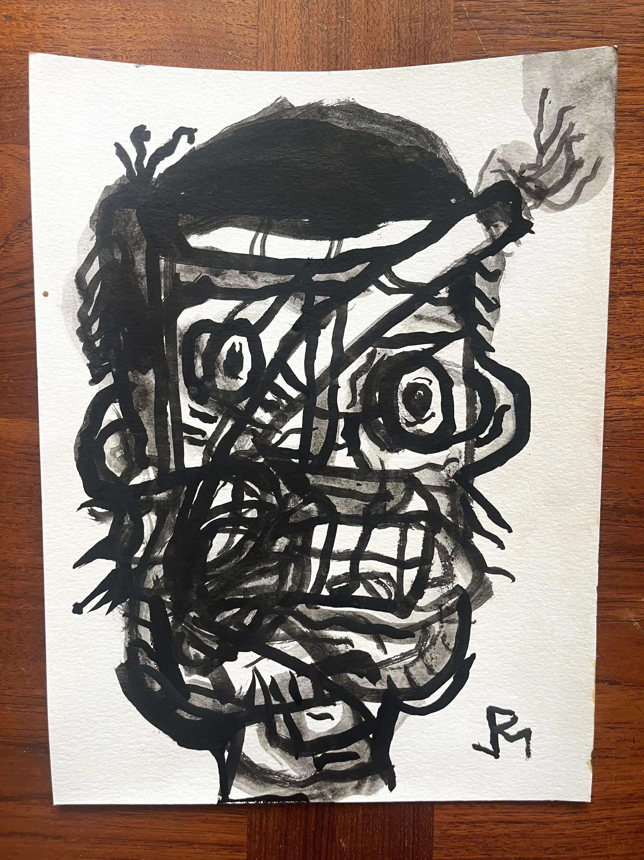
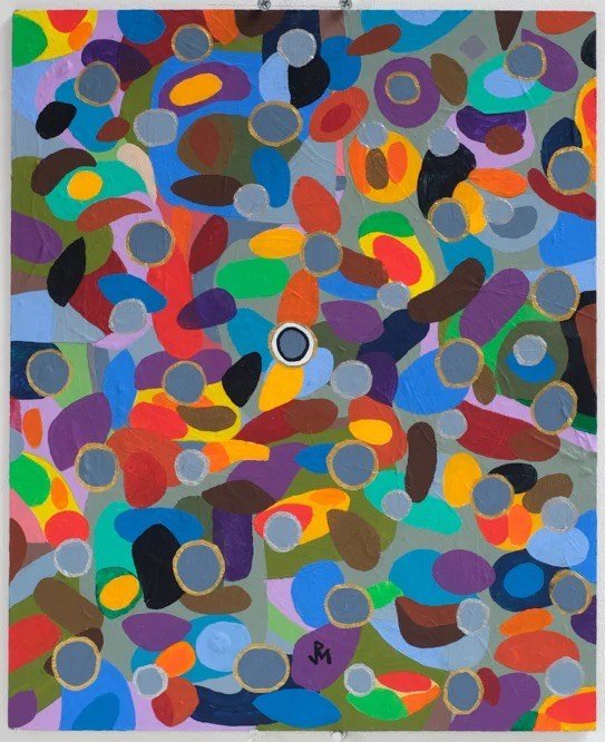
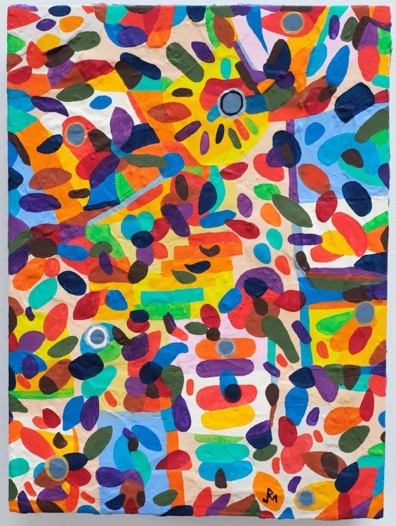
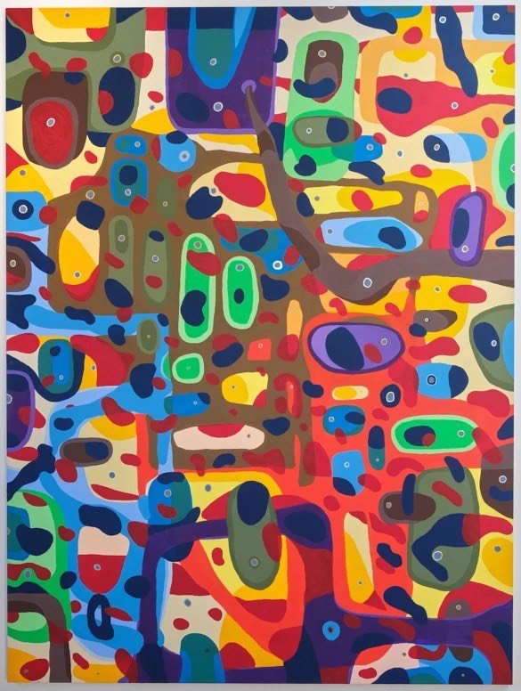
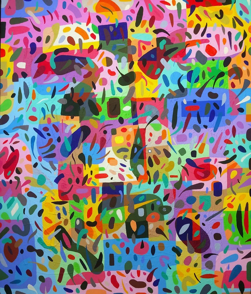
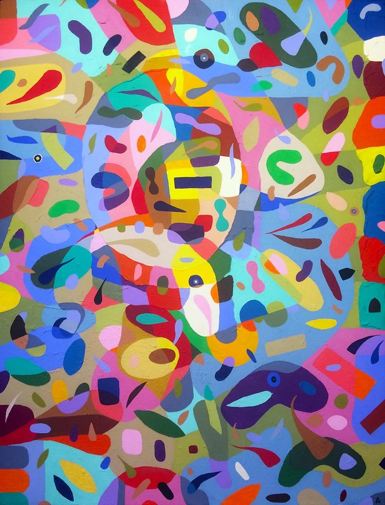
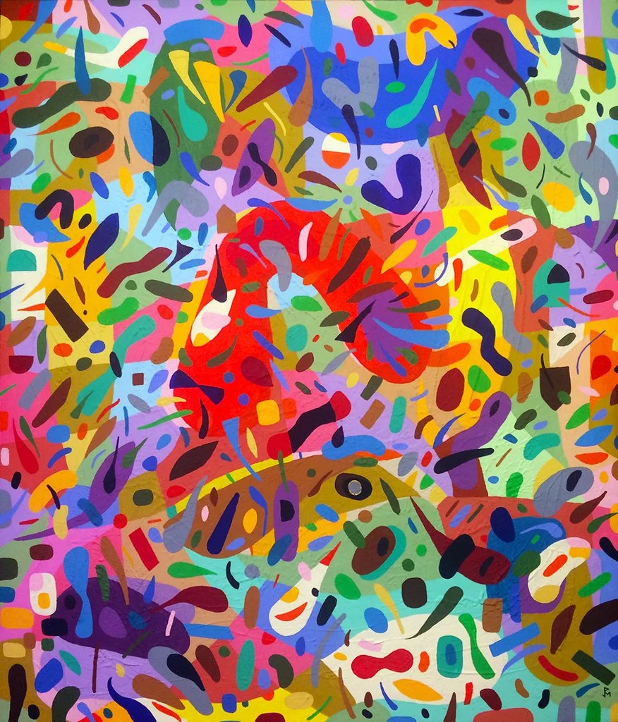
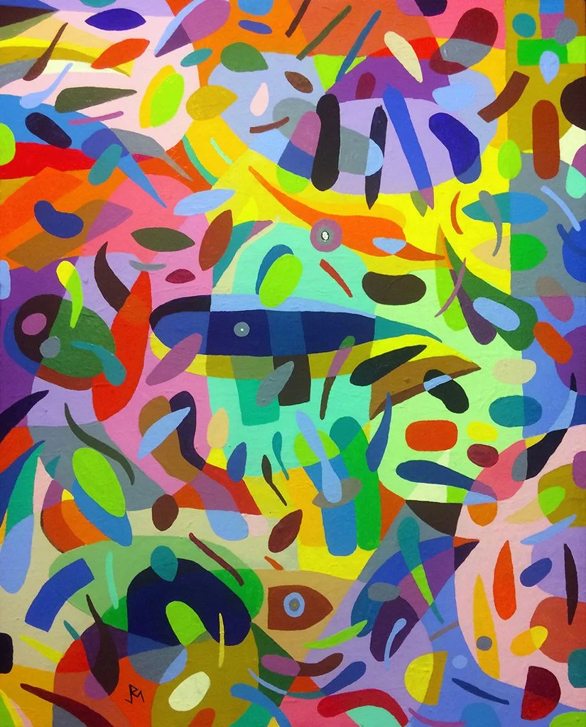
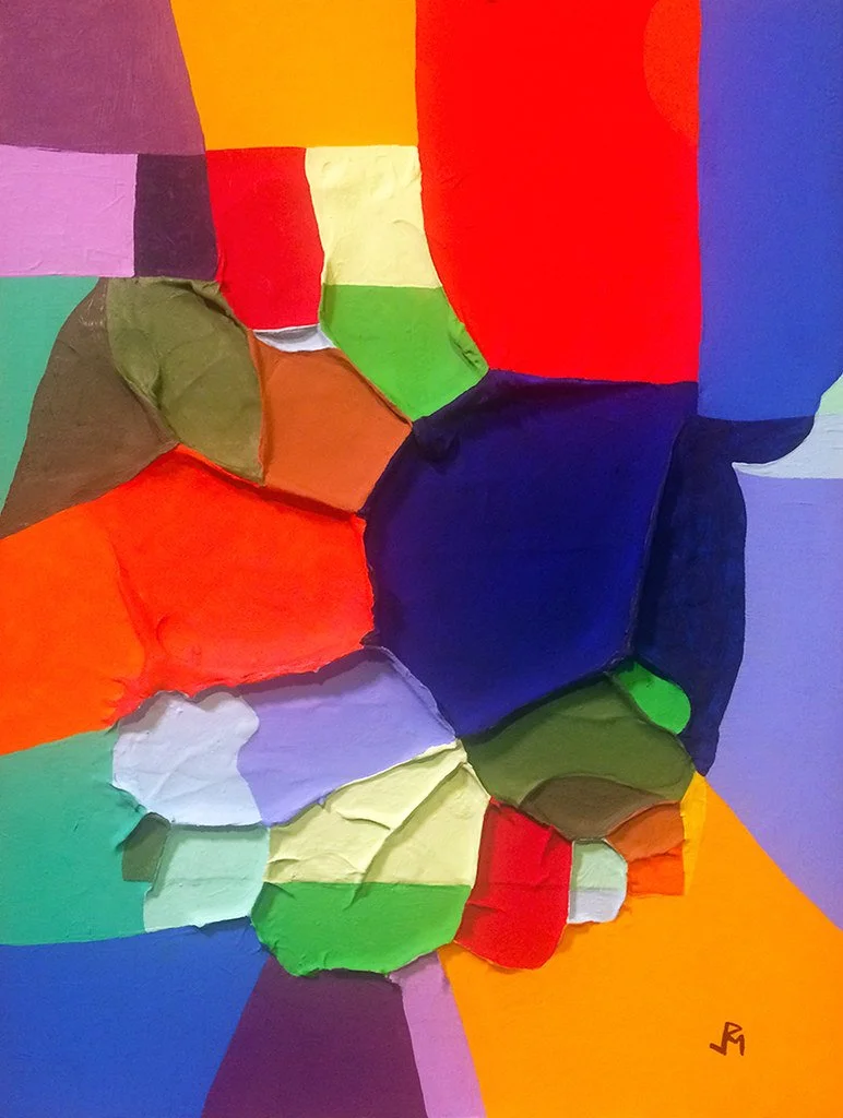
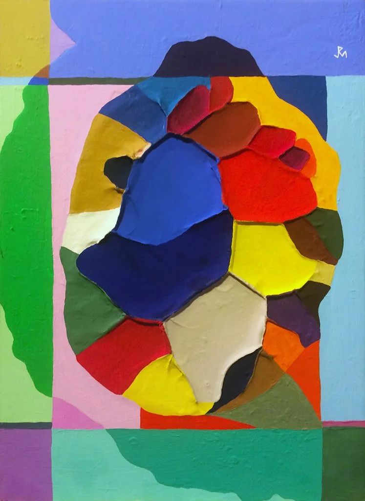
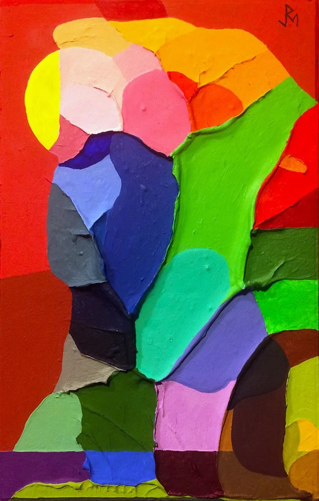
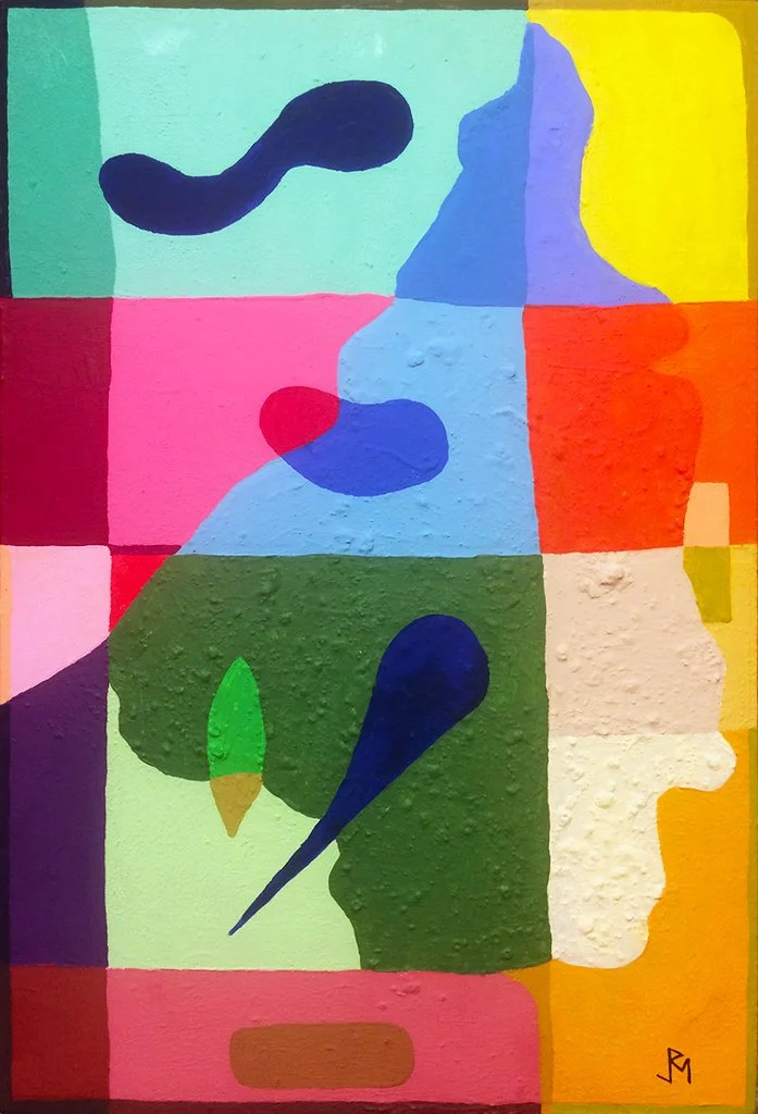
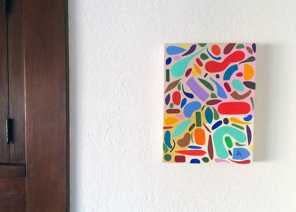
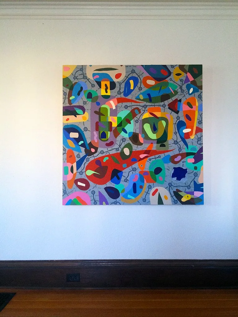
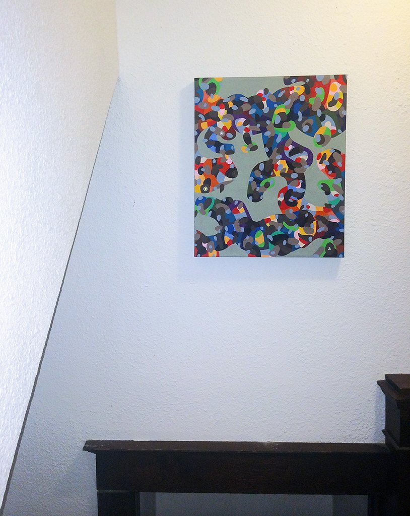
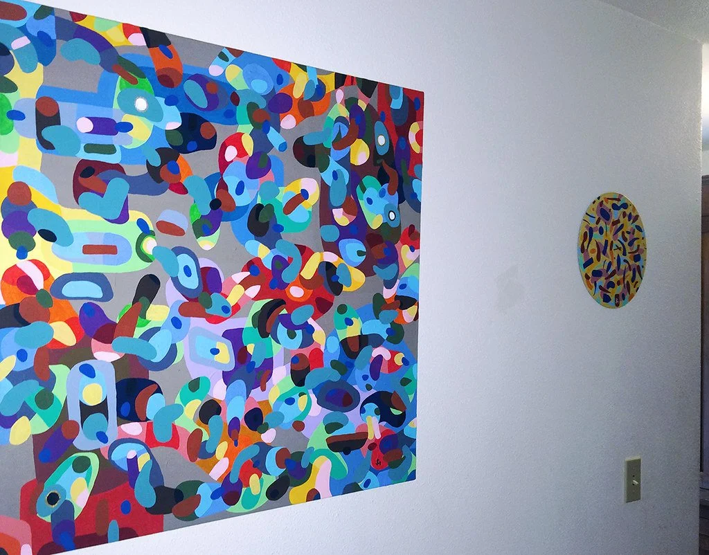
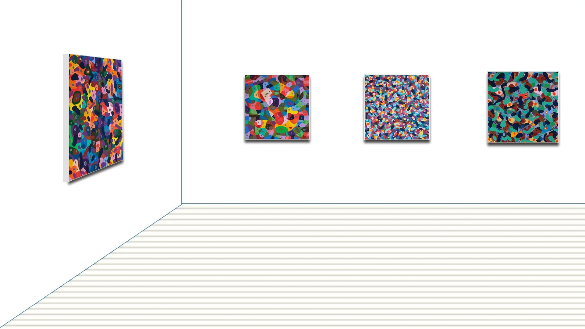
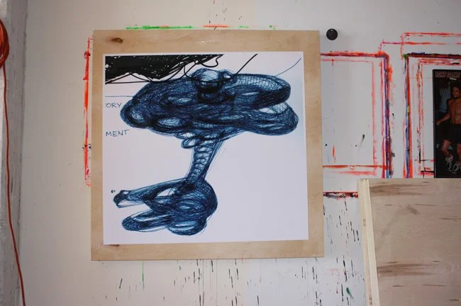
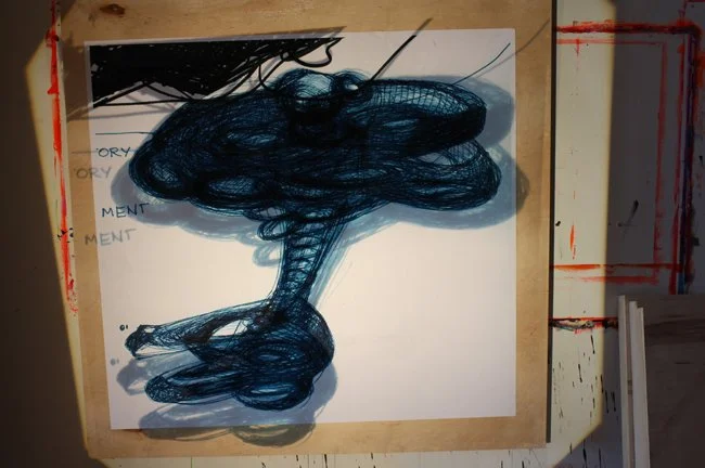
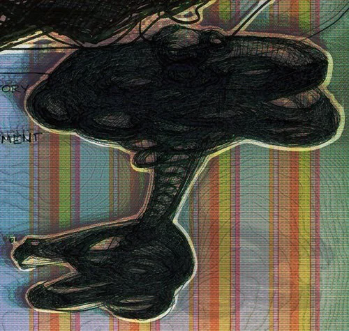
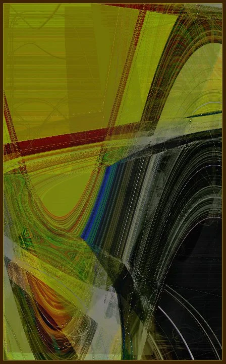
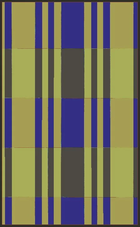
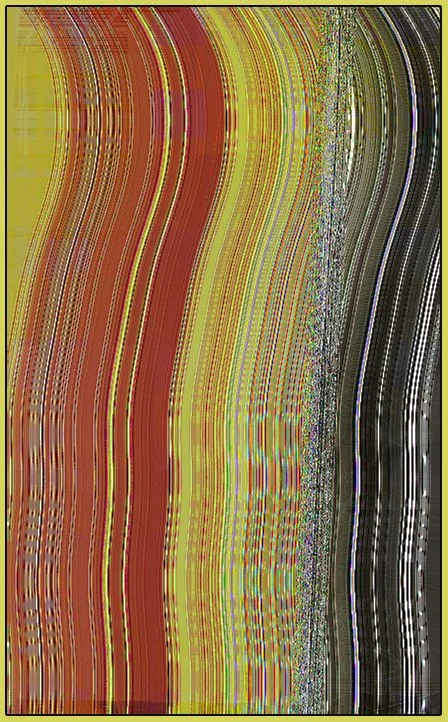
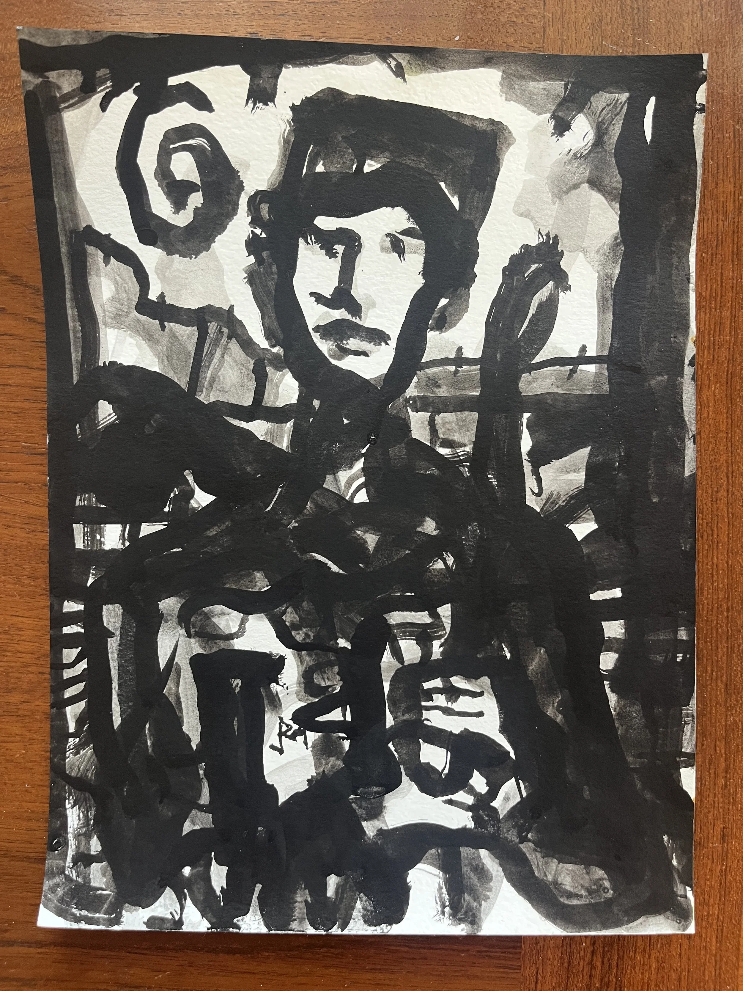
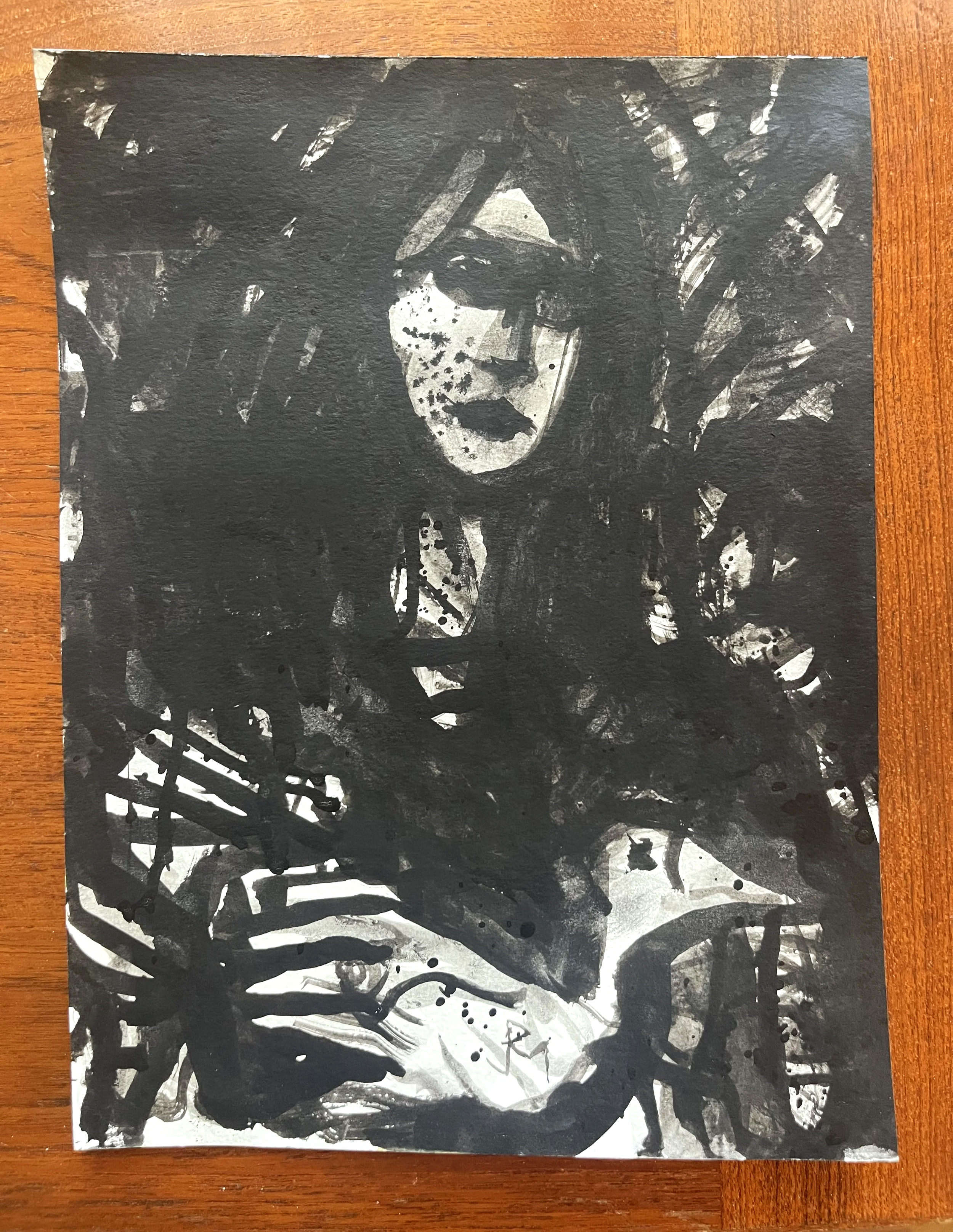
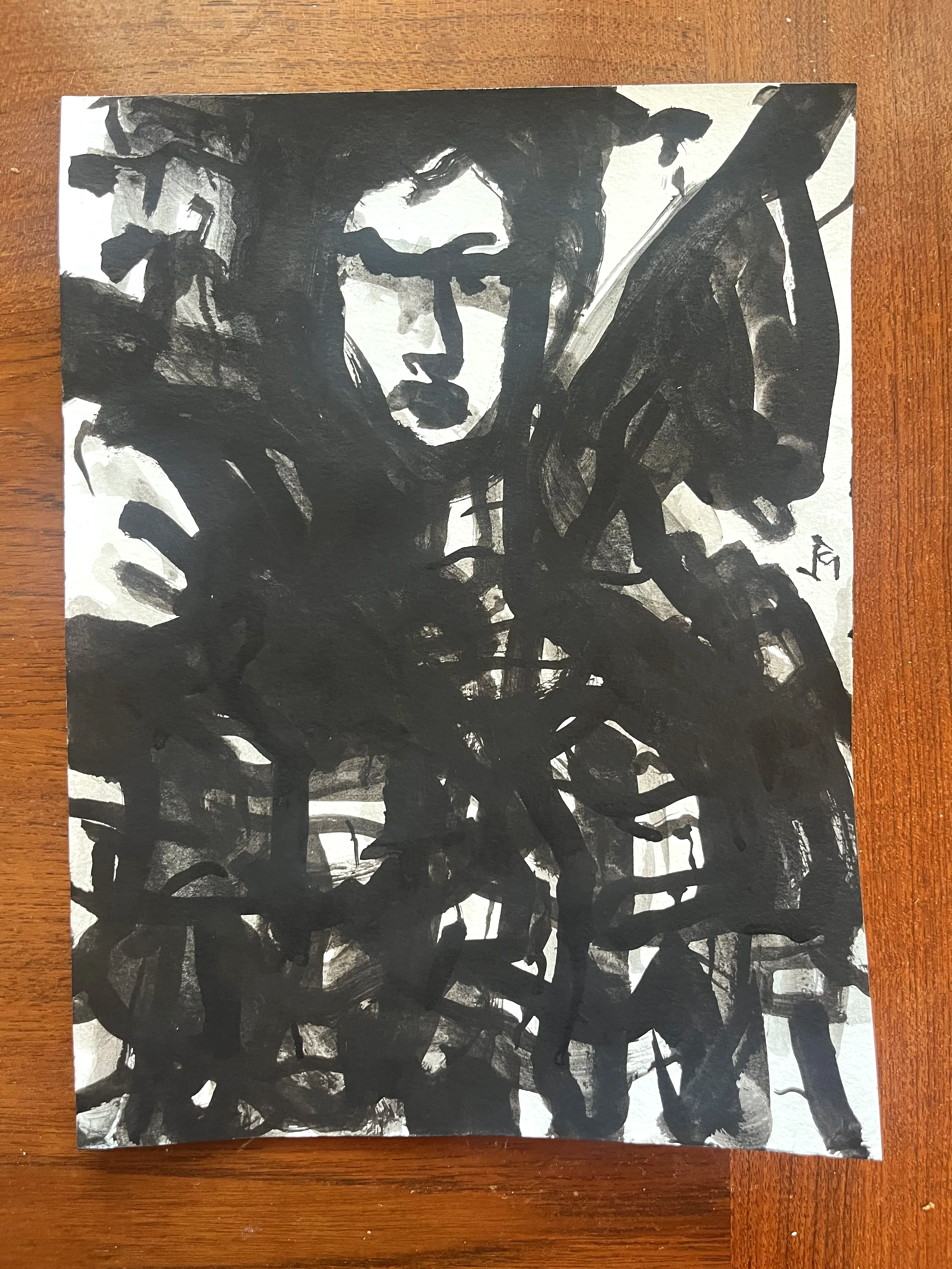
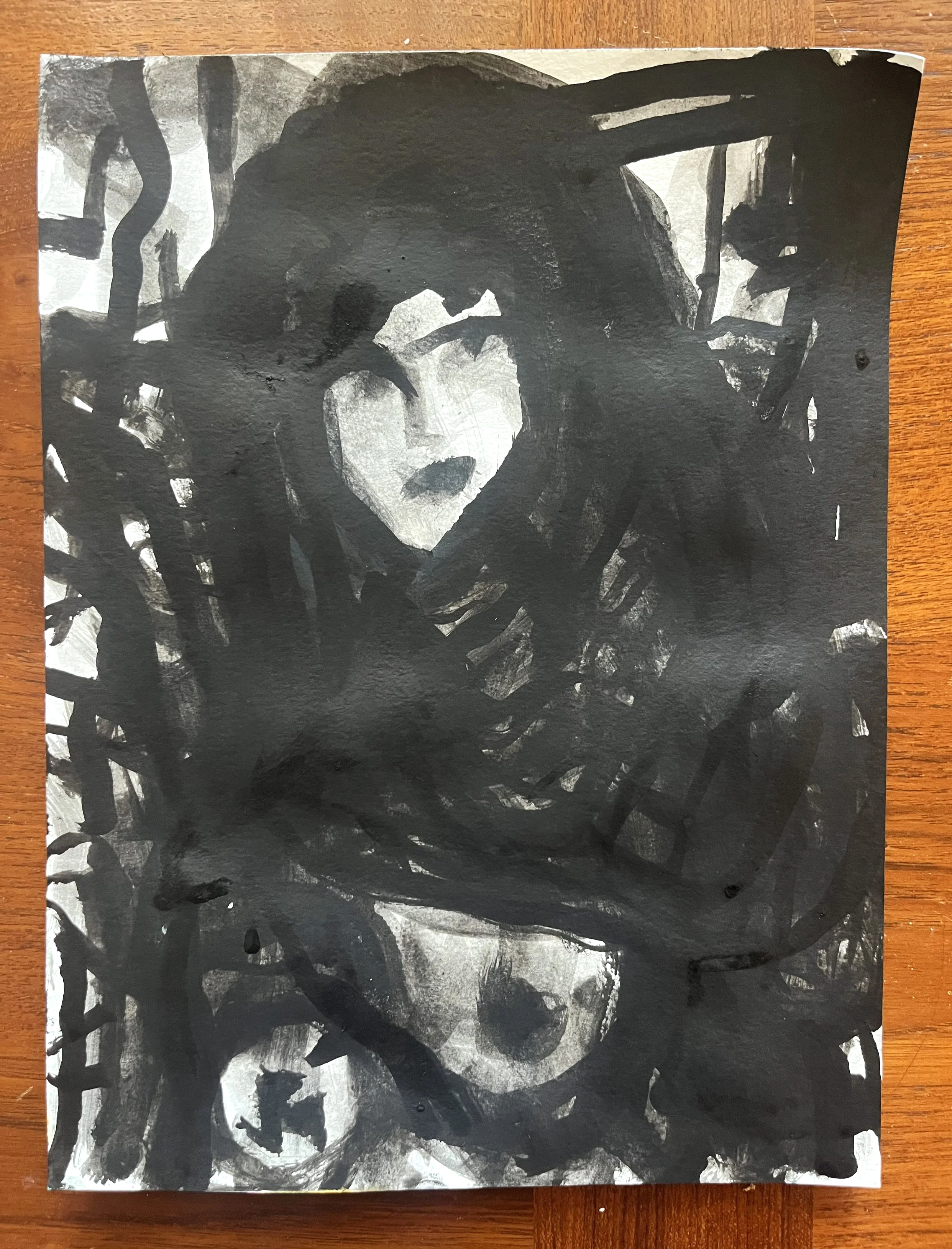
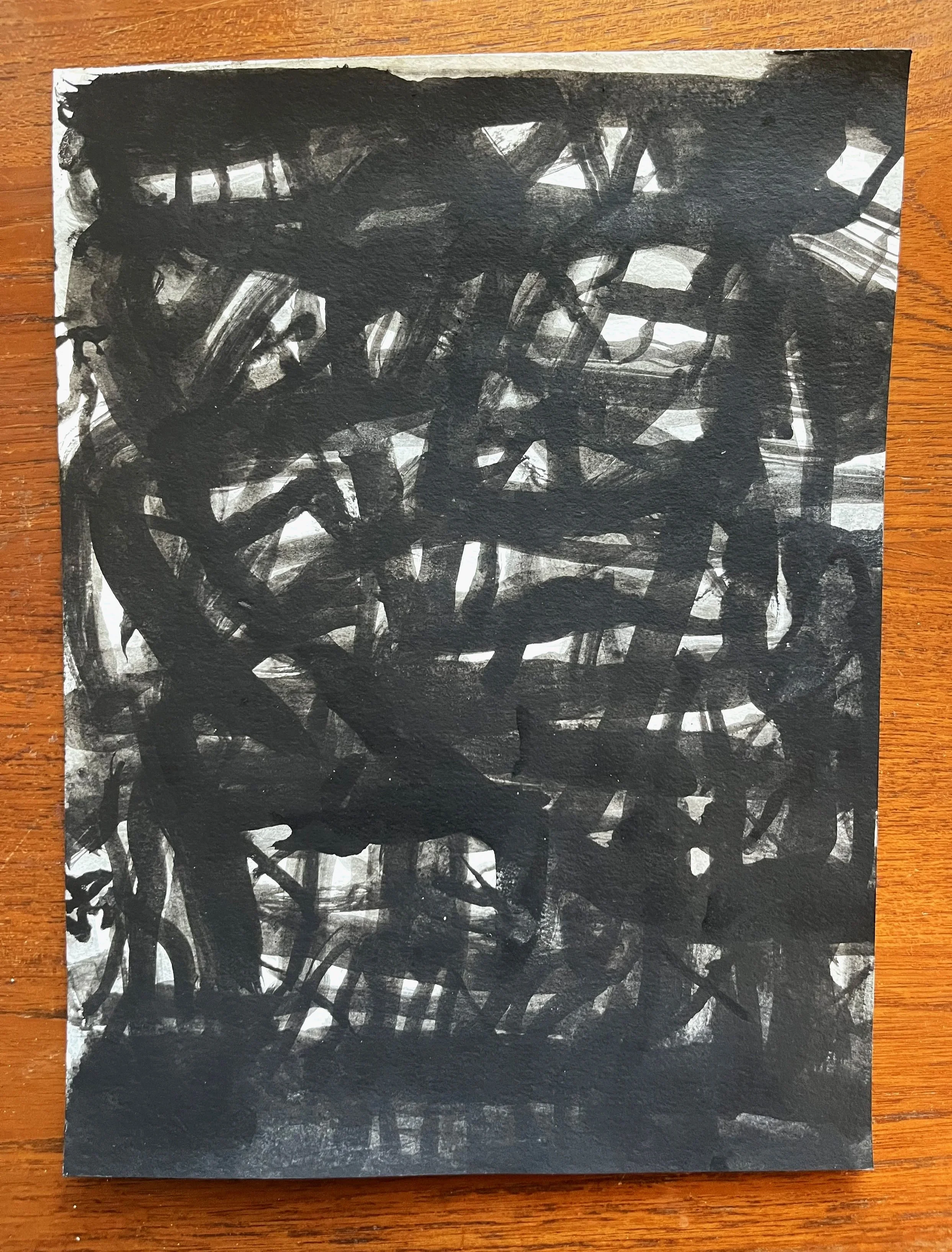
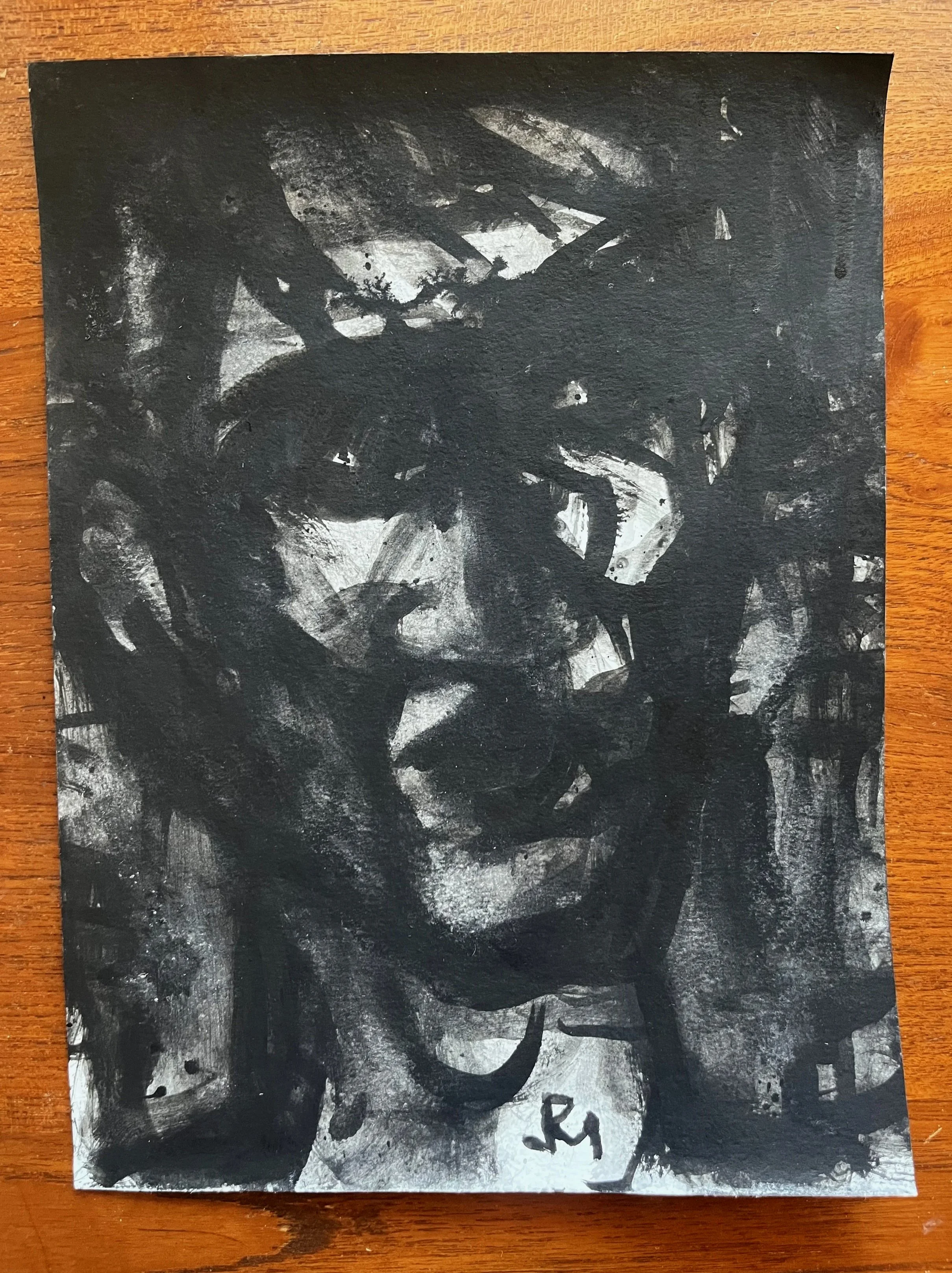
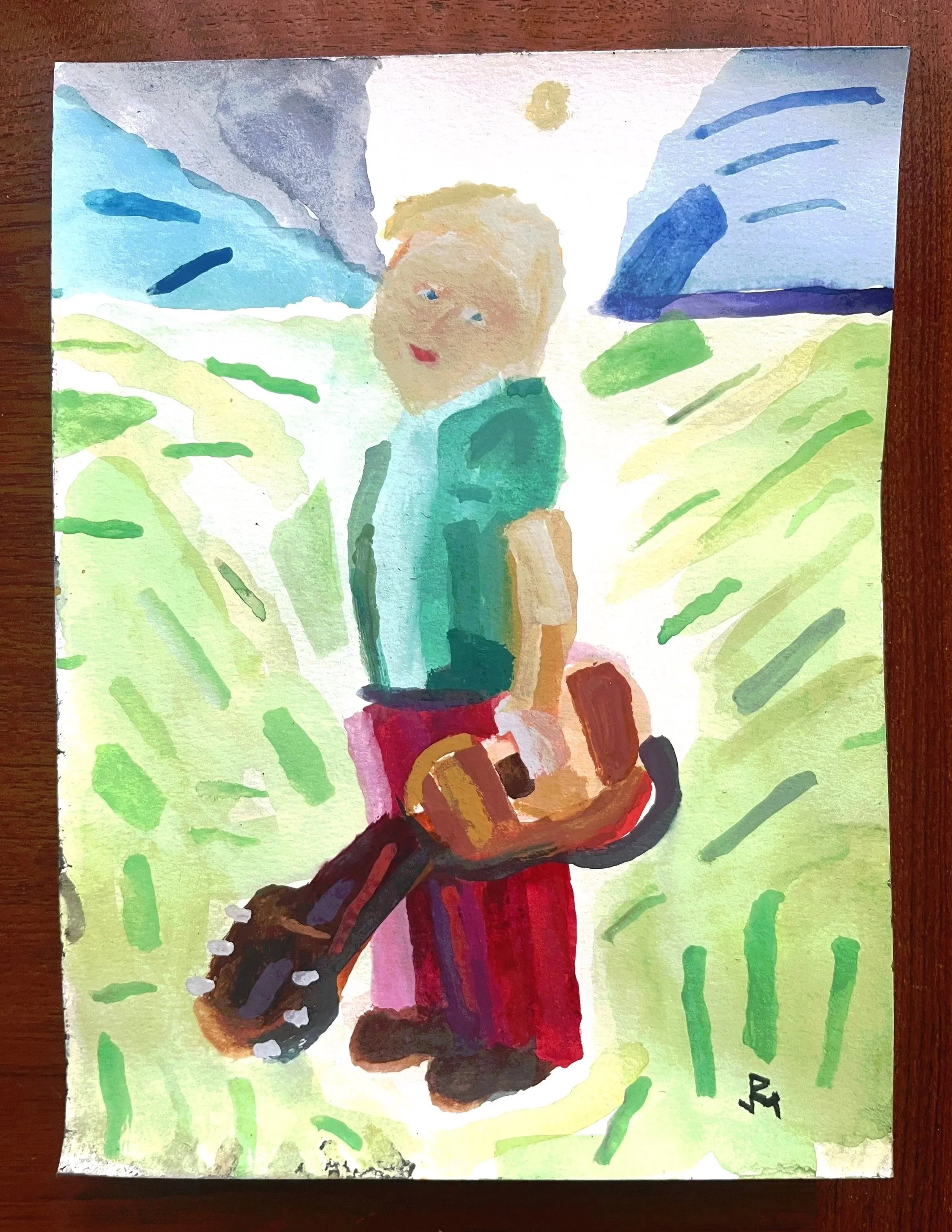
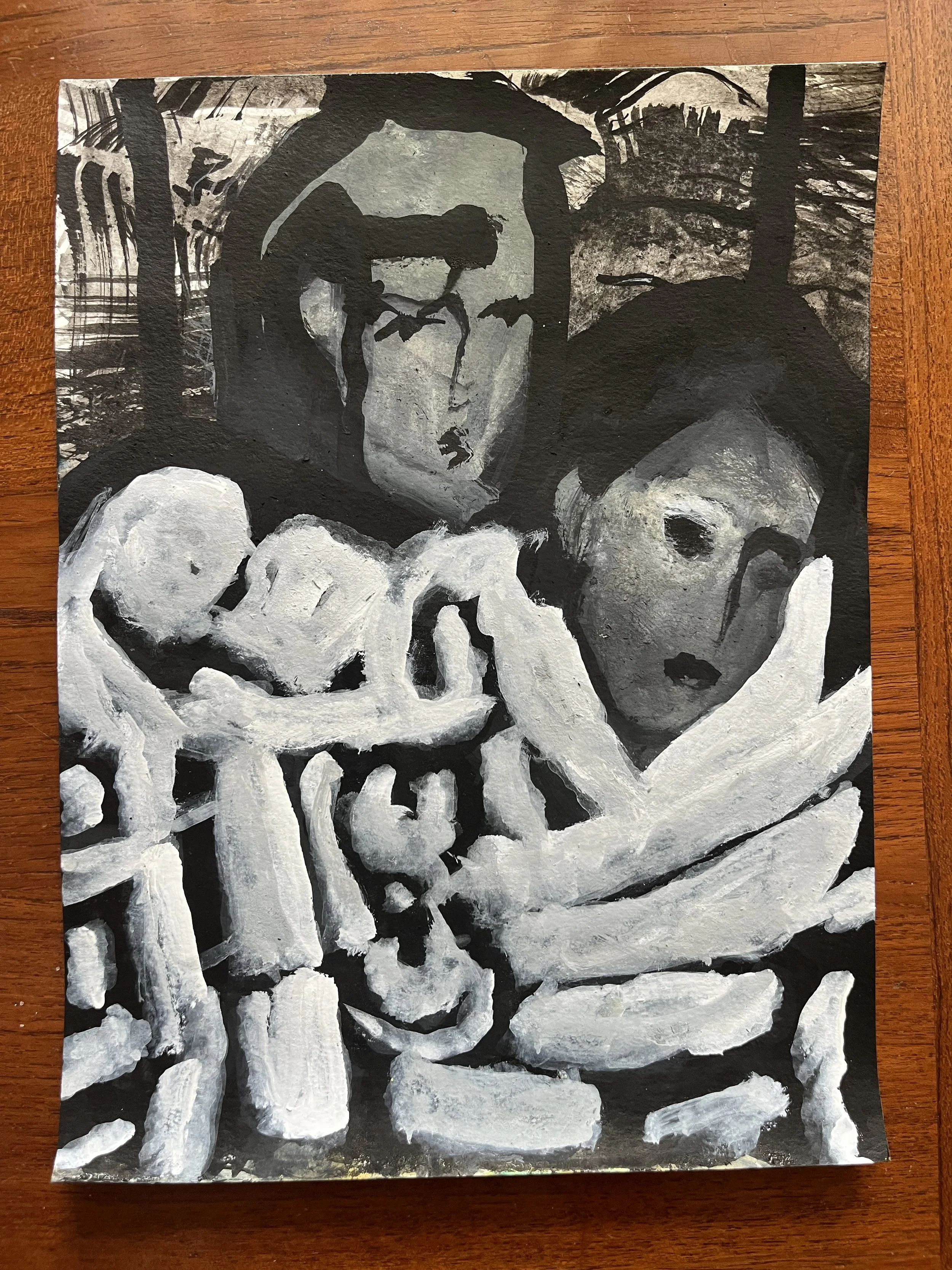
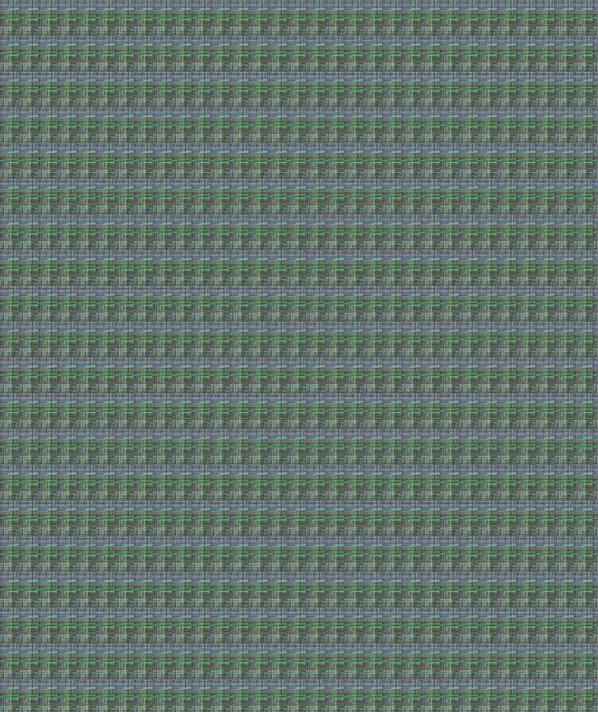
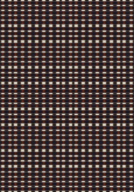
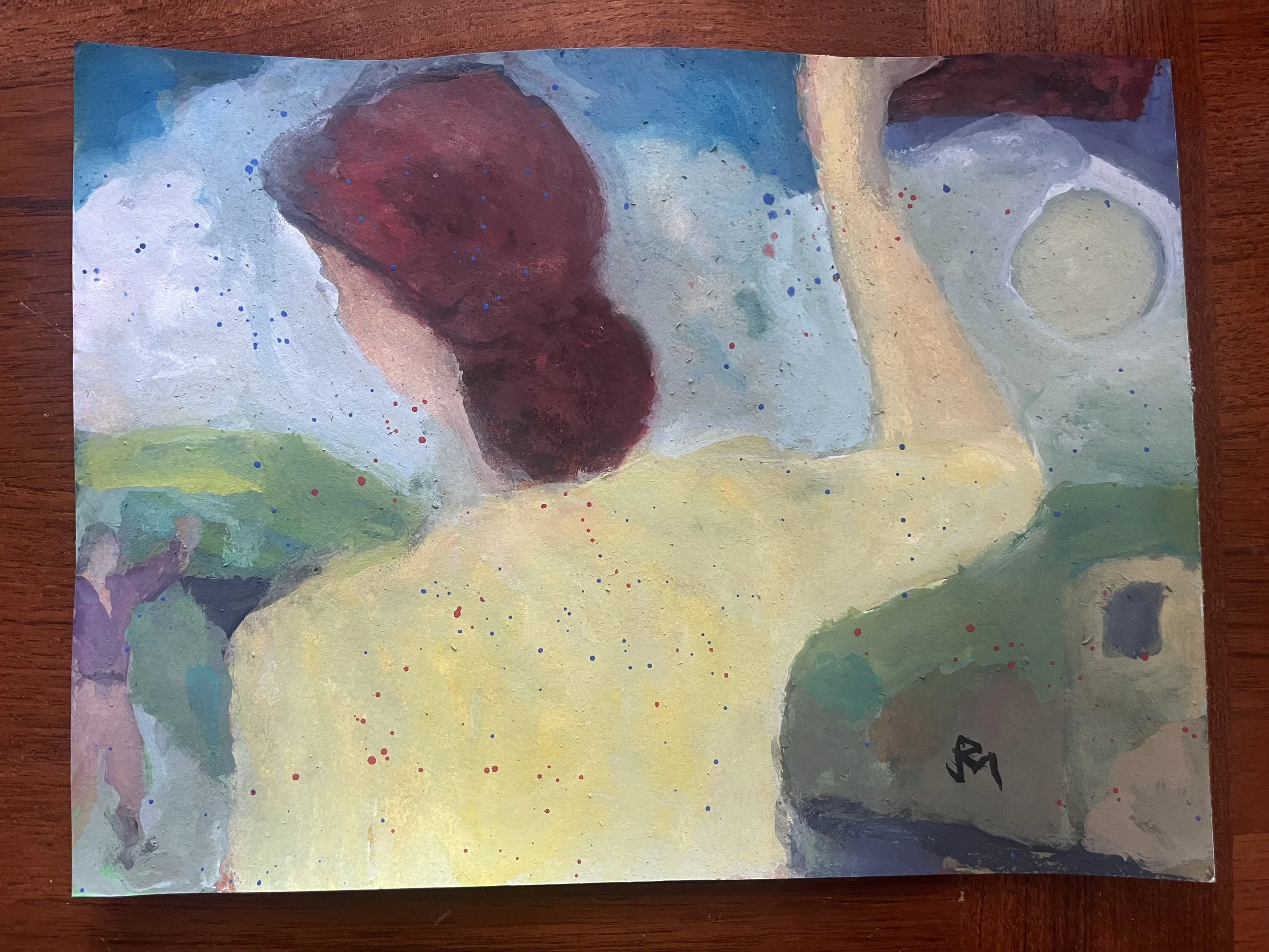
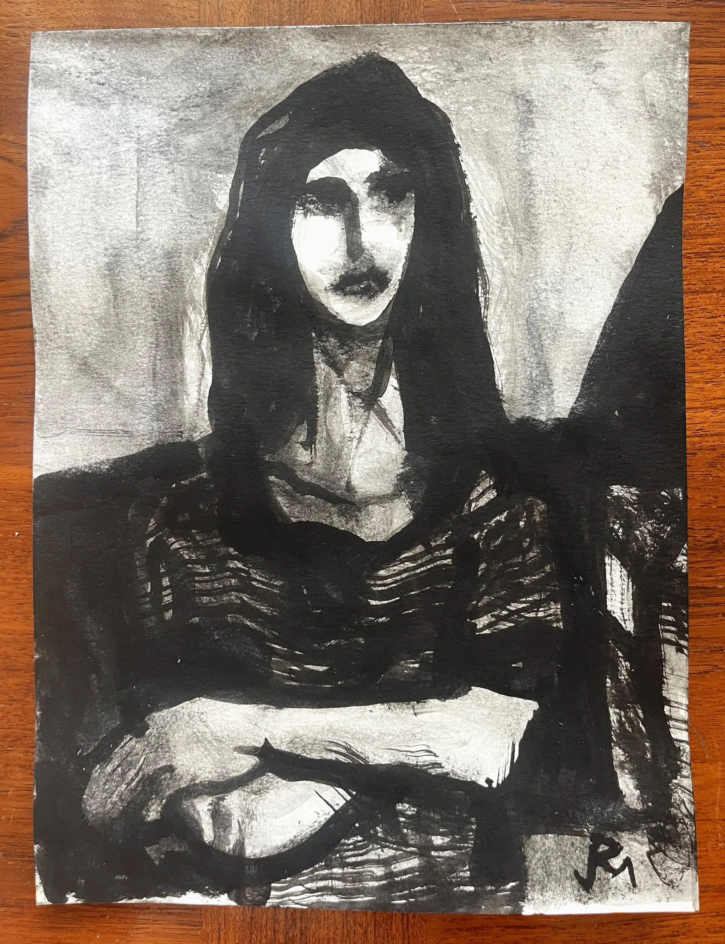
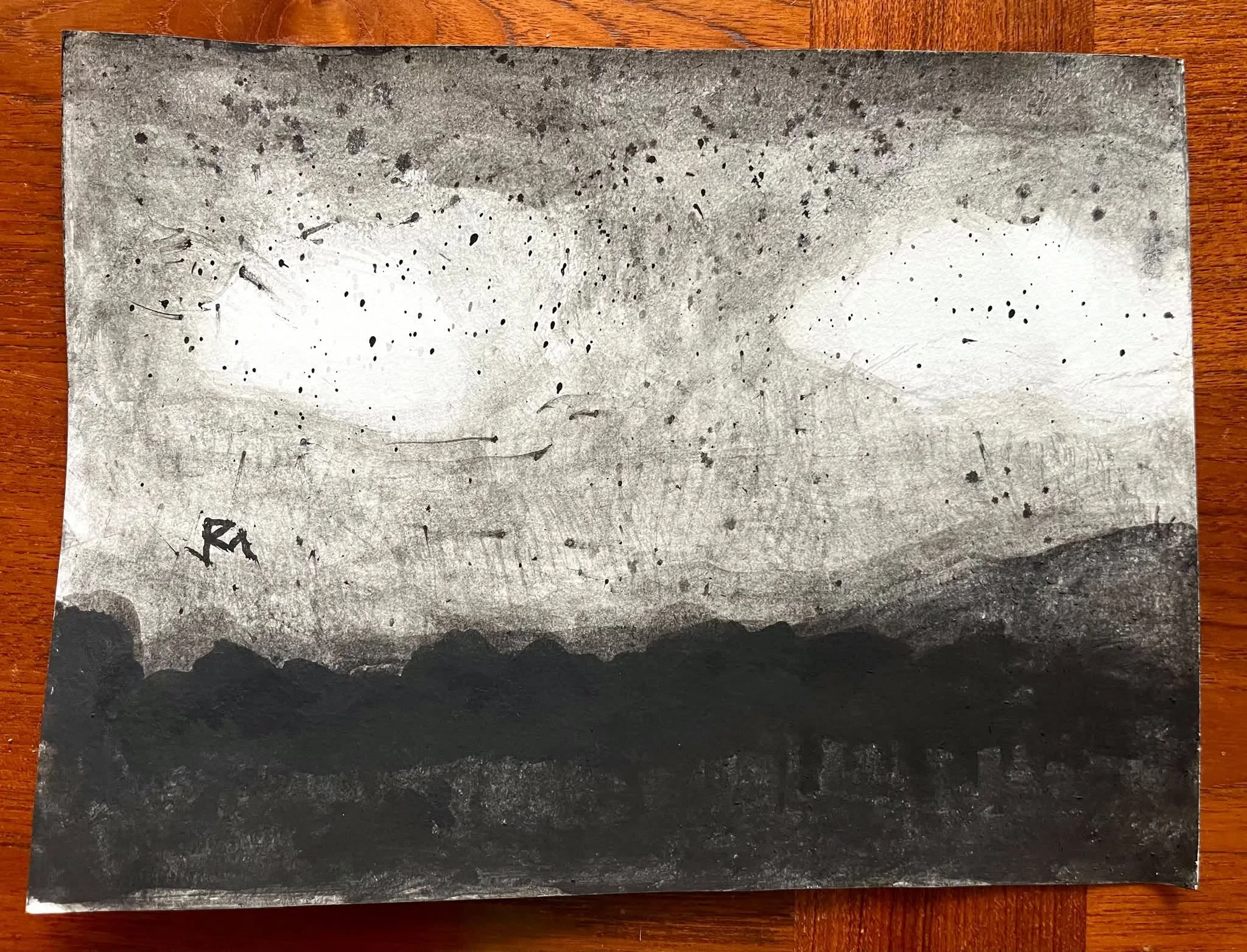
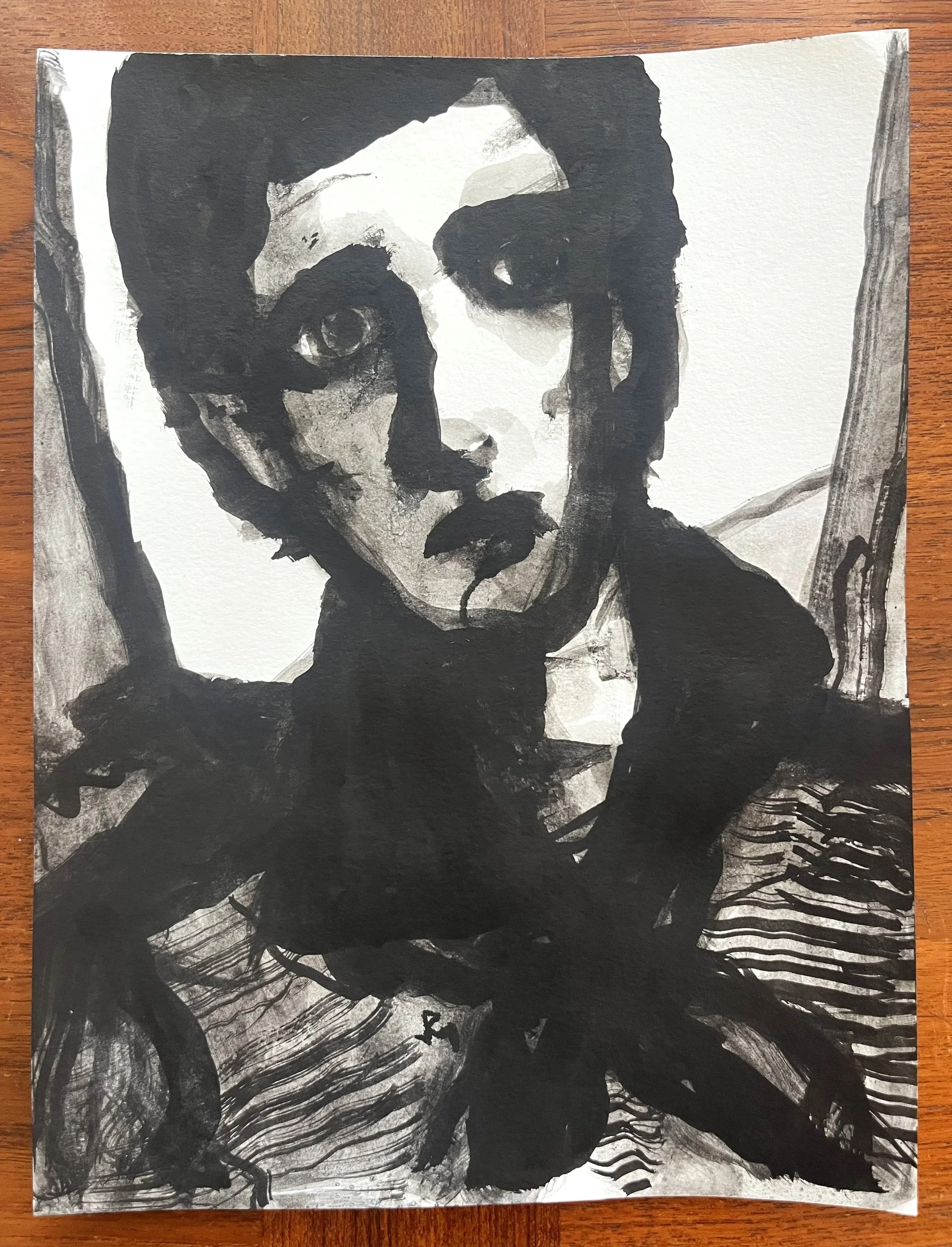
My studio painting approach is serial, grounded in trial-and-error. Flow is a term that resonates, with a nod toward another CGU (Drucker School) author and lecturer, Mihalyi Csikszentmihalyi. I think though that what I am referring to as flow has more to do with production or creative output than a psychological state. I am certainly not opposed to inter-disciplinary collaboration, crossover intelligence (as the above paragraph demonstrates) or multi-disciplinarity as an academic or practical matter, as anyone familiar with my collective and collaborative work over the past four decades, knows. If nothing else, for God’s sake, it can be fun! That said, I would argue that comparative studies on the quality of creativity among disparate disciplines is conjectural, and has been pursued over the last half century for the wrong purposes to the wrong end. For reasons rooted in institutional validation and self-interest (funding), academic authorities in management studies have found it appealing to conflate their subject with art-based practice and thought. At the risk of being provocative: In my opinion their arguments are rarely compelling, or reciprocal.
There is also the problem with massive consumer portable culture corporations and syndicates (SONY, Disney and YouTube come readily to mind), who have invested billions into campaigns to elevate machine technology by displacing so-called analog or traditional mediums. I think the long-tailed trends of suggesting art function more like a business, a related or contingent ideological messaging strategy, are not beneficial to art as a long-term proposition. Conversely, I find managers’ claims about creativity — using art as a metaphor for what they imagine they do at work, or would like their employees to imagine they do at work or play — to be disingenuous at best, cynical or delusional at worst.
Studio painting of the kind I have known is largely a solitary pursuit. The primary relationships are simple: artist to craft; artist to painting; artist and painting in art history; art and artist to viewer. The dealer, academic and critic all can play vital roles as mediators and interlocutors, helping a viewer appropriately contextualize artwork and artist. The social value of art and artist, as this essay frames it, is, in the post-contemporary period, very much up in the air, like a cloud.
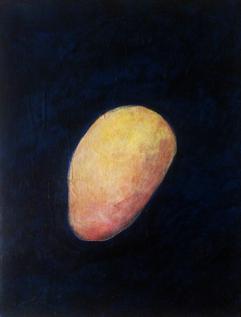
∞
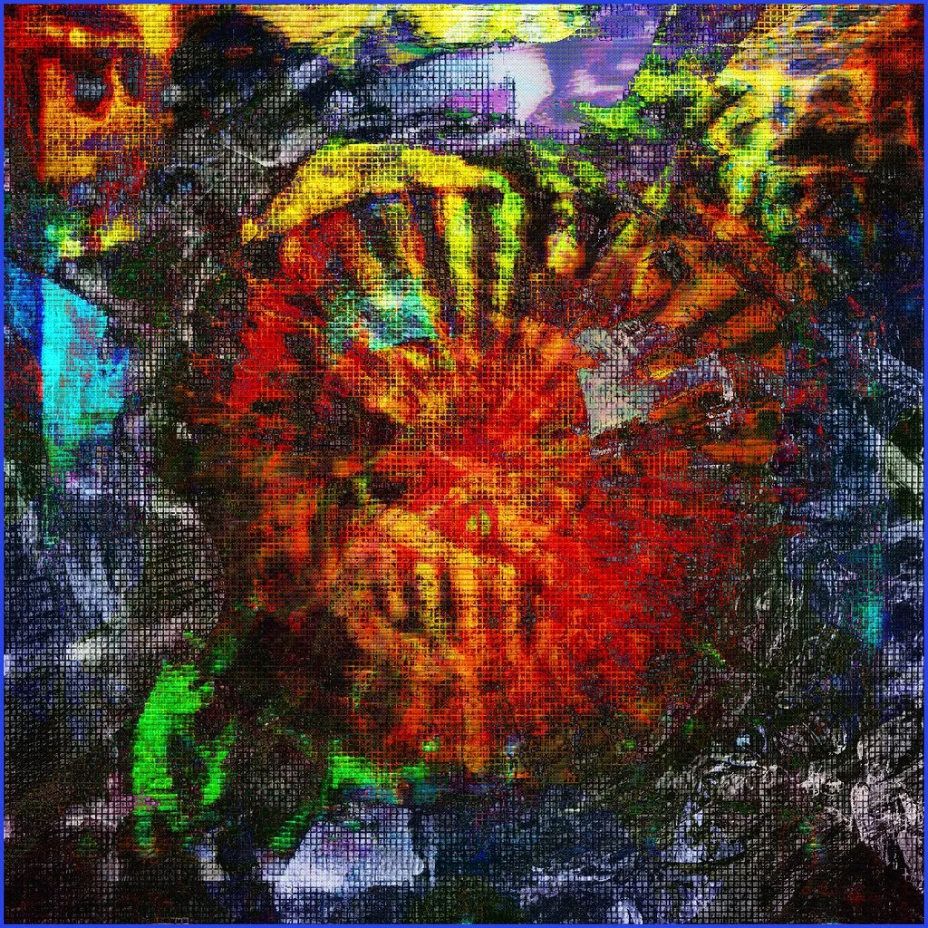
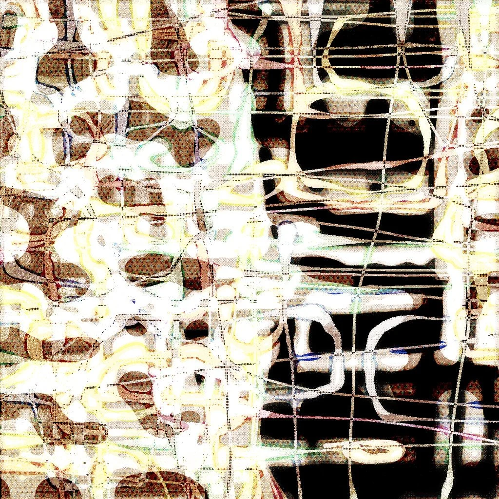
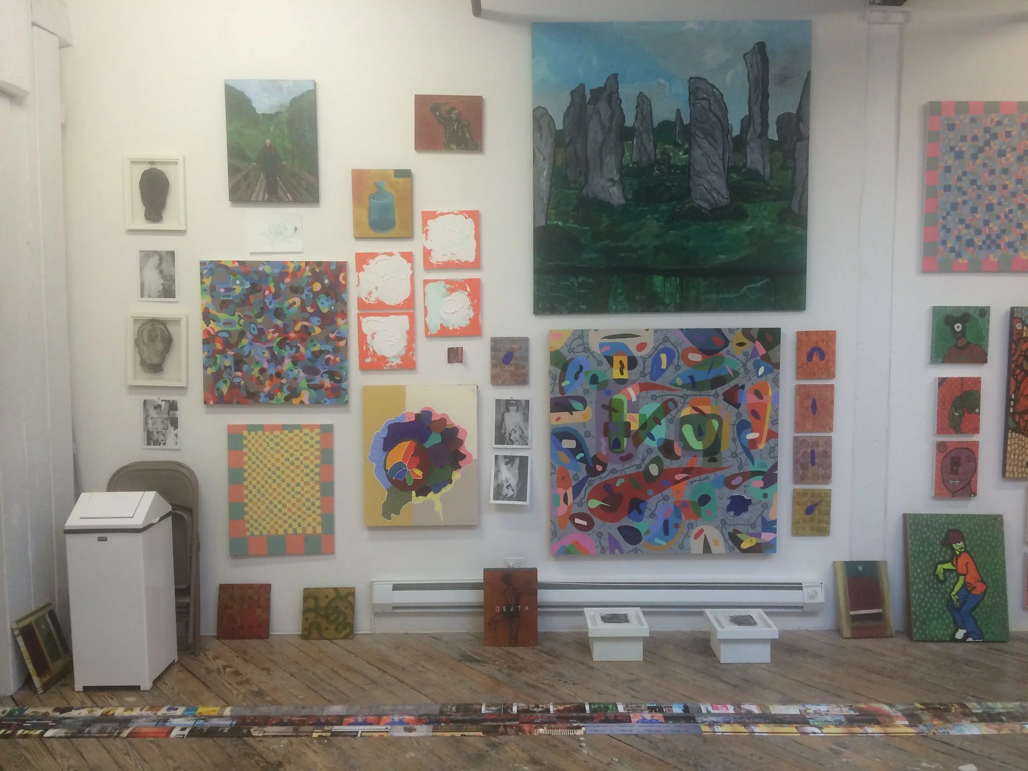
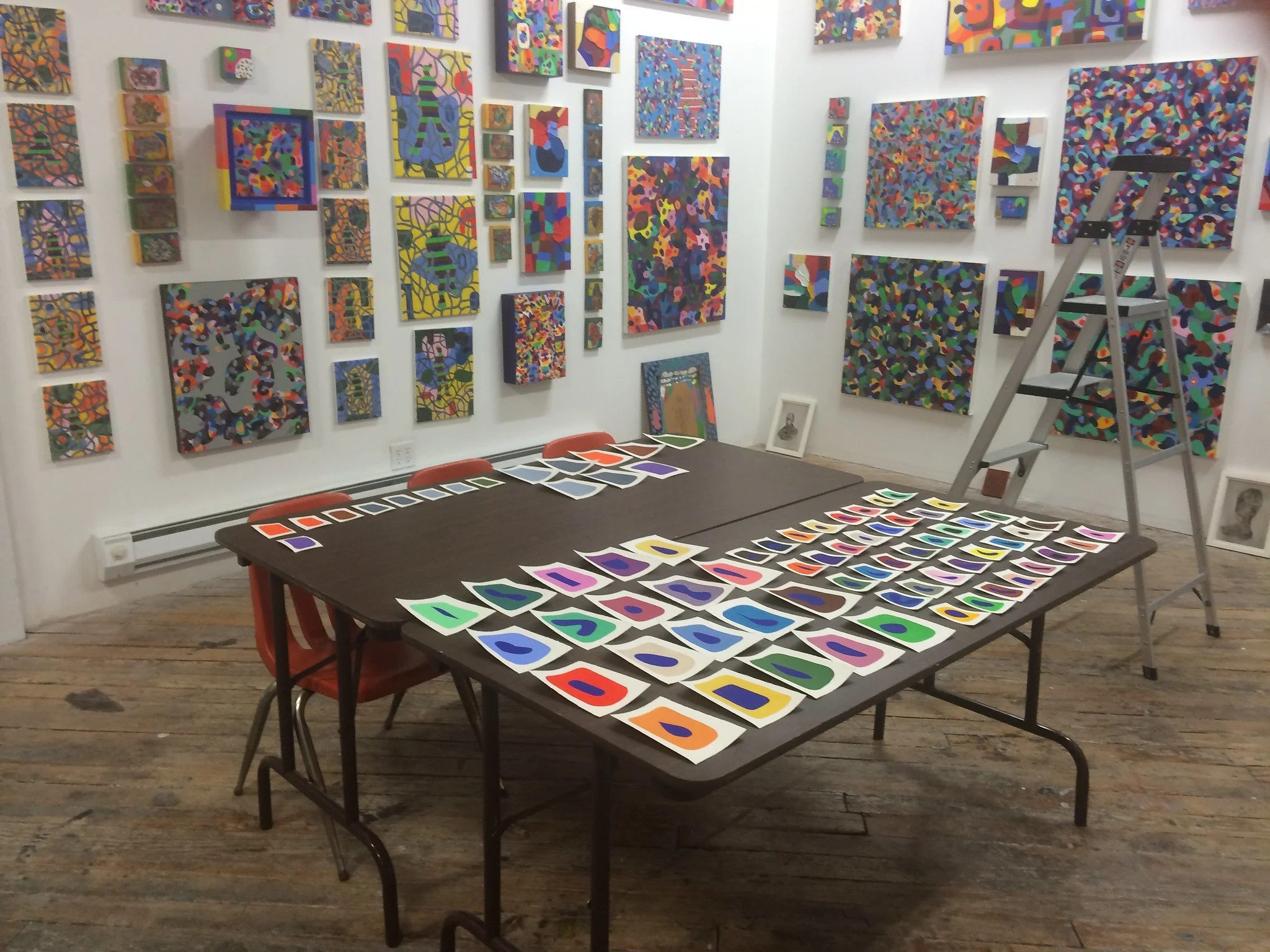
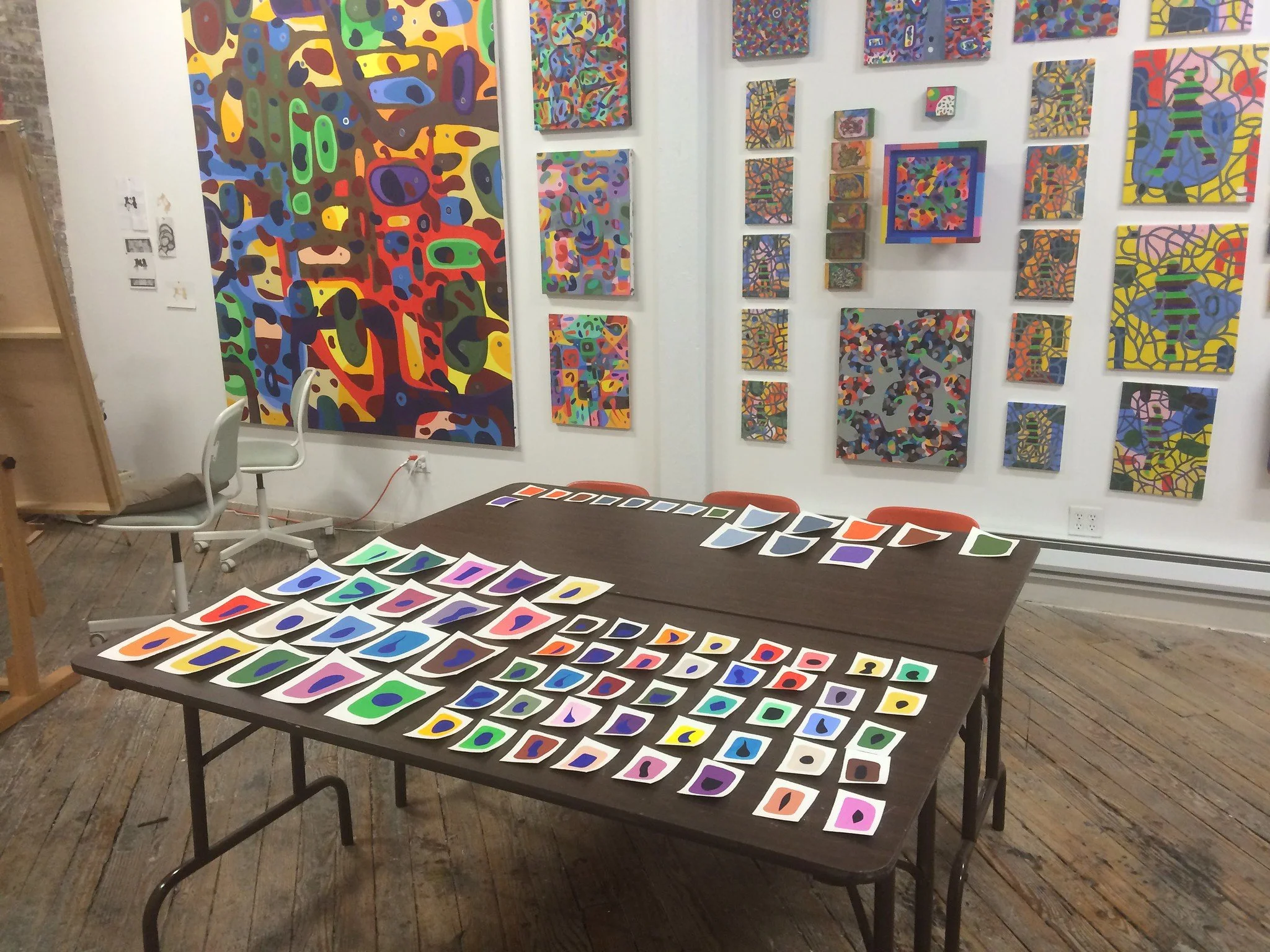
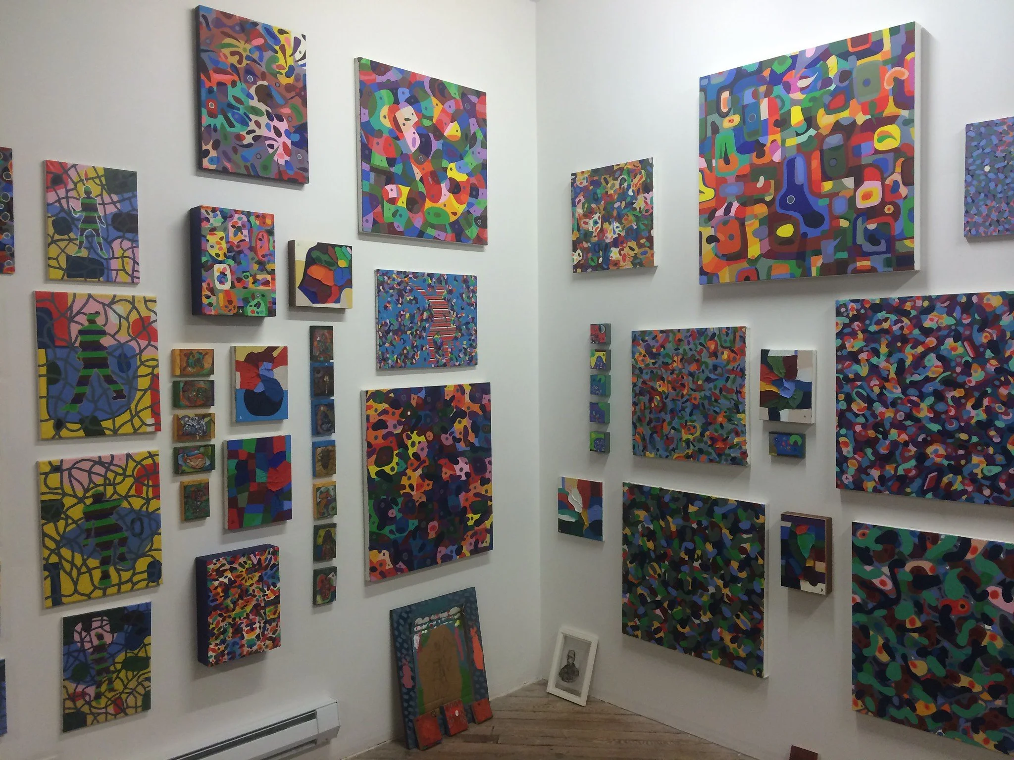
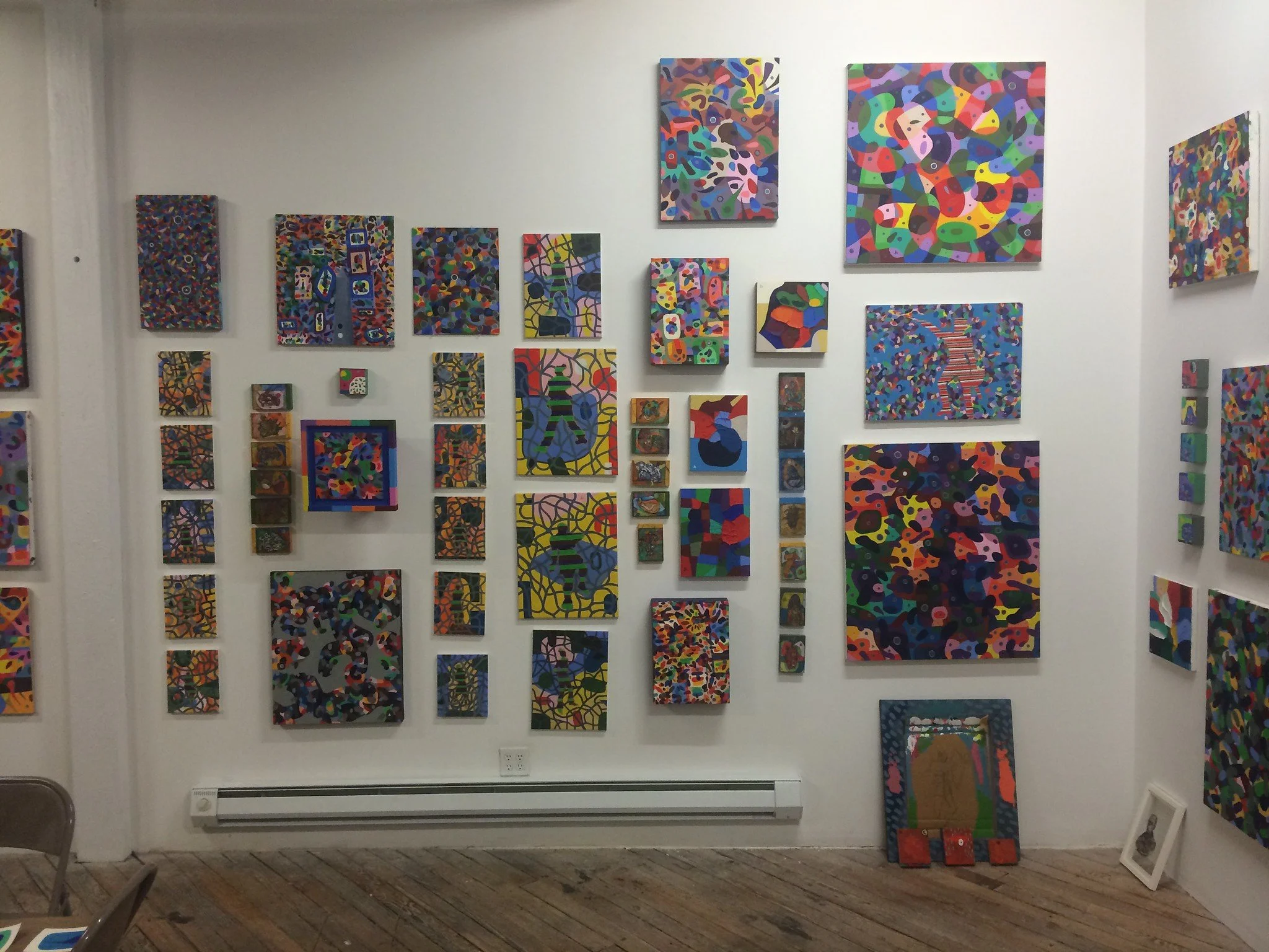
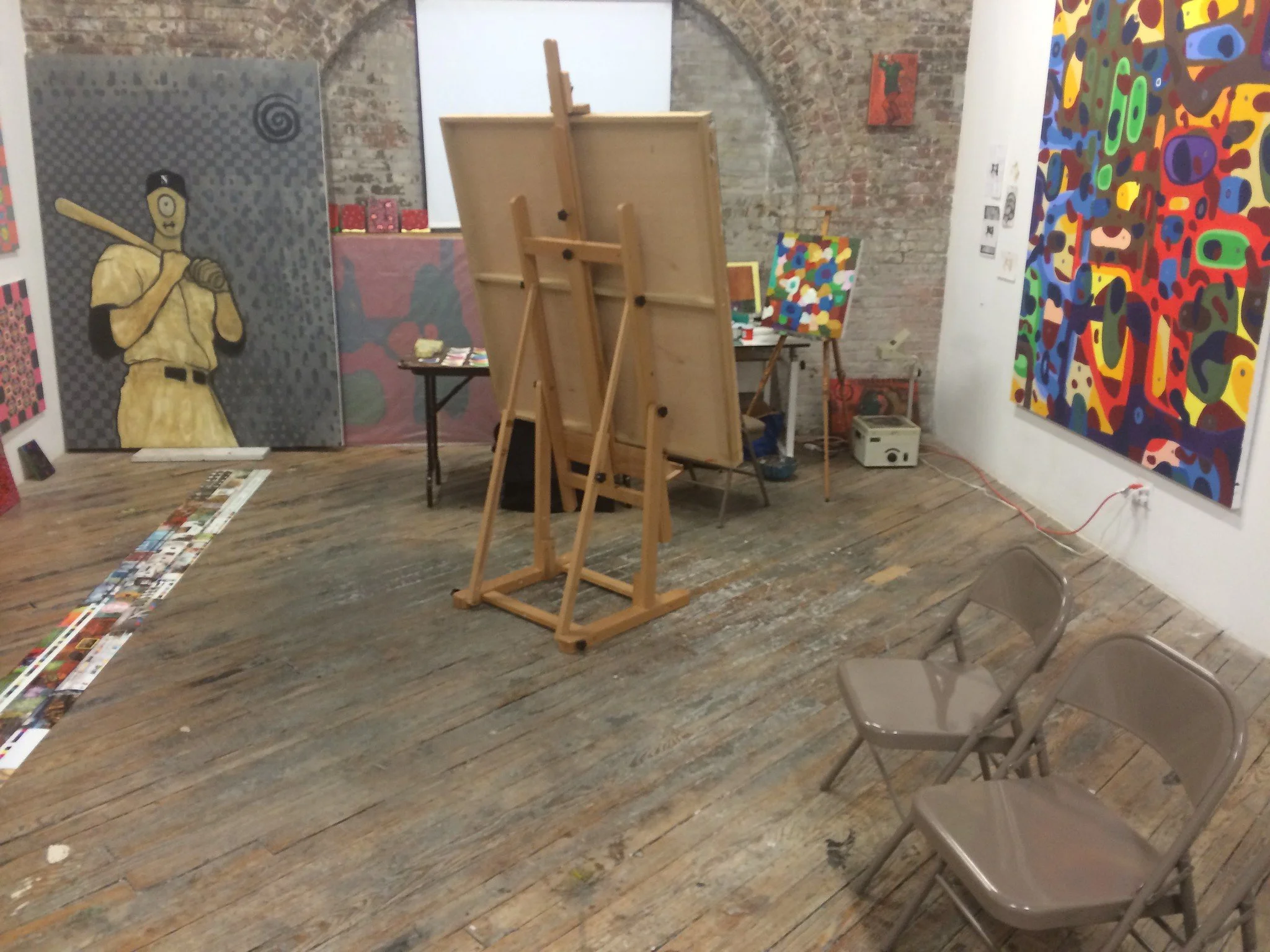
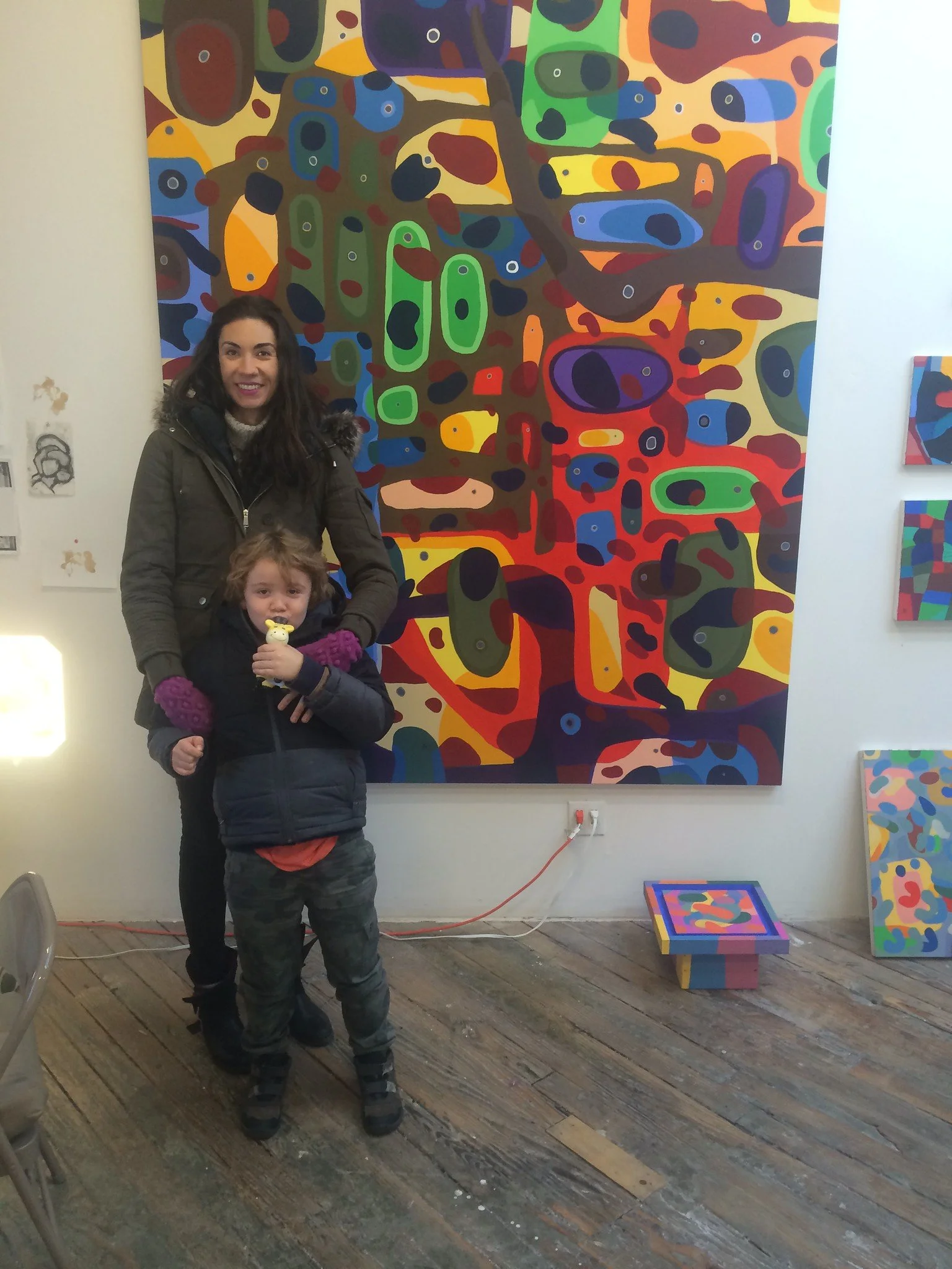
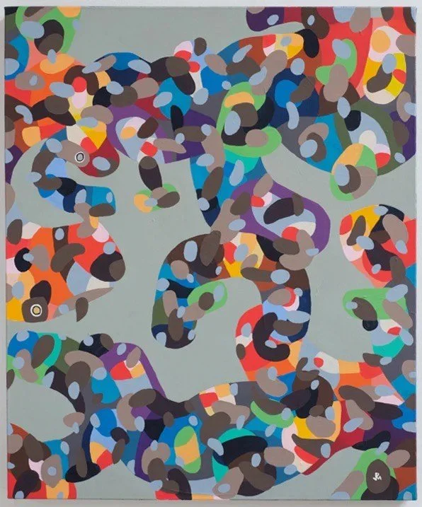
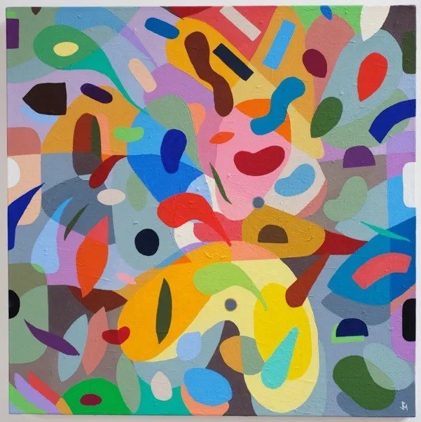
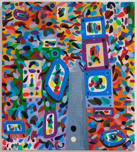
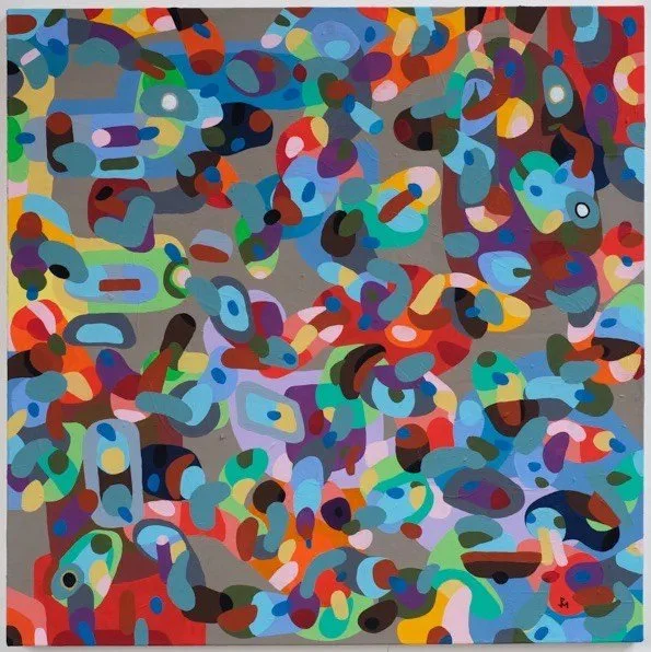
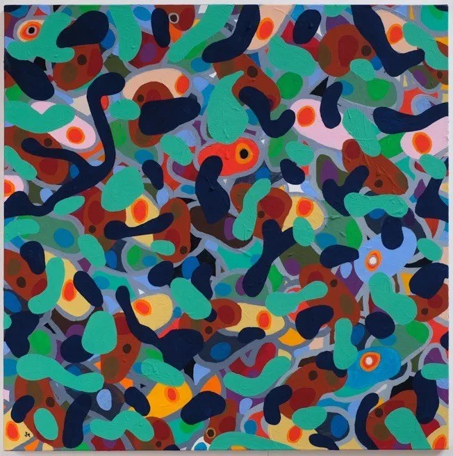
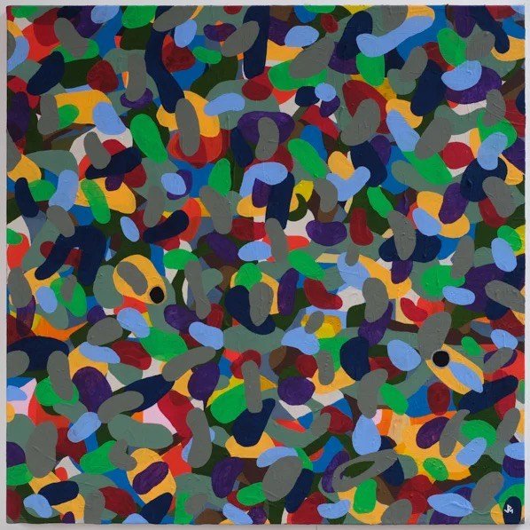
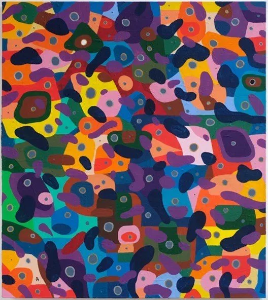
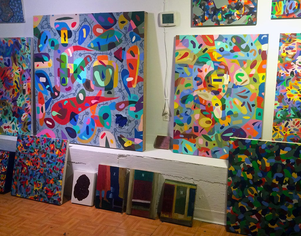
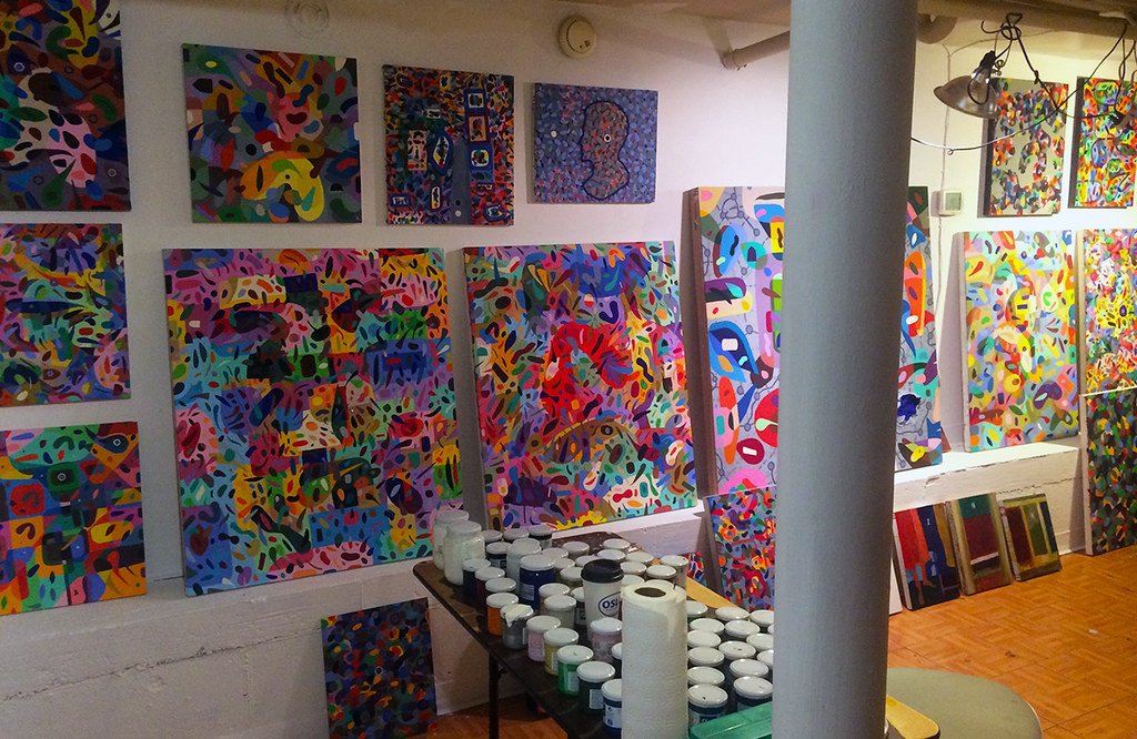
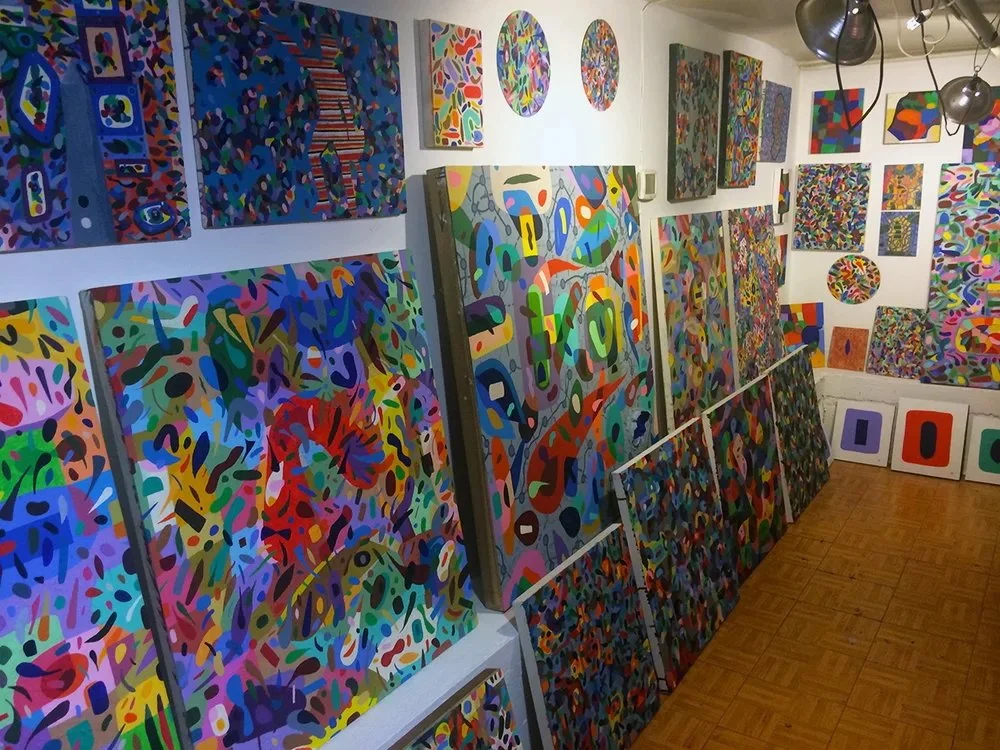
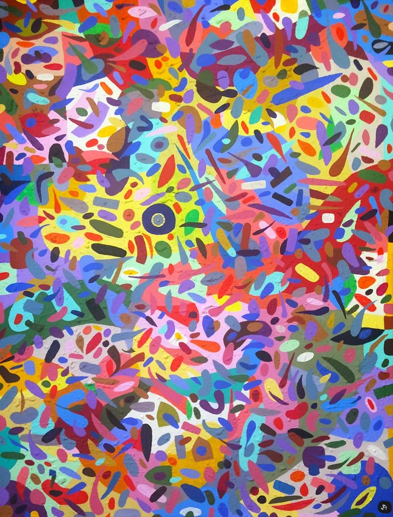
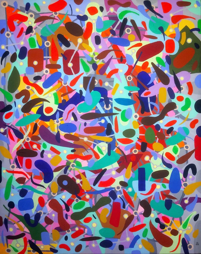
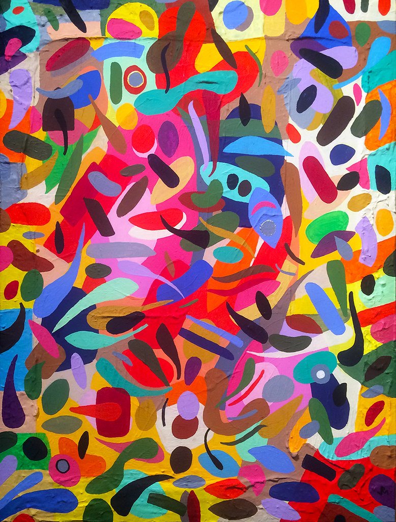
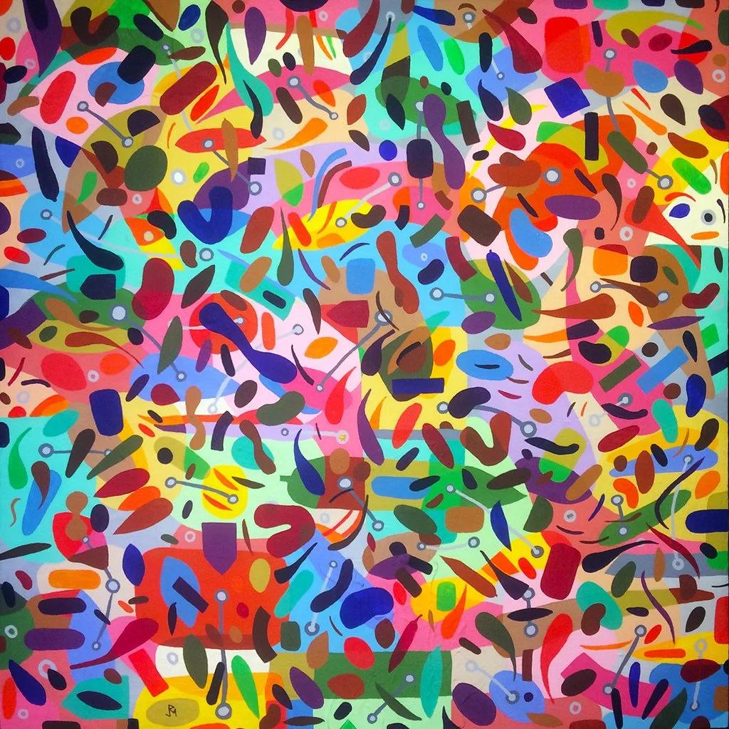
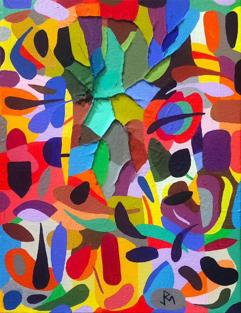
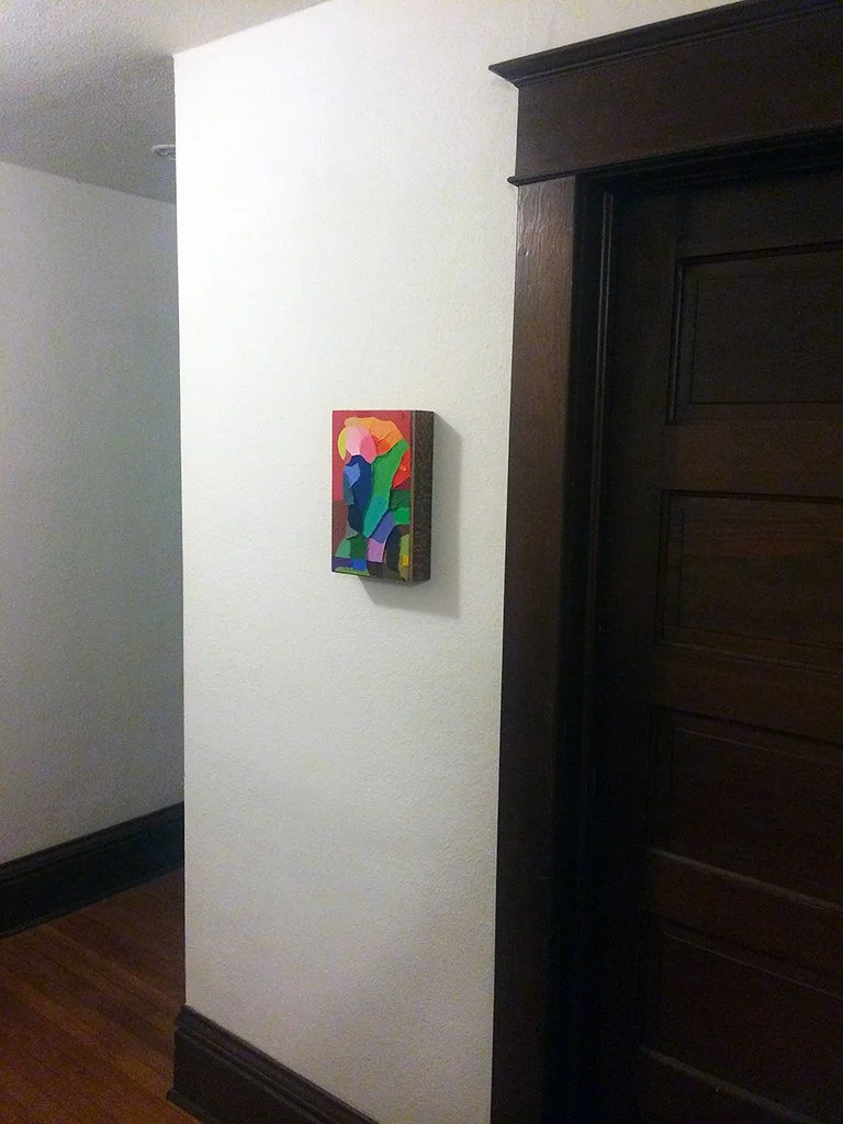
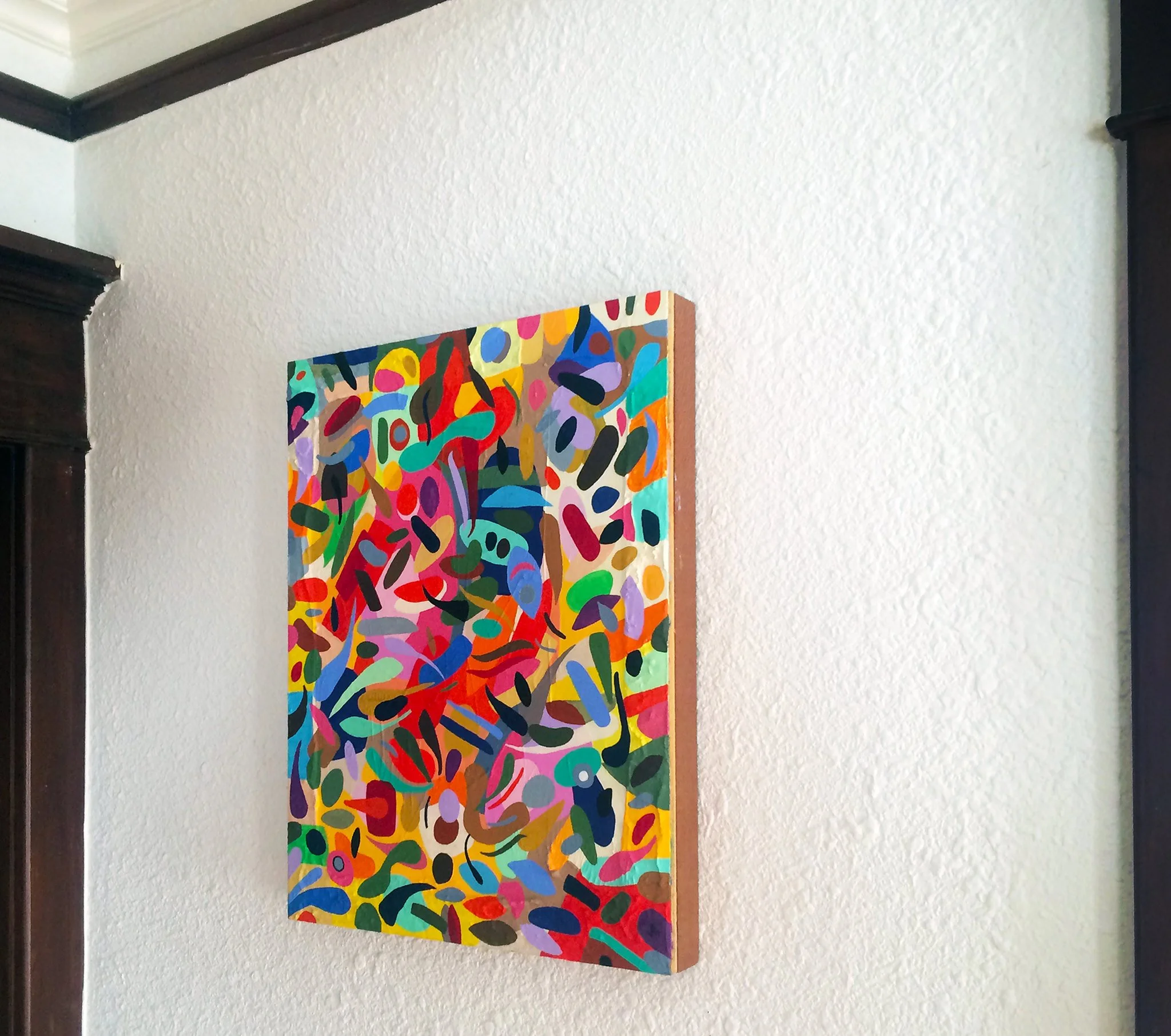
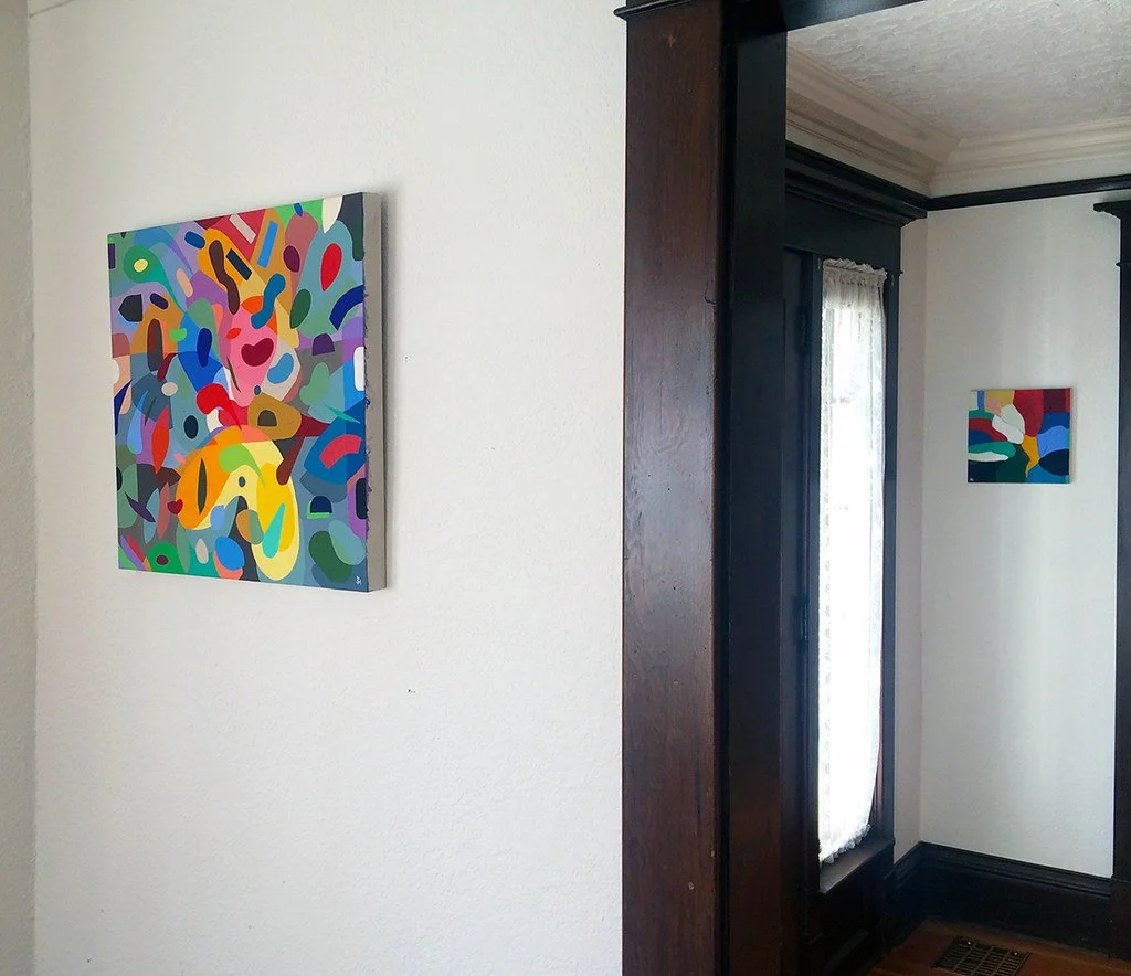
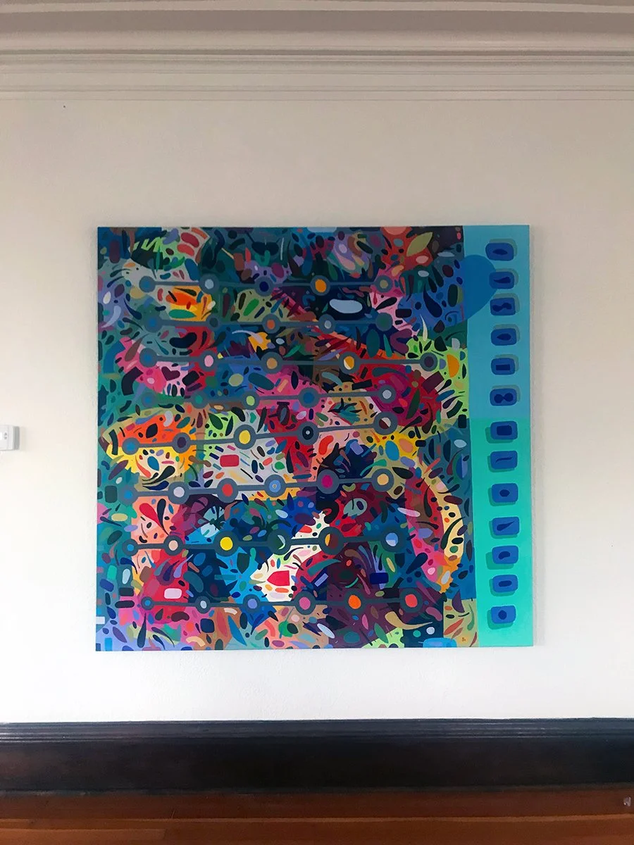
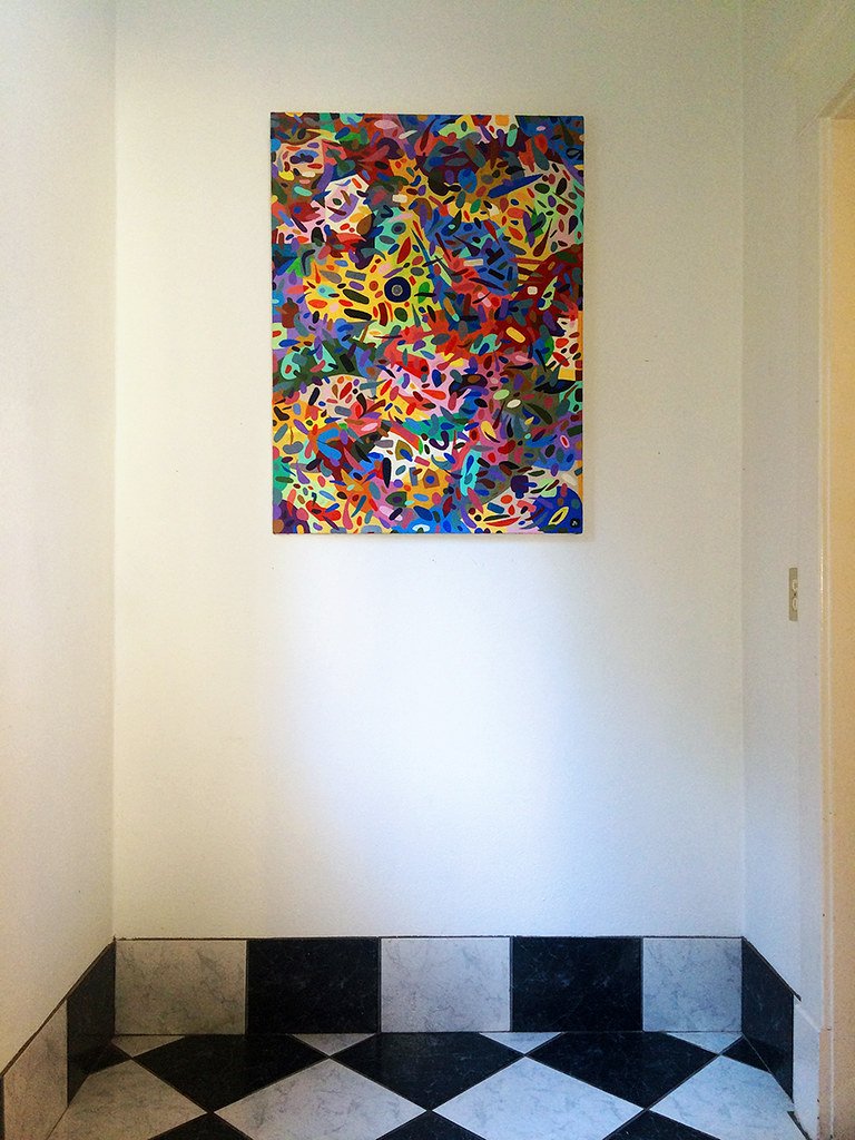
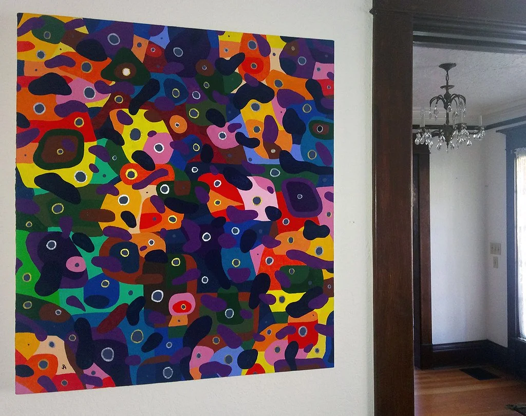
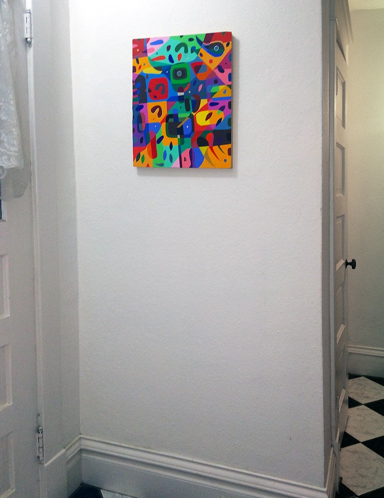
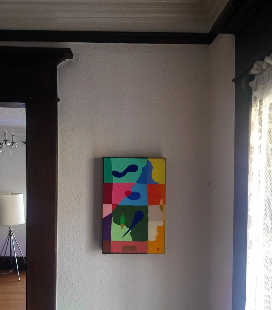
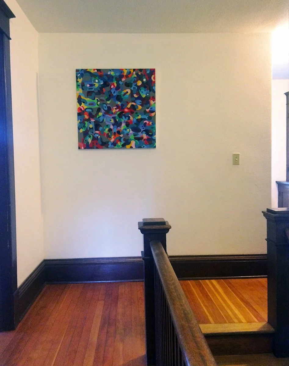
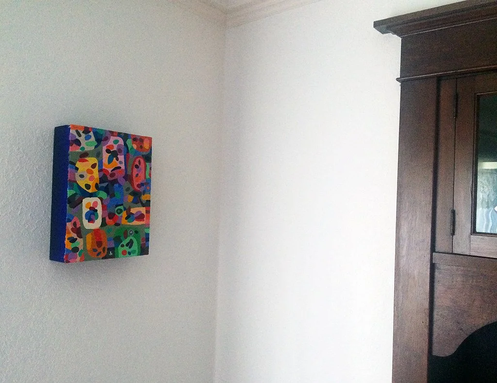
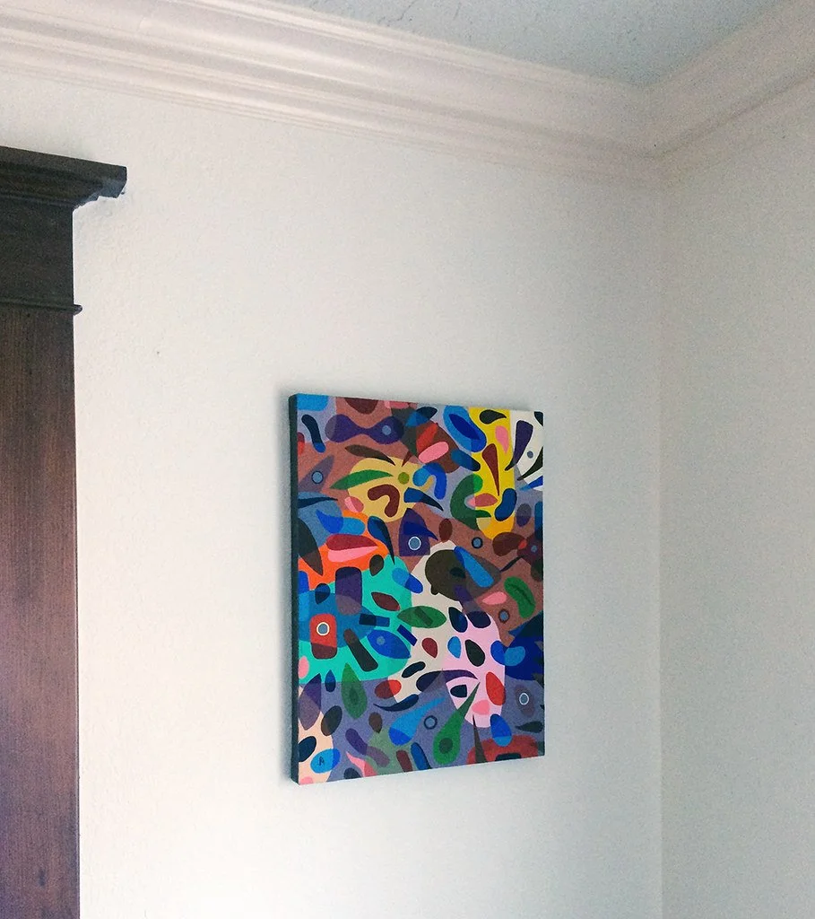
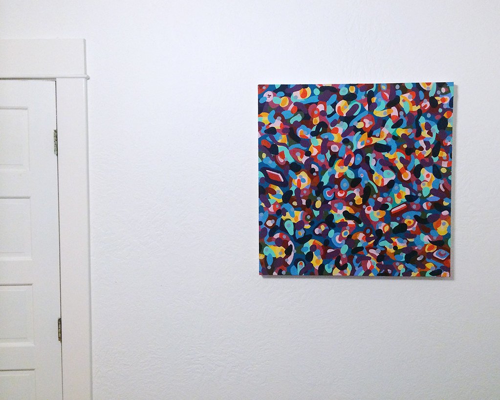
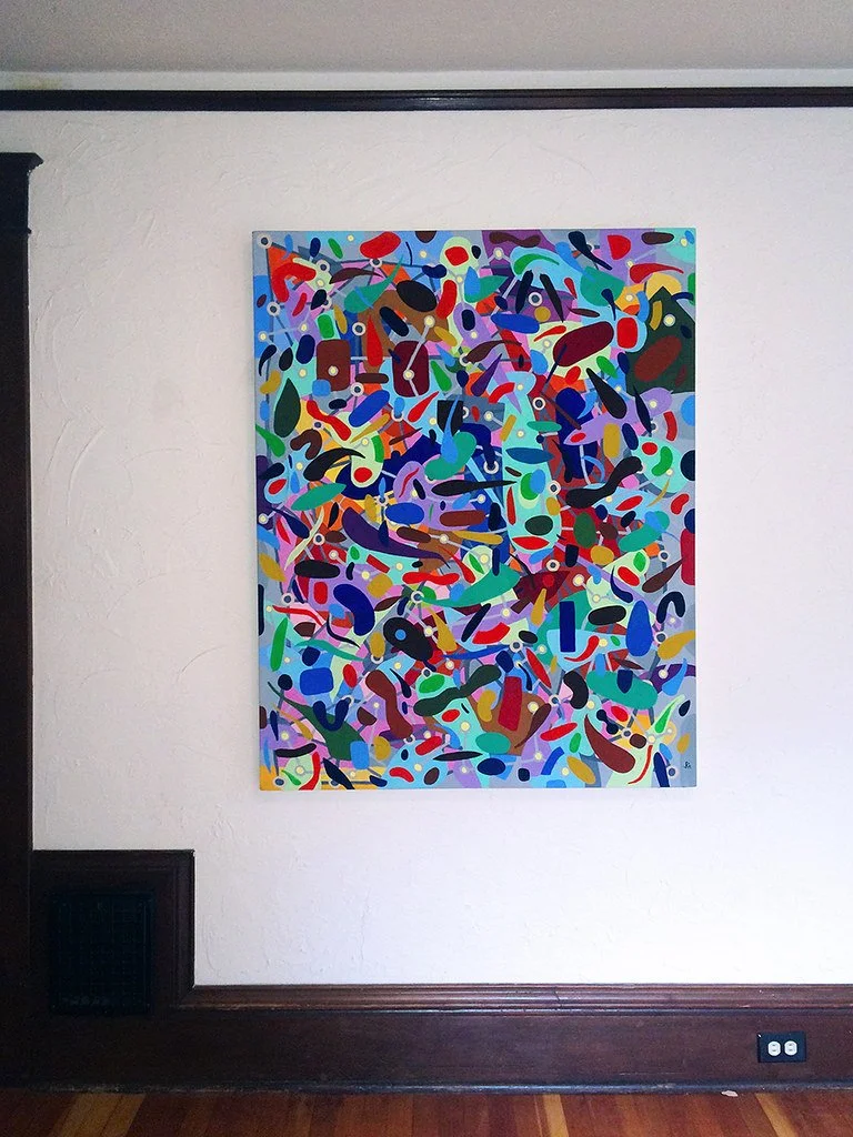
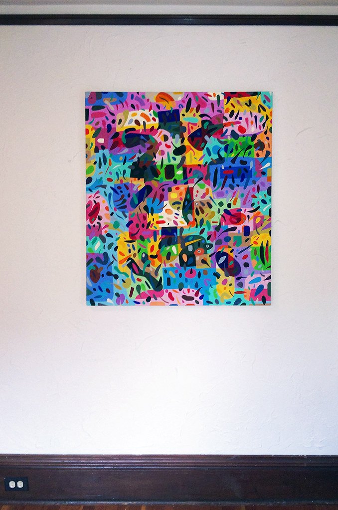
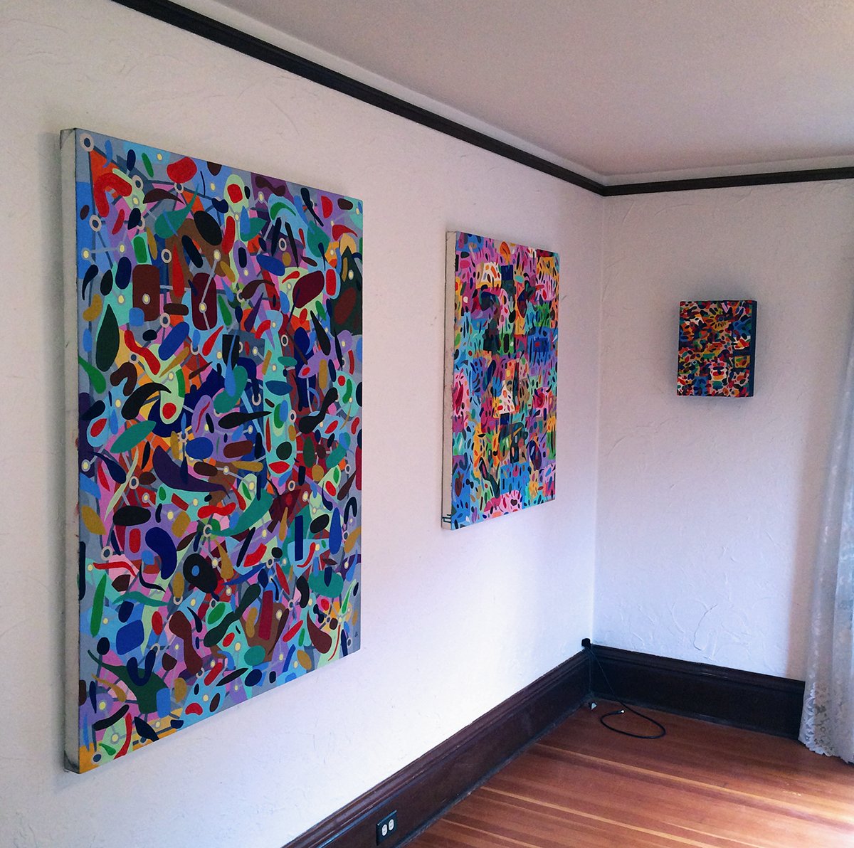
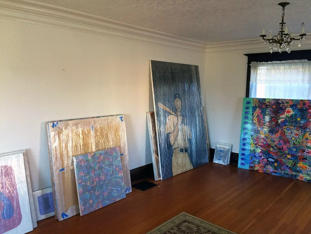
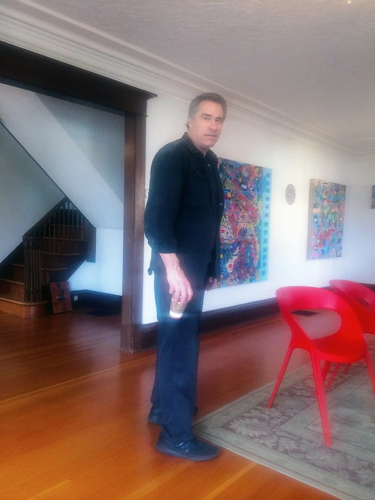
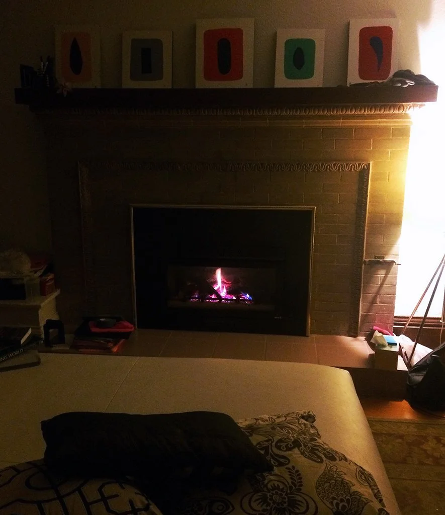
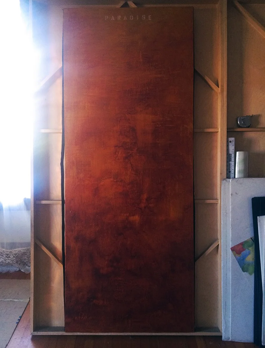
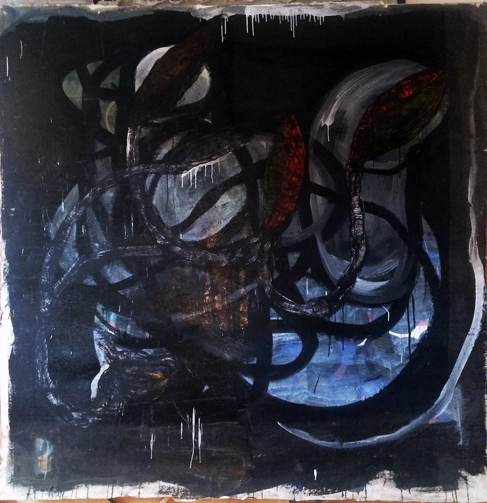
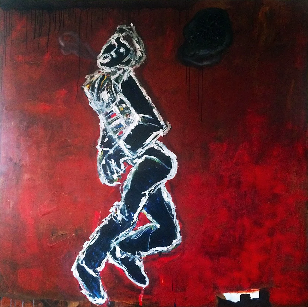
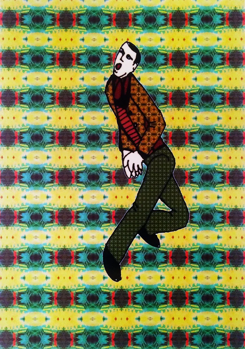
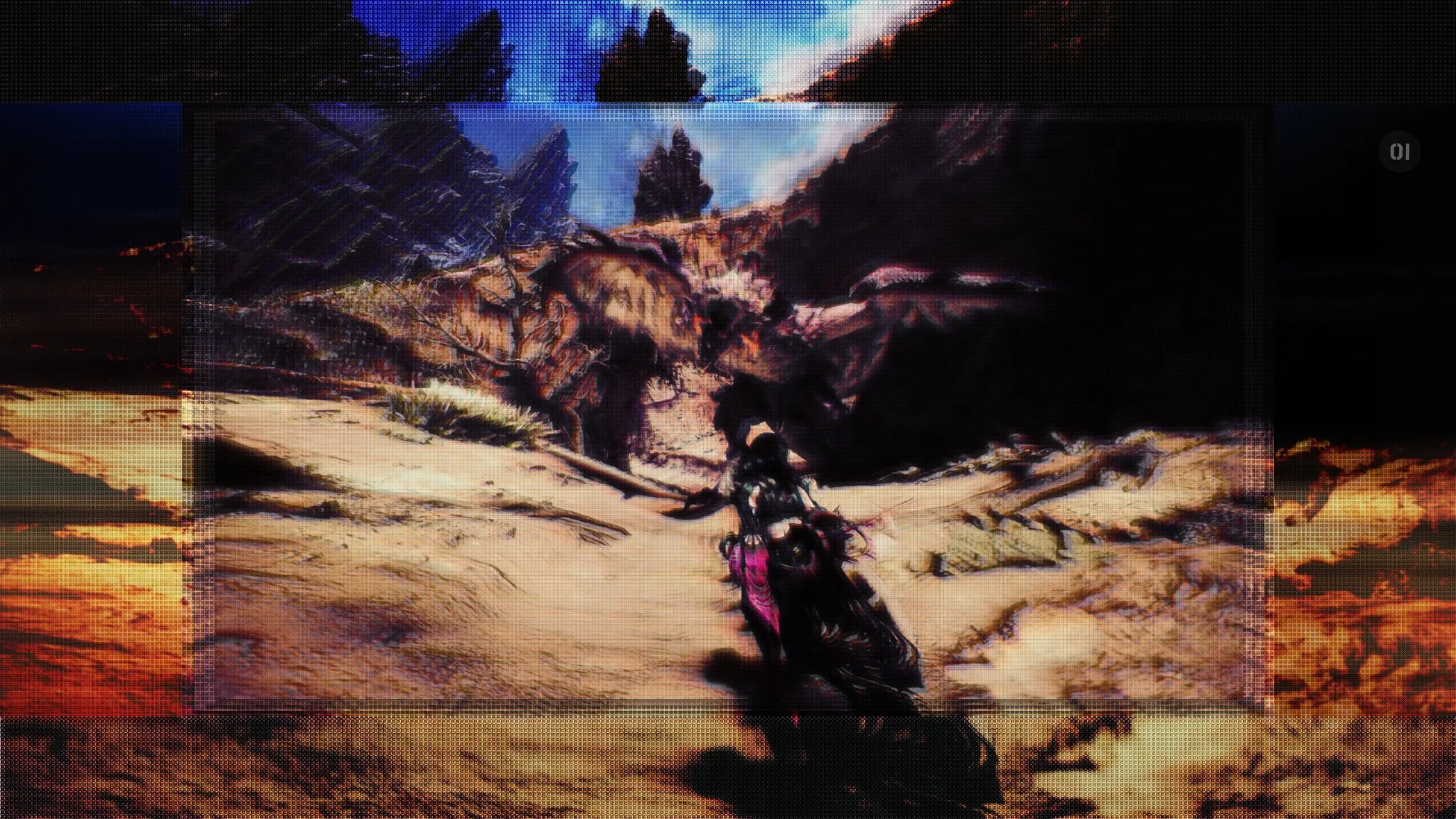
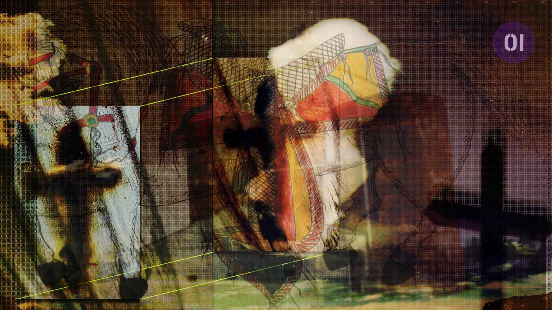
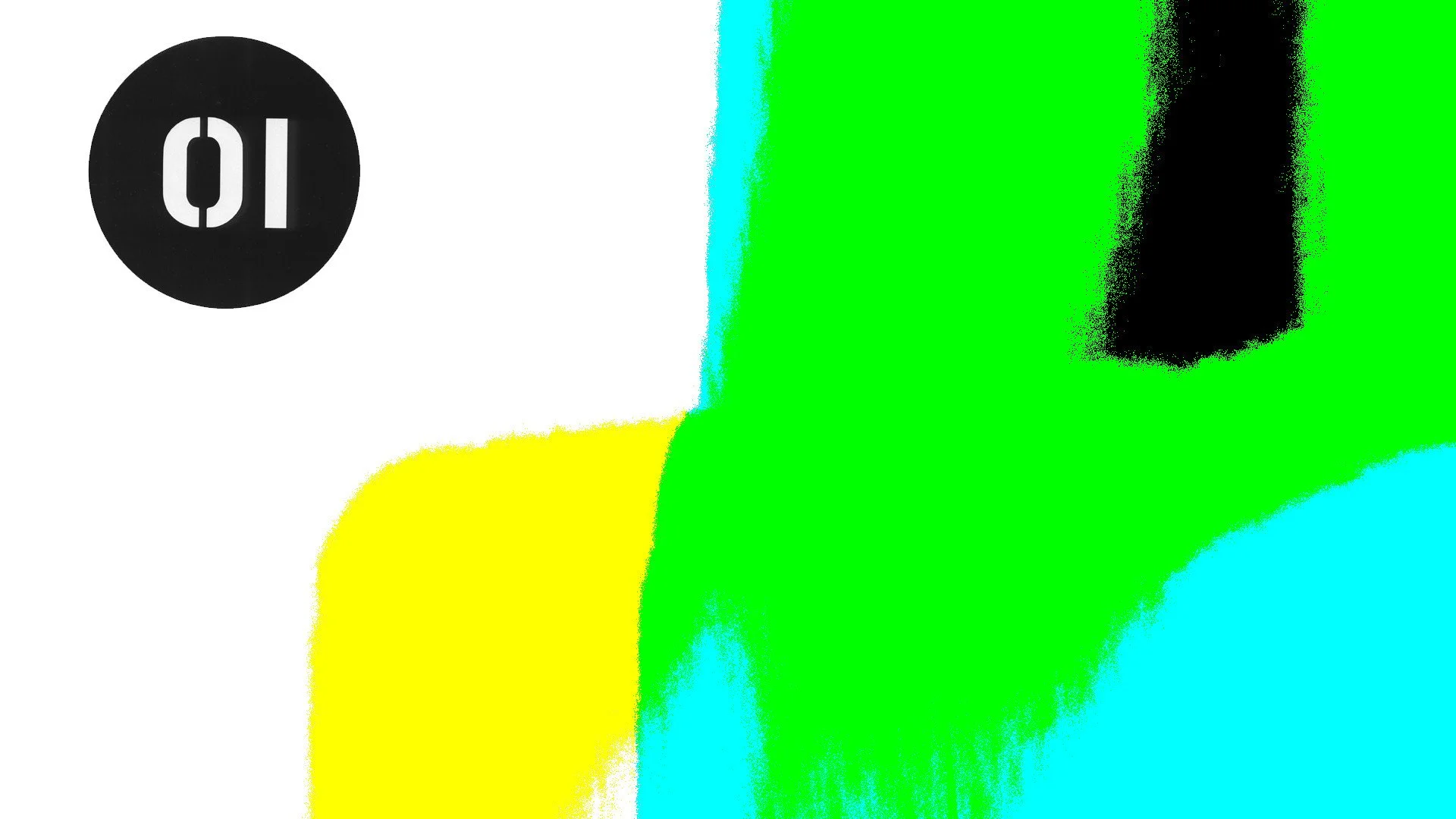
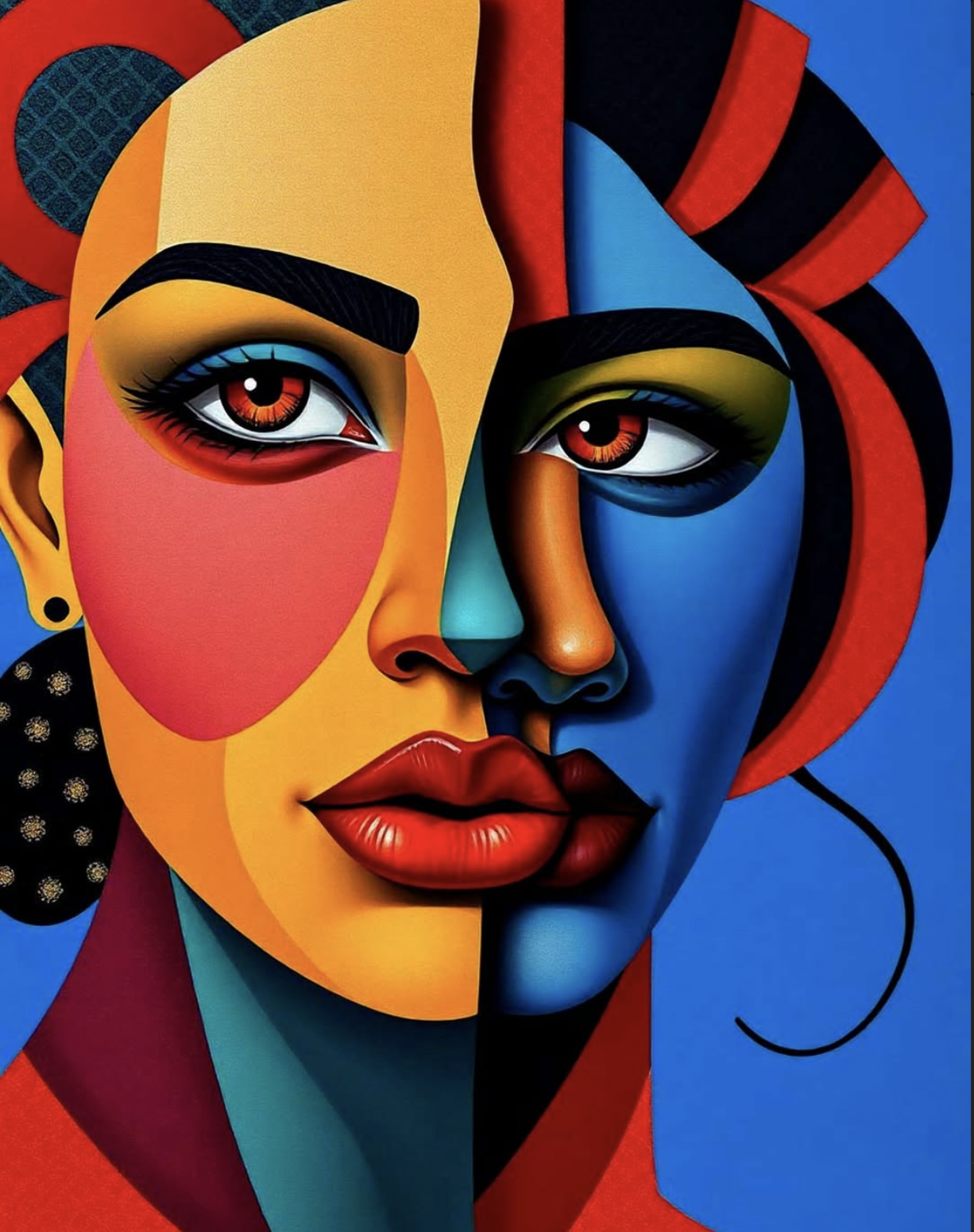
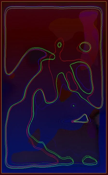
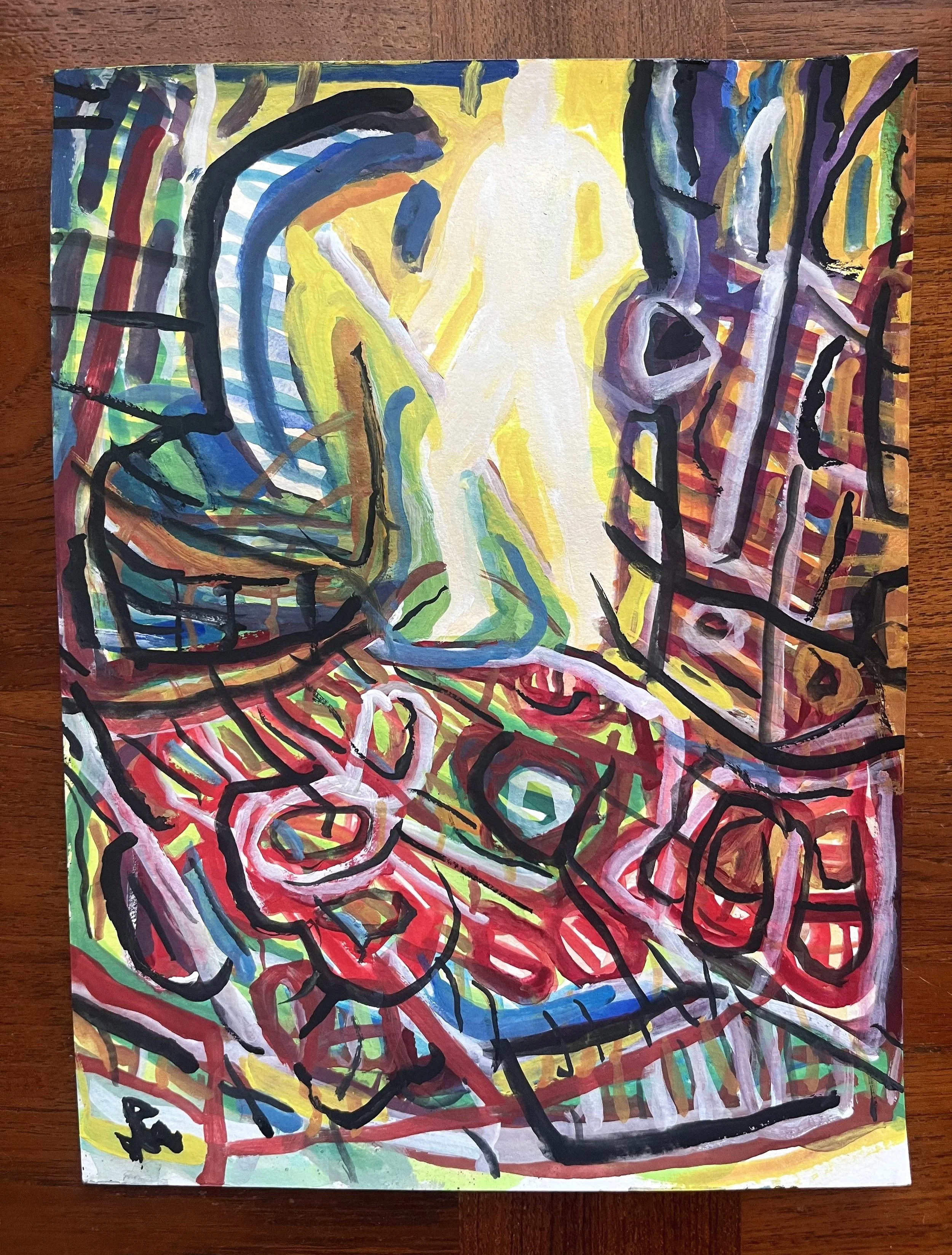
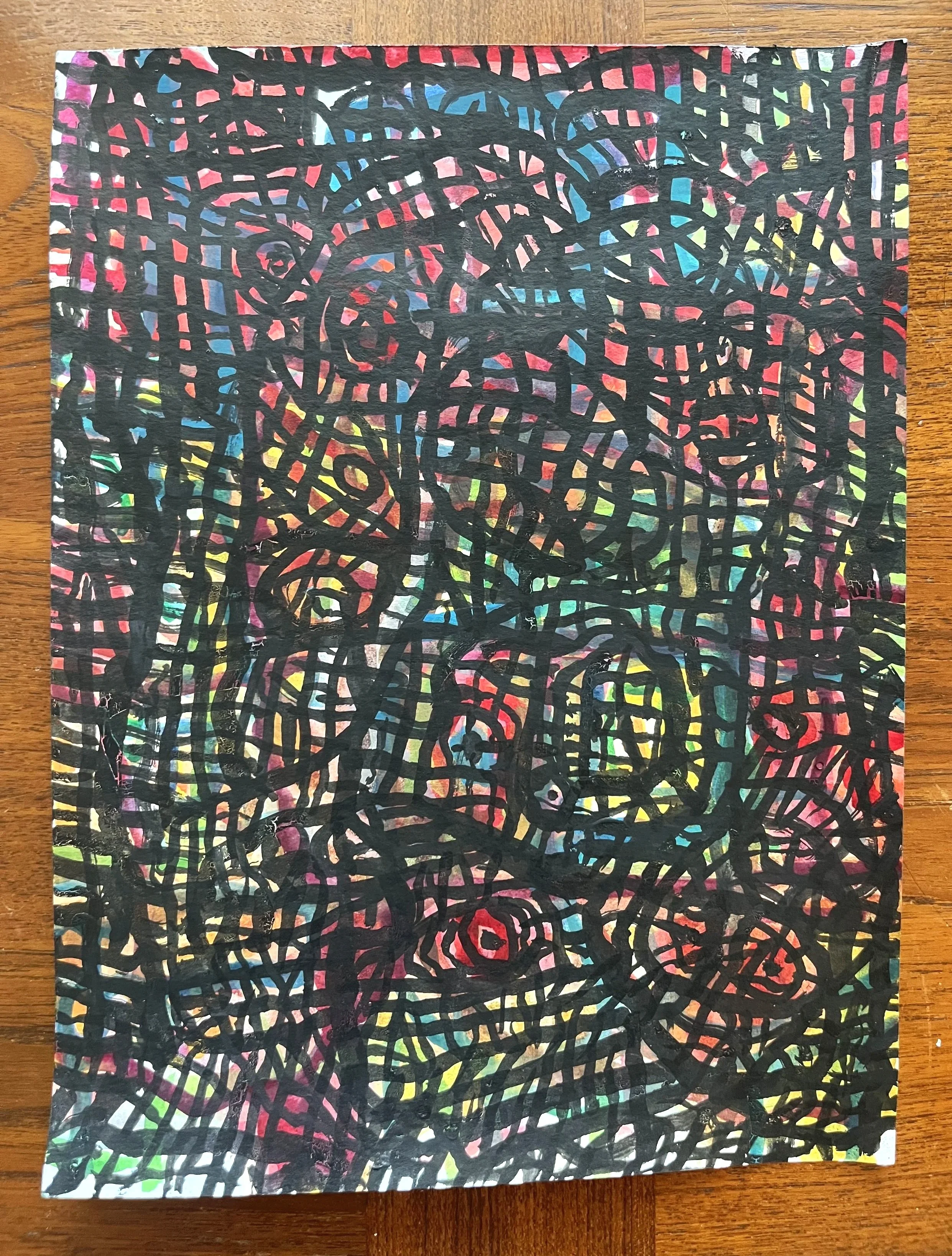
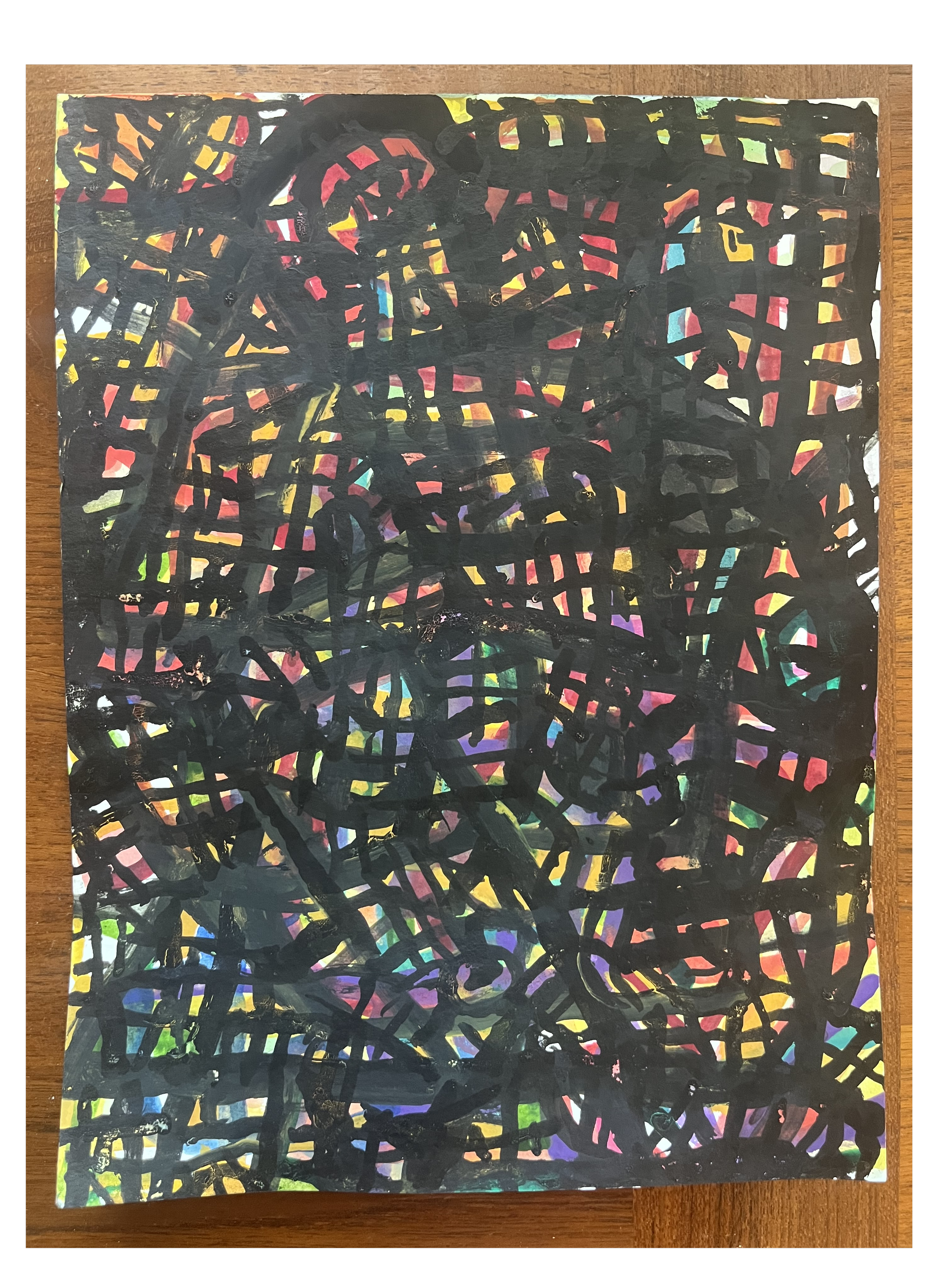
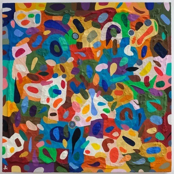
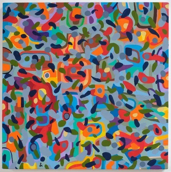
As noted already, N-fusion is one of a series of paintings entitled The VyNIL Cycle, which consists of several hundred pieces in four sub-series, and a bunch of sub-sub-series. Over the course of the past eight or so years I have almost exclusively devoted to this project, a specific practical methodology is one of the things that distinguish these works from previous ones in my oeuvre. The primary structural driver for me with VyNIL is to produce art that embodies a completion phase for my artist life. I have been thinking of these artworks in aspirational terms of legacy, scale, value and more. My objective therefore has been to commit the remainder of my art productive years toward the fulfillment of the vision I have for VyNIL, as a singularly defining body of work. Choices I make with respect to materials, formal composition, scale, consistency among the individual paintings and so on reflect my goal. I wouldn’t expect the reader and viewer to be receptive to these assertions, or make sense of them based on the appearance of any one or bunch of VyNIL Cycle paintings. It’s just how it is.
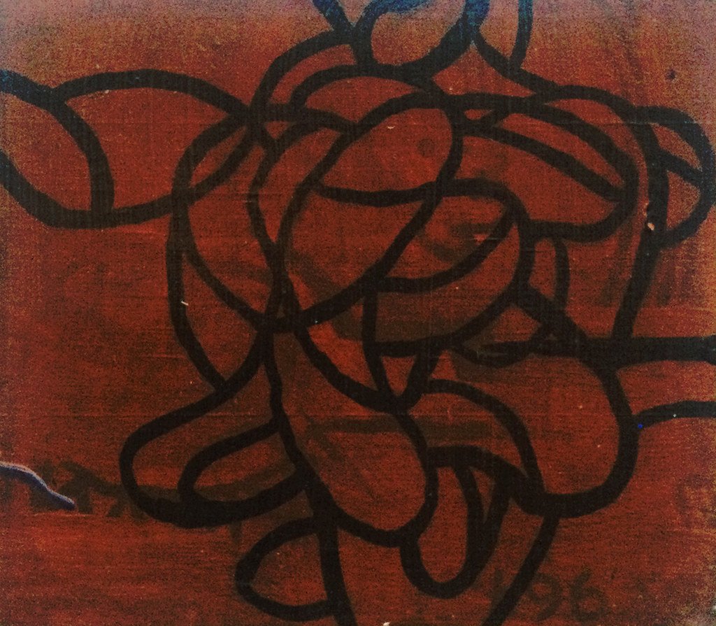
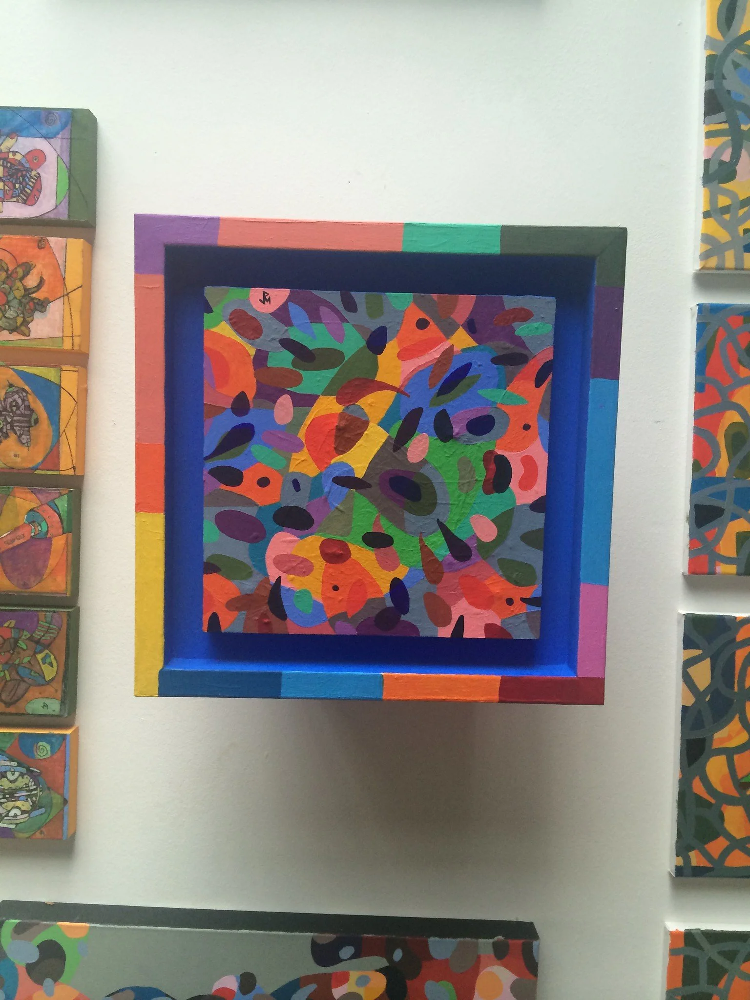
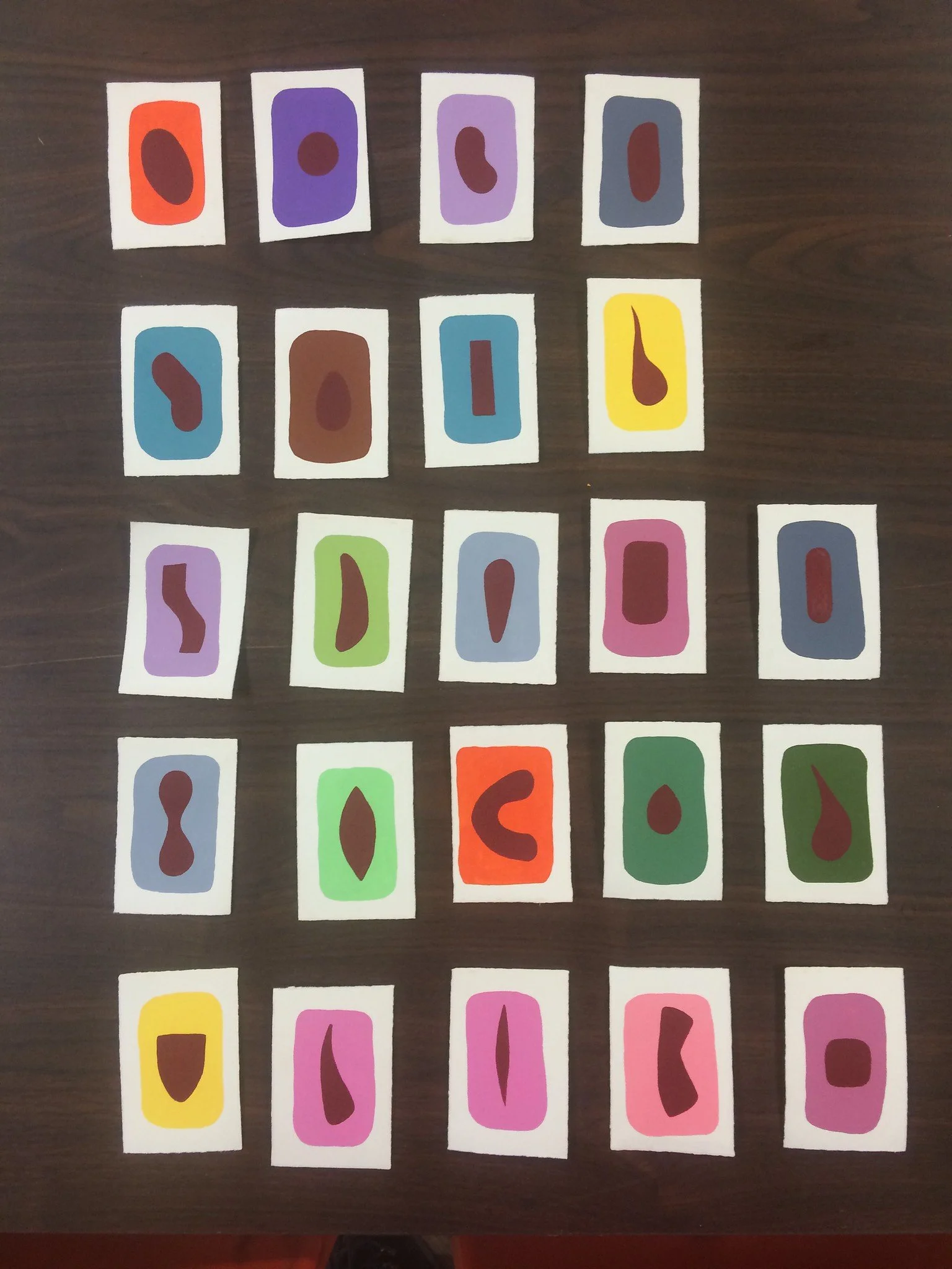
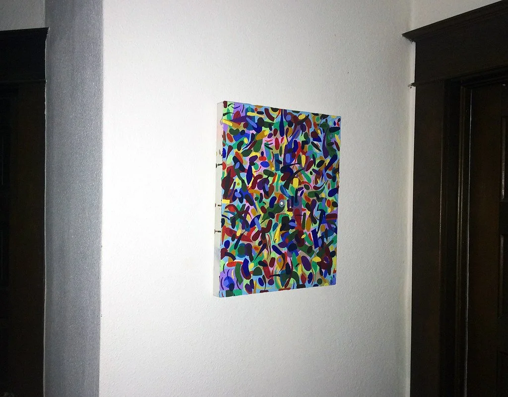
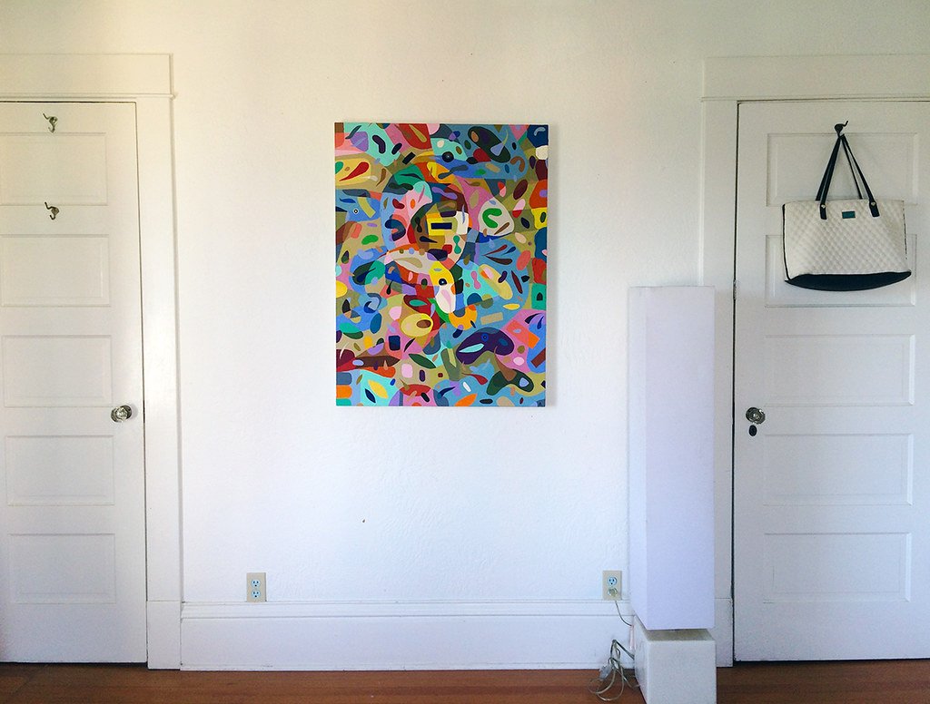
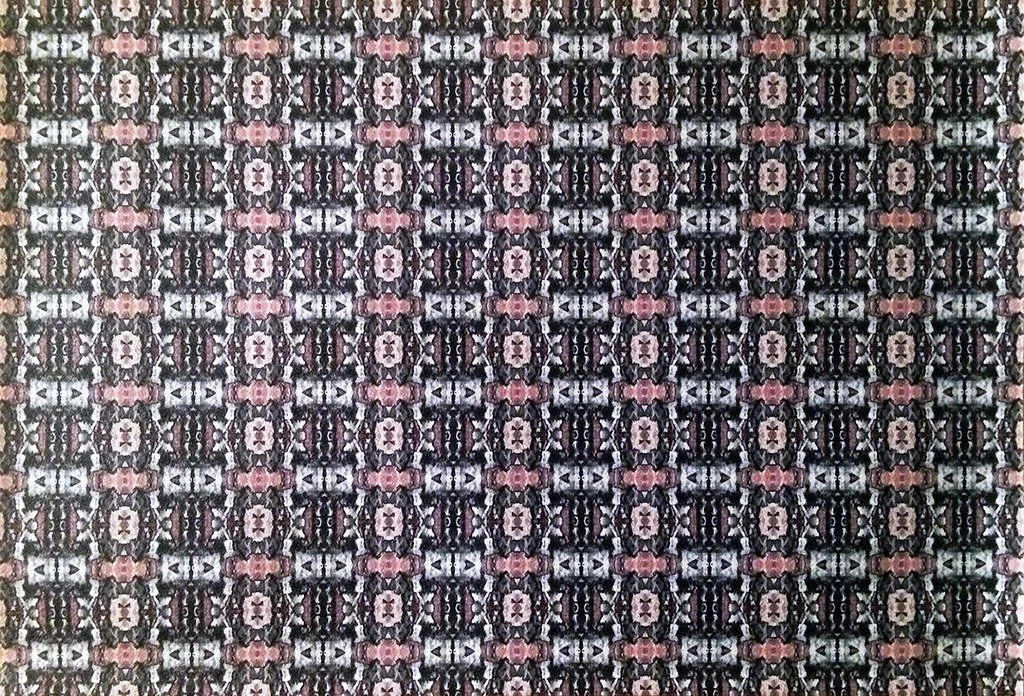
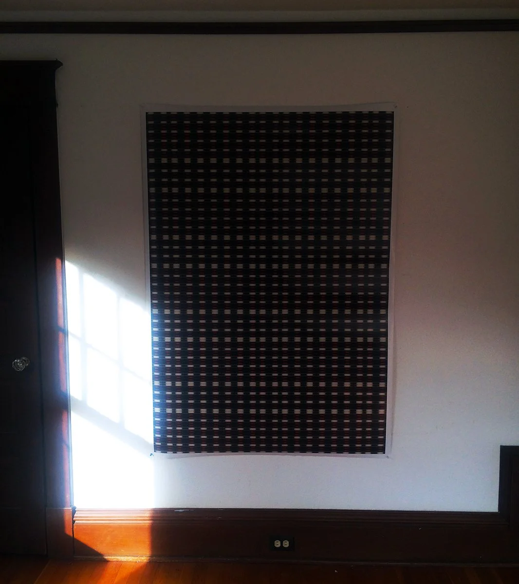
Techniques and compositional strategies have evolved throughout the Cycle. N-fusion arises out of the body of work. Still, each VyNIL Cycle painting is unique in its own right, and each painting is at the same time one of many. It shares features with others in the set as a whole. The series overall is unified, as mentioned above, by the Flashe vinyl paint, and the limitations of the manufacturer’s line of retail products, as they are made available to a retail buyer/user like me. Stylistically, the Cycle contains many variations. I don’t wish to overwork this point, but I do mean to observe one of the fundamental differences in digital or virtual and analog or actual media. In Real World painting, no perfect copy exists. The nature of kind and type, of sets and cycles, repetition and pattern, in the two realms is not identical. VyNIL engages with these disjunctive realities. It is not a stretch from here to suggest that art in the post-contemporary ought to, because the separation of realities is poignant and existential now. Maybe it always has been for us, but the intersection of programmed and lived experience is undergoing a profound transformation, because of ubiquitous technology, fast global communications and networks.
In the first several years of VyNIL production, I worked primarily straight-from-the-jar, while I became acquainted with the medium’s (Flashe vinyl’s) idiosyncrasies. I learned that some colors required multiple layers of paint to be fully opaque. I discovered I preferred the full opacity generally with Flashe. More translucent finishes were not as attractive, to my gaze. I learned to build layers mindfully, conscious of light-to-dark layering, and the tricks of underpainting, as one does with watercolor, or skin tones in traditional oil painting. I did from the beginning of production create half-tone mixes using the white Flashe paint, which permitted nice, amplifying areas of intensity, when conjoined or otherwise integrated with the full-strength pigment. In the Currents, Flow & Reproduction series, I began to introduce colors combining multiple colors in various tonal intensities. The compositions were toggling between complexity and simplicity, and this seemed naturally or organically to link to my confidence in the color distributions and applications. I am - sorry - painting in broad strokes in my accounting of the technique and evolving series content. As the Cycle progressed, the technical turns from painting to painting might be abrupt or incremental, depending on some internal calculus on my part that really only comes into focus as the sample becomes big enough to reveal the logic of the sequence, such as it is.
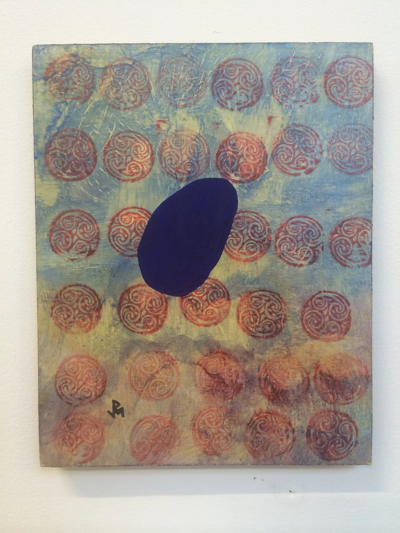
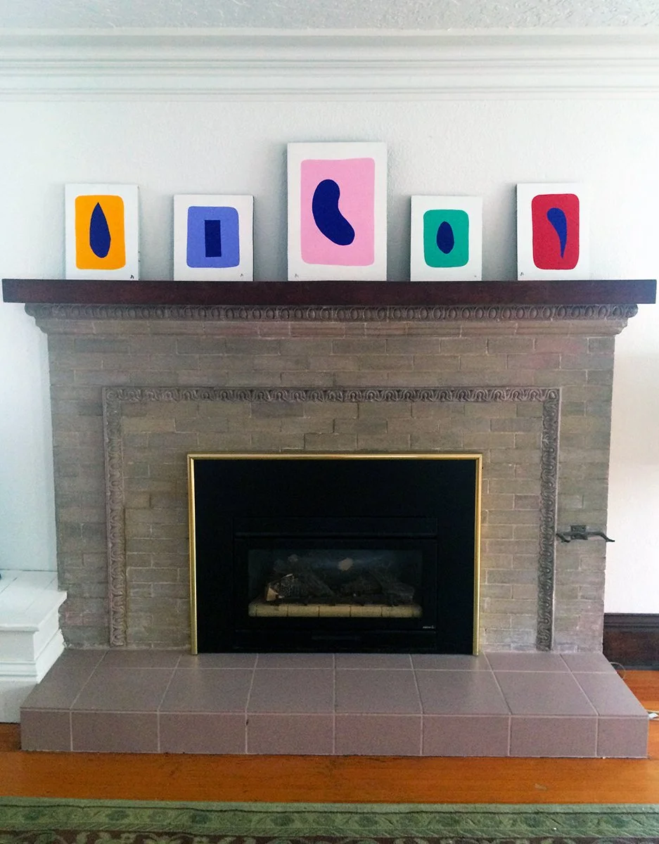
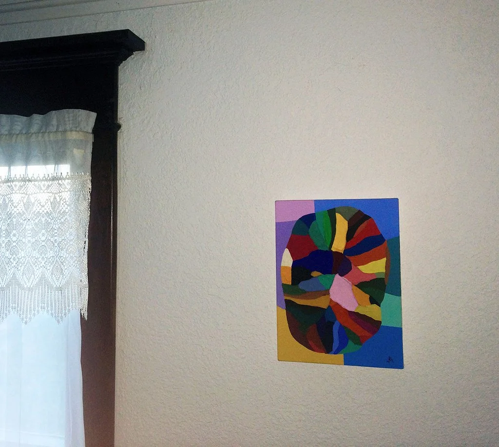
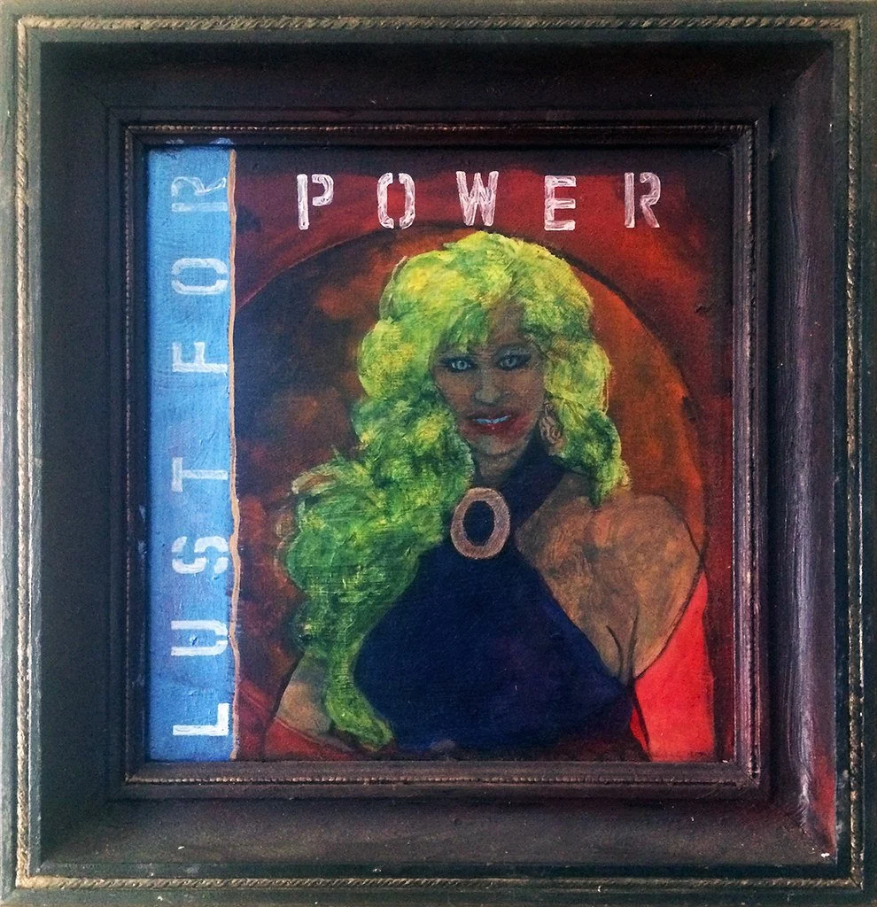
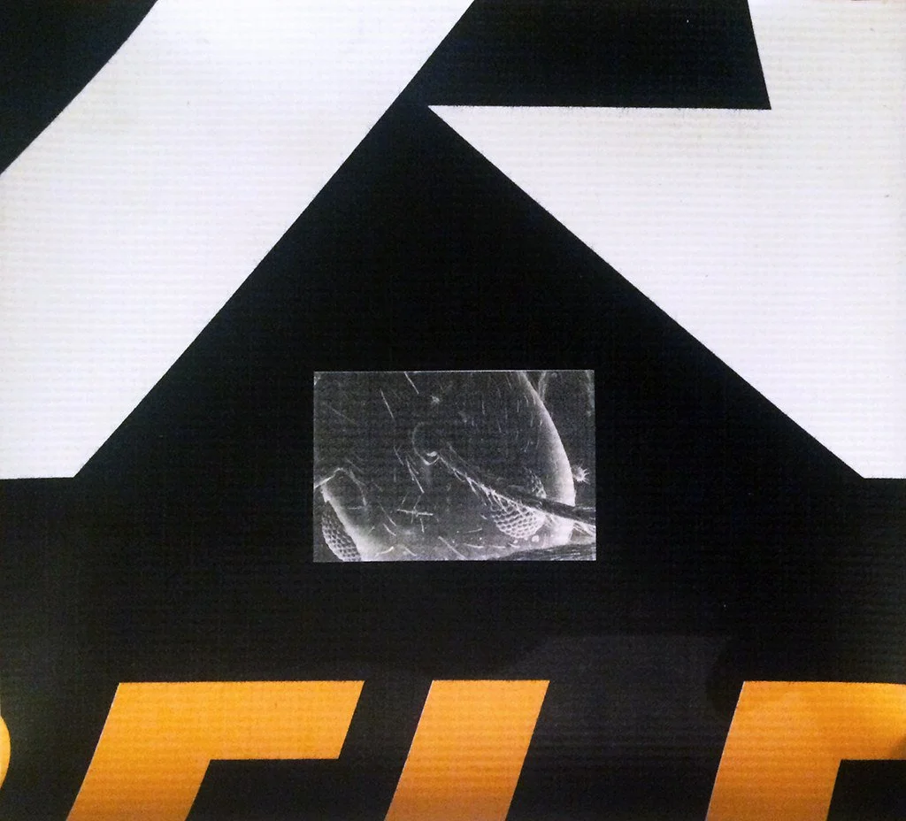
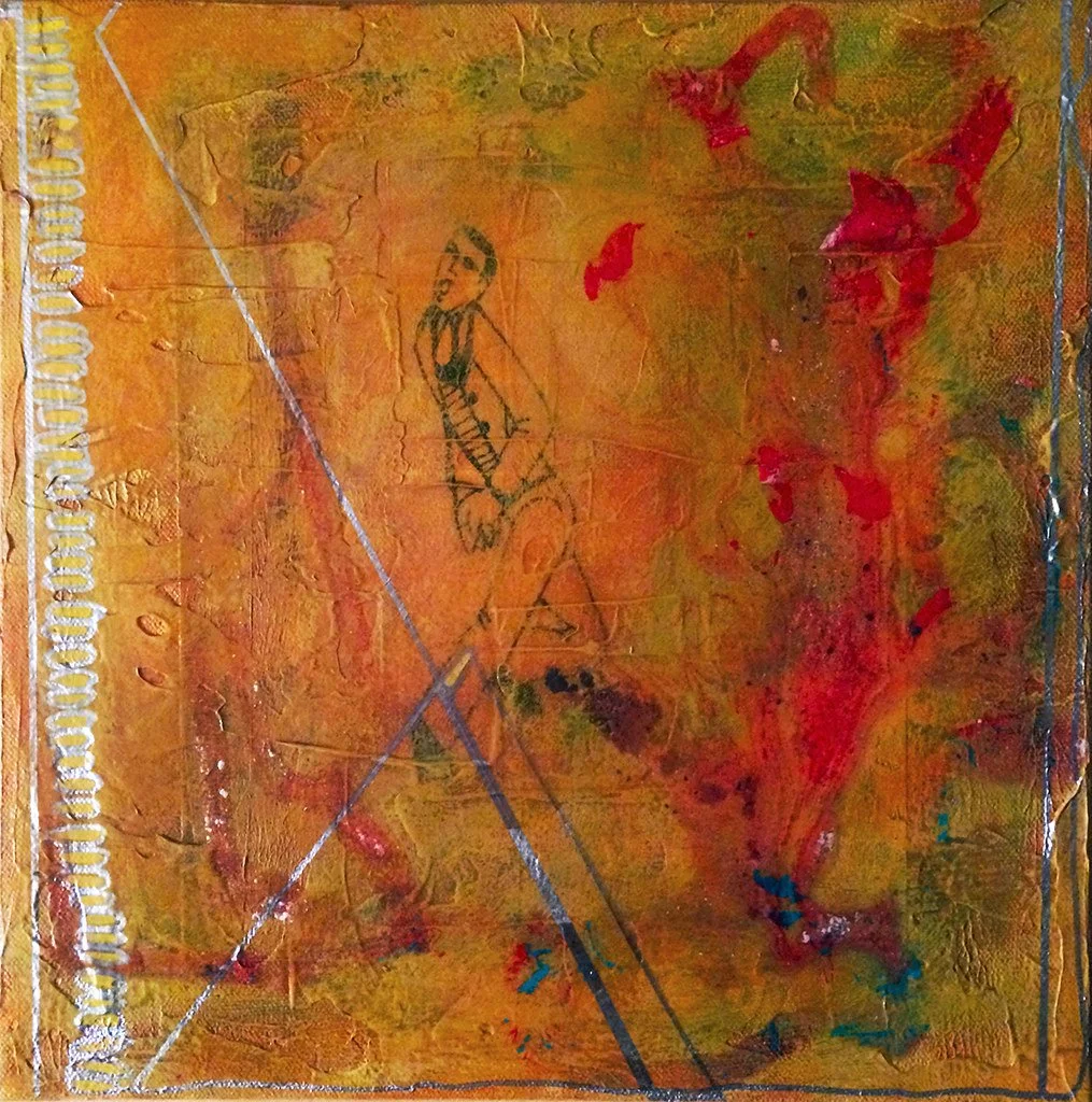
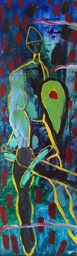
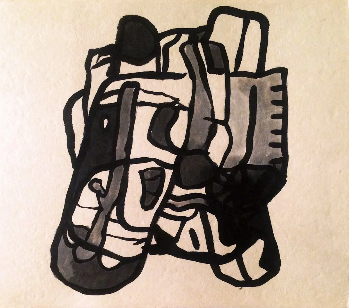
Roundabout, a word on substrates. My first experiments with Flashe were applied to small canvases and panels. On a dozen or so of the latter I mounted works on paper with sketches. I tried finishes on those (satin Golden medium), and additional enhancements with other media (ink, pencils, acrylics, etc.) From there, did a sub-series of sixteen small canvases that had figurative elements overlaid on simple abstract backgrounds, with Brice Marden-inspired color-webs. I added Flashe-painted forms that I later called Meta-elements to compositions on wood, made with stamps and Dr. Martin’s ink in patterns. I commenced the Net Work series in earnest with a large professional canvas, and just like that, I was all in. I had secured a posh studio at the border of Williamsburg and Bushwick, and the pace of production was very high.
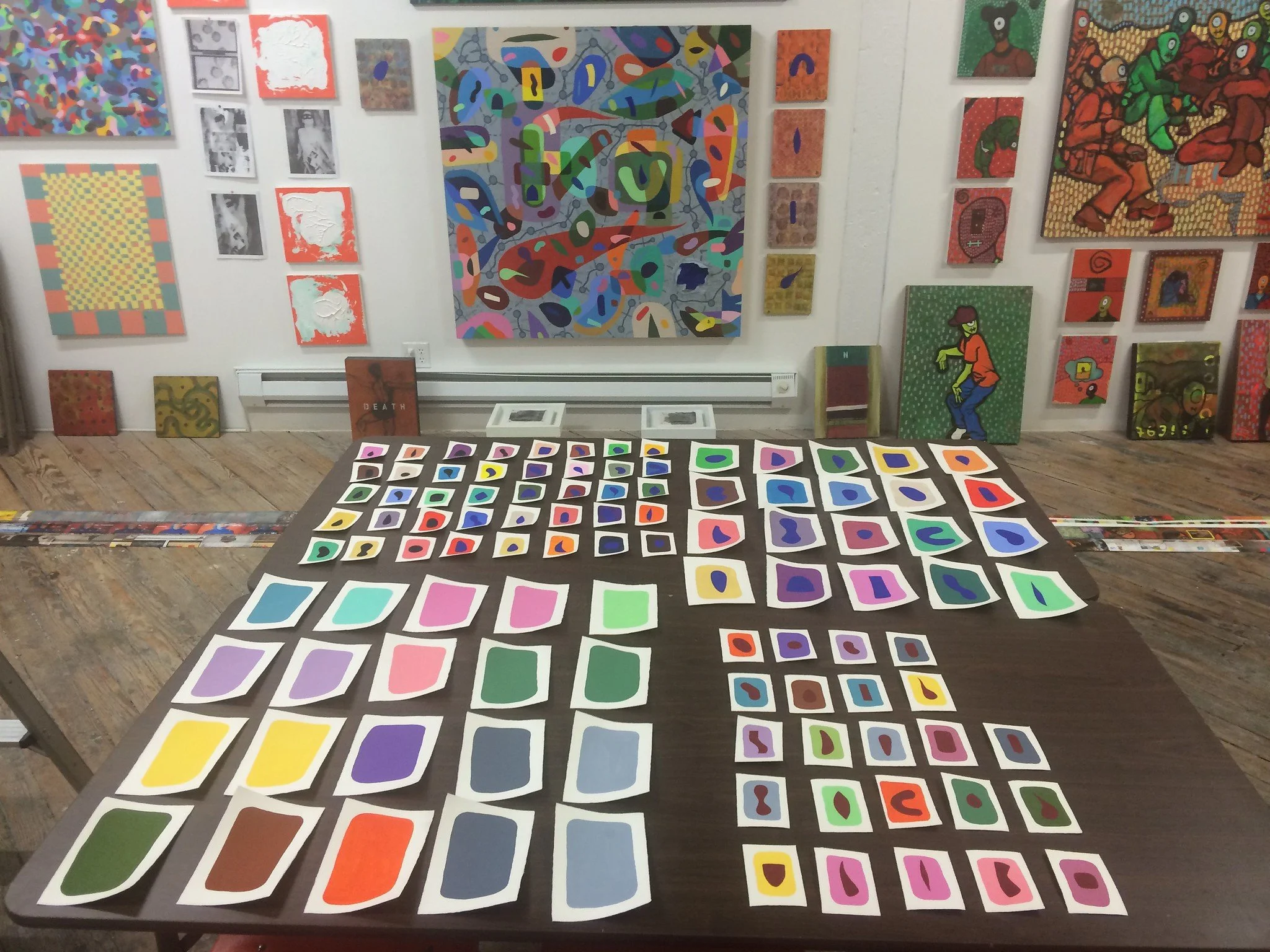
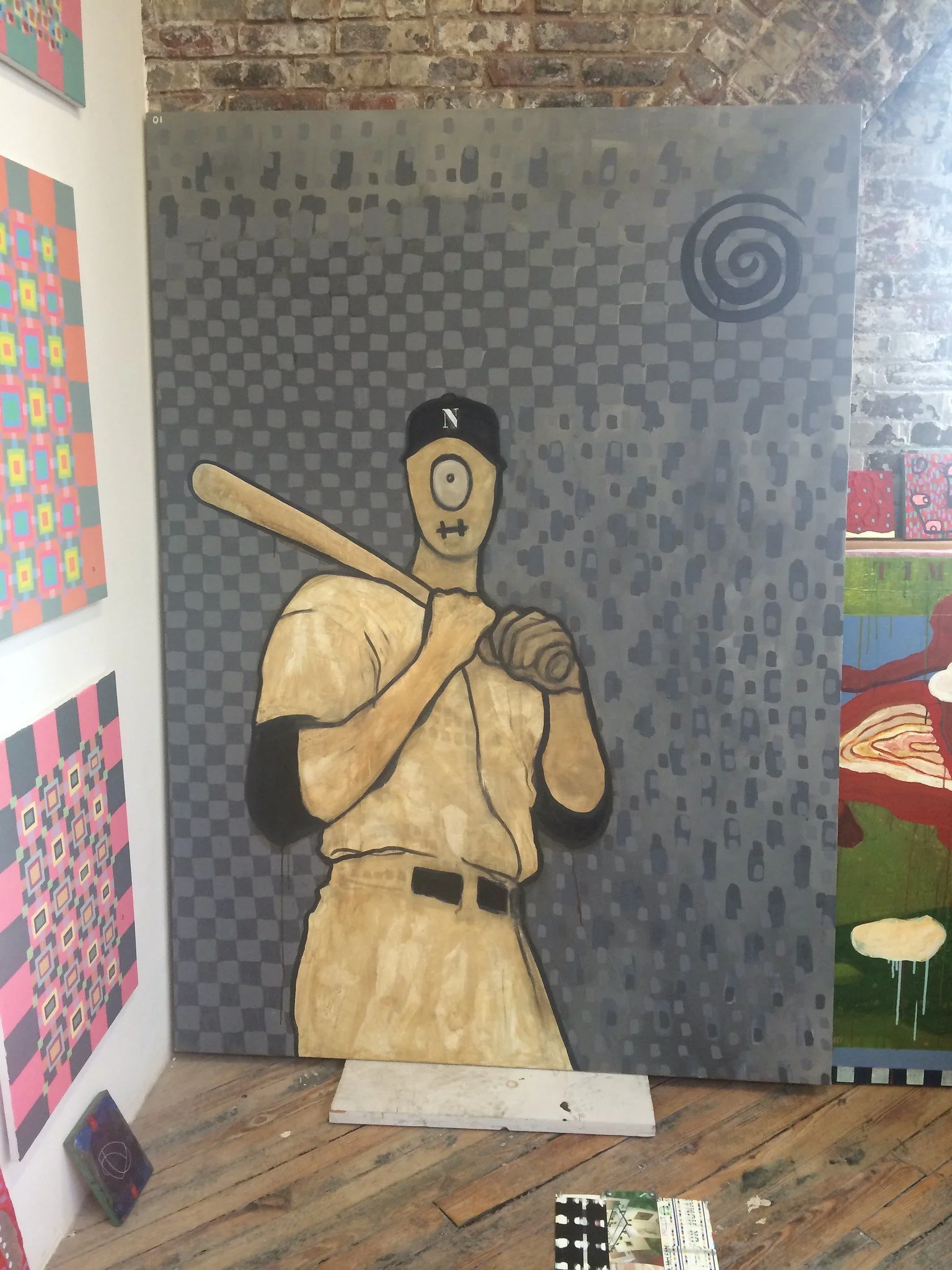
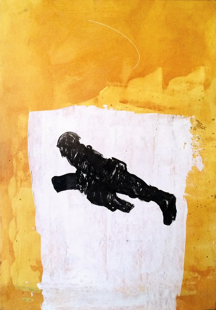
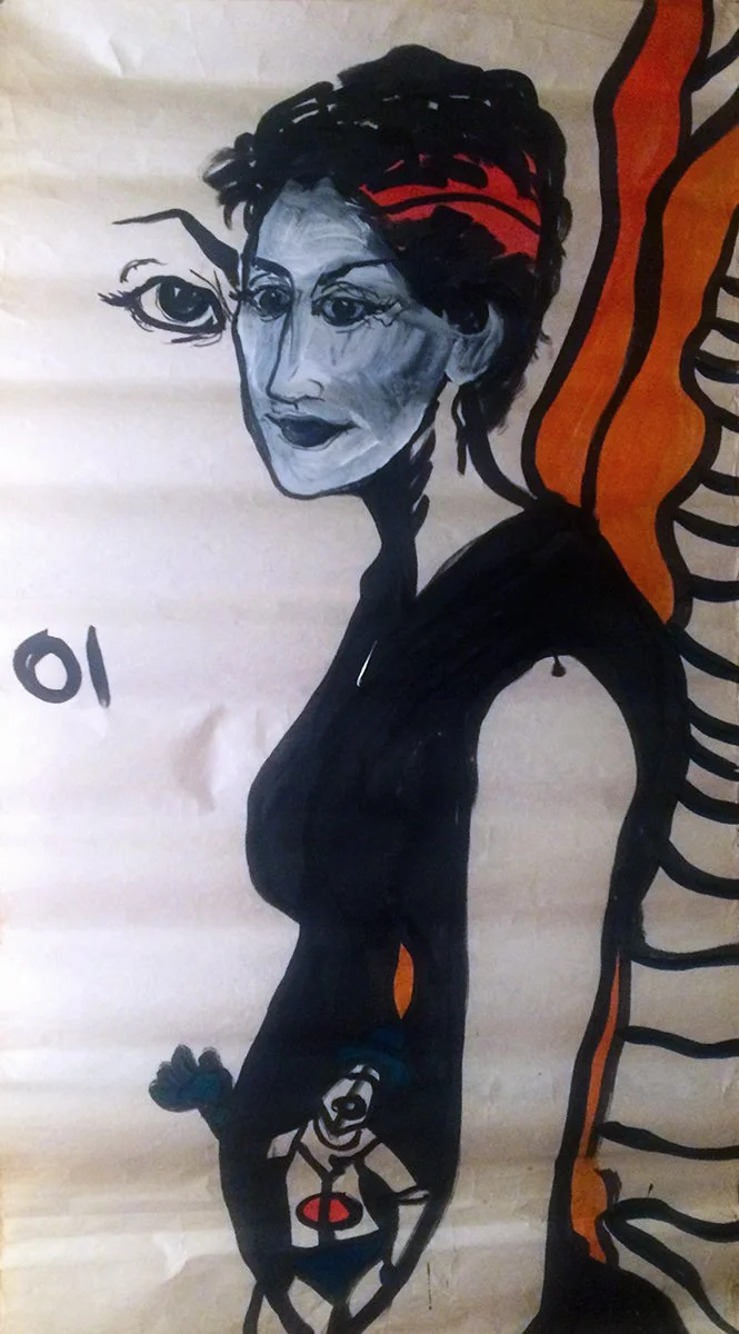
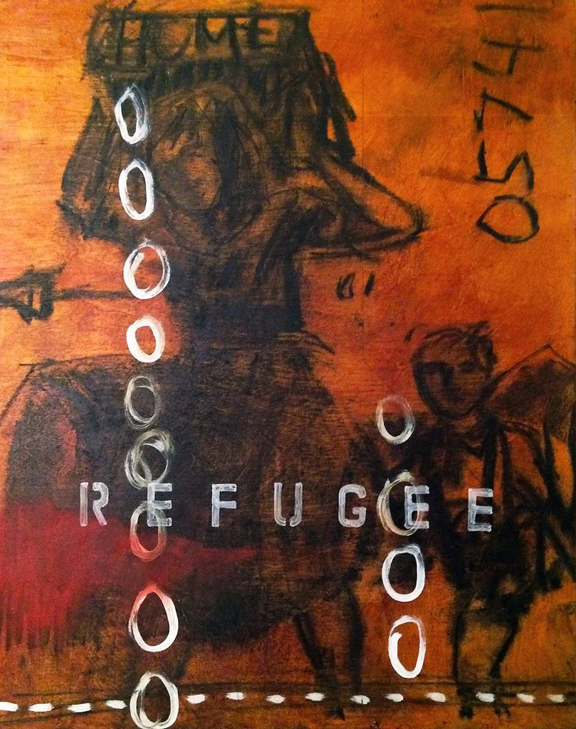
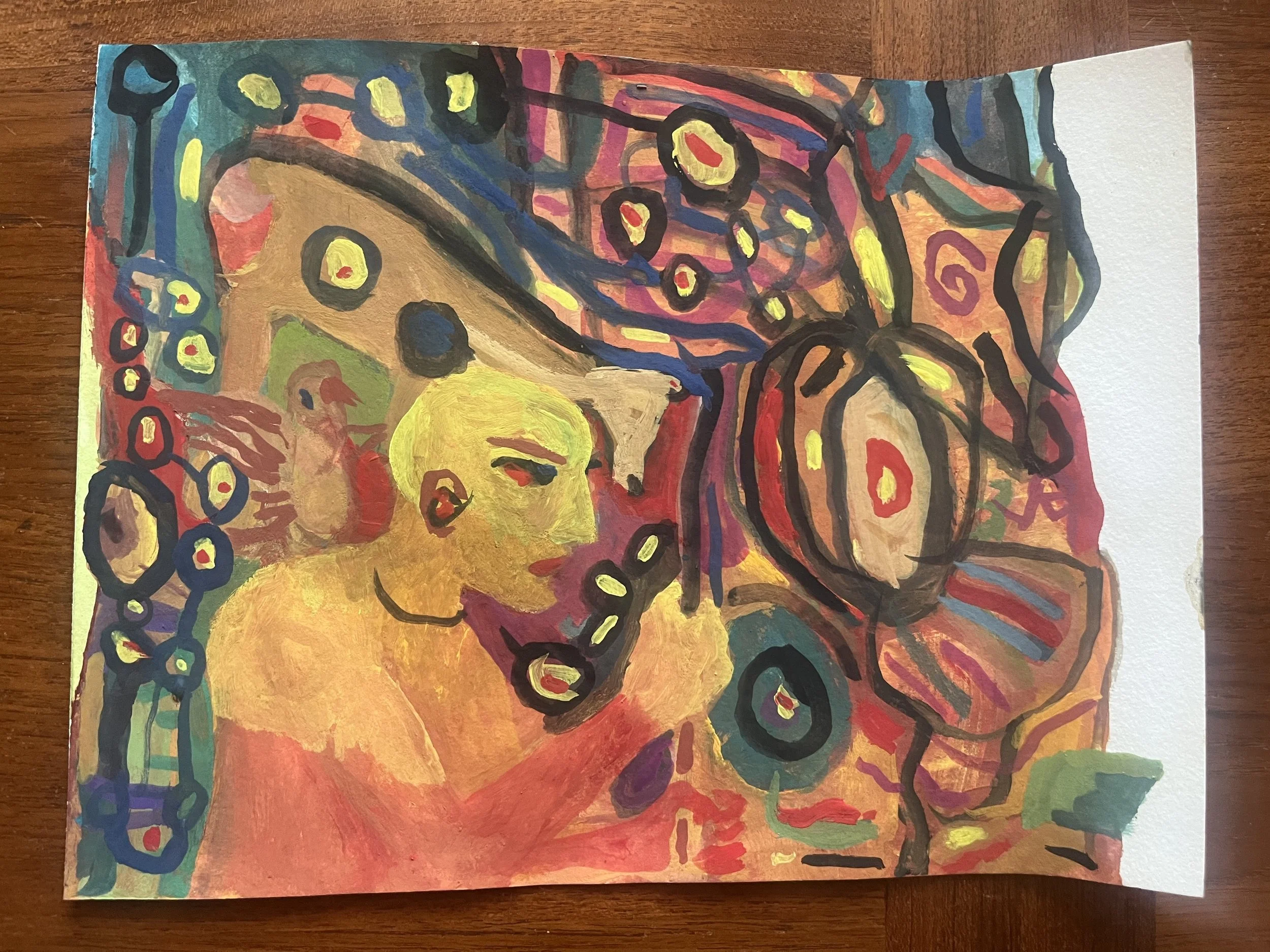
Once the VyNIL series had taken off, I began to re-appropriate paintings from previous bodies of work, overpainting them with vinyl, sometimes keeping original elements with modifications. This was new for me. I produced sets of very small Meta-element paintings on Italian paper. Mostly, the substrates were canvas, panel and paper. The continuation or conversion experiments were challenging, in that the pre-existing textures required me to adapt the forms and techniques I was settling on for VyNIL, or to find solutions that made the optical effects I wanted possible. The finished (textural) paintings appeared consistent at a distance of 10’ or so, but on closer inspection the viewer would discover that the surfaces were variable from painting to painting, sometimes wildly so. In one sub-series, I overpainted a bunch of what I had called “3D-pixel paintings’” (circa 2006-7) surfaces, assigning single Flashe colors to each legible feature of their acrylic topology.
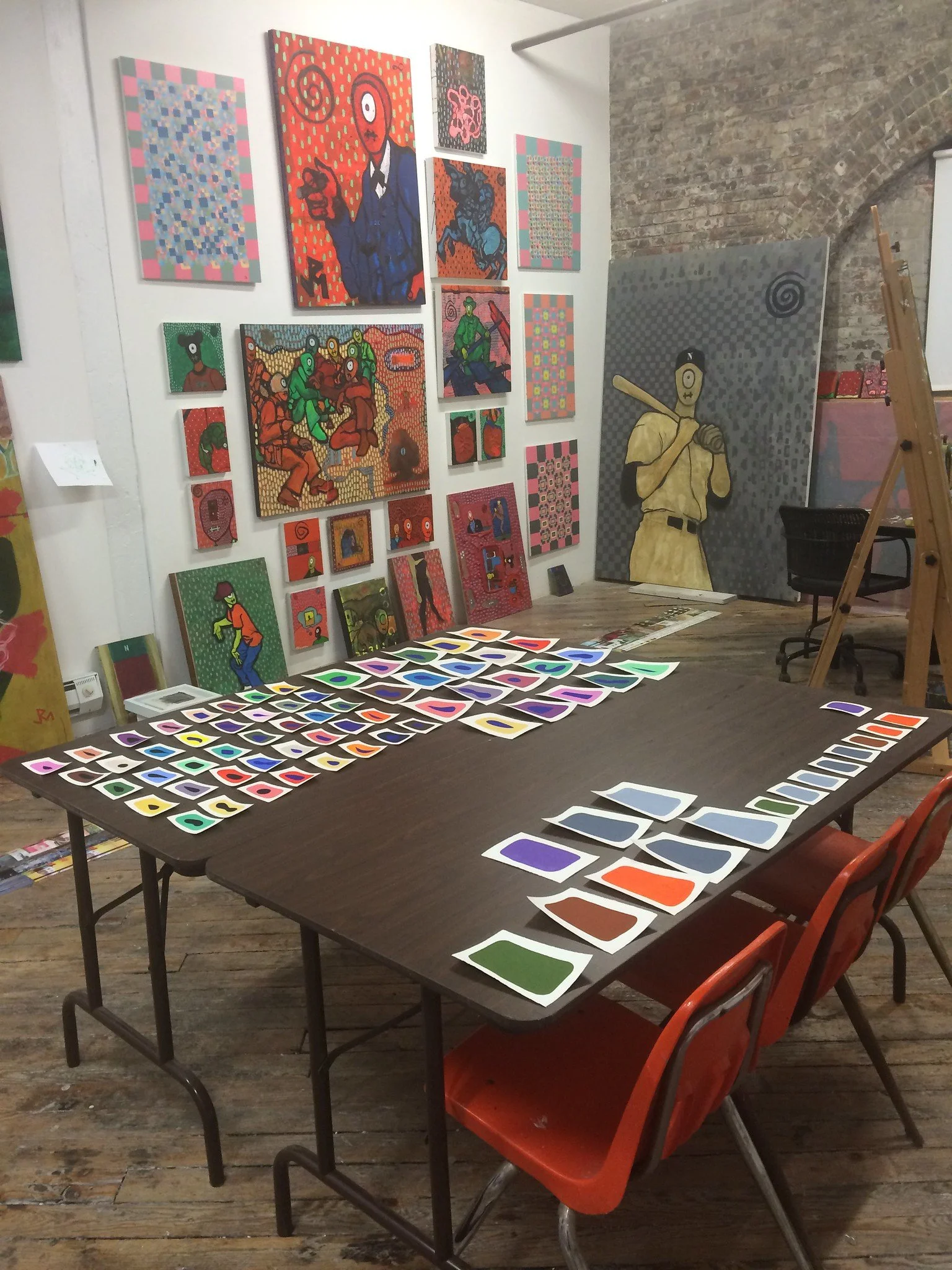
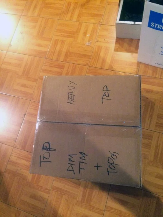
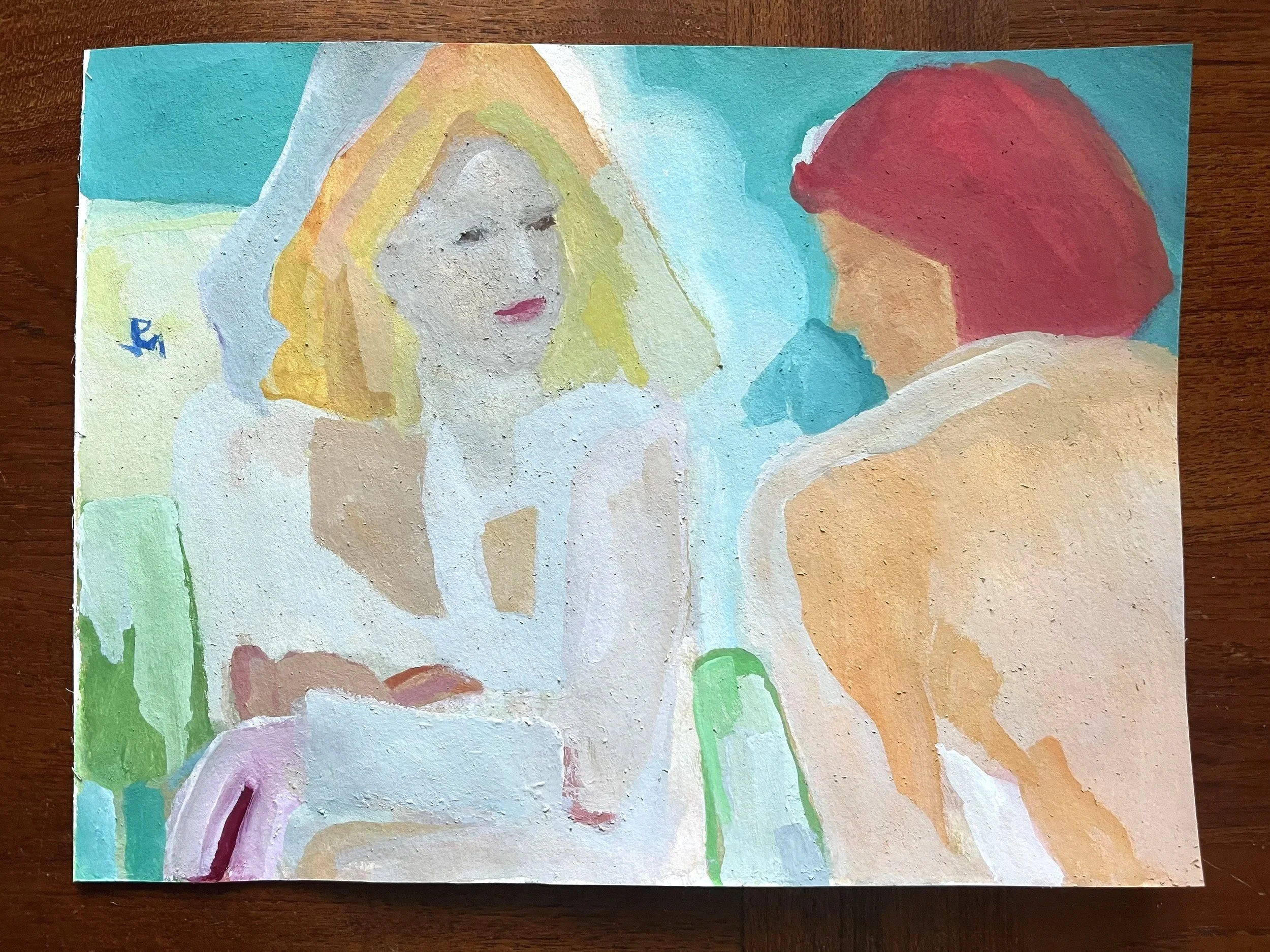
After we moved from Bushwick (where the series starts) to Astoria, Oregon (where I am working now), we transported the contents of several storage units we had in Upland, California, including a sizable cache of artworks. I pursued the overpainting project in earnest for months. I converted dozens of paintings on panel, canvas and many types of paper into VyNIL output, applying Flashe over a broad range of media and different textures. I reconstituted or rebooted pieces from a string or chain of series that spanned my career to that moment, including (not in chronological order): undergrad and grad thesis shows, Dim Tim, A Prayer for Clean Water, Nagas, Tobacco Road, Bar Codes, Cowboyz, Code Duello, CONTENT, and so on. Ultimately, I became convinced that for my purposes, the optimum substate for Flashe applications was a wood panel with minimal texturing. All that experimentation was invaluable, however. I came to understand all these gestures as formal compression, or flattening, but they also had to do with the conduct of completion.
∞
The color selection process throughout VyNIL production is eccentric in a certain way. I do not establish any formula for color composition. I think of it as a call-and-response thing. The distribution of color across the visual or visible surface throughout the VyNIL Cycle is intuitive, to a degree. Again, this term is only partly satisfactory, because the progression of the painting from session to session involves what I might call inertia or momentum. I have a long-running relationship with color as a practical matter. I have explored color systems and theory; the science of color; color physics and chemistry; studied optics, the mechanics of the visual; even the psychology of color. These days, I don’t think about color, much. I try to put the knowledge of color behind my back. I’m more concerned with acting on my artistic instincts through the painterly application of color to a surface — in a way that’s effortlessly my own. I do possess a Masters degree in fine art, after all.
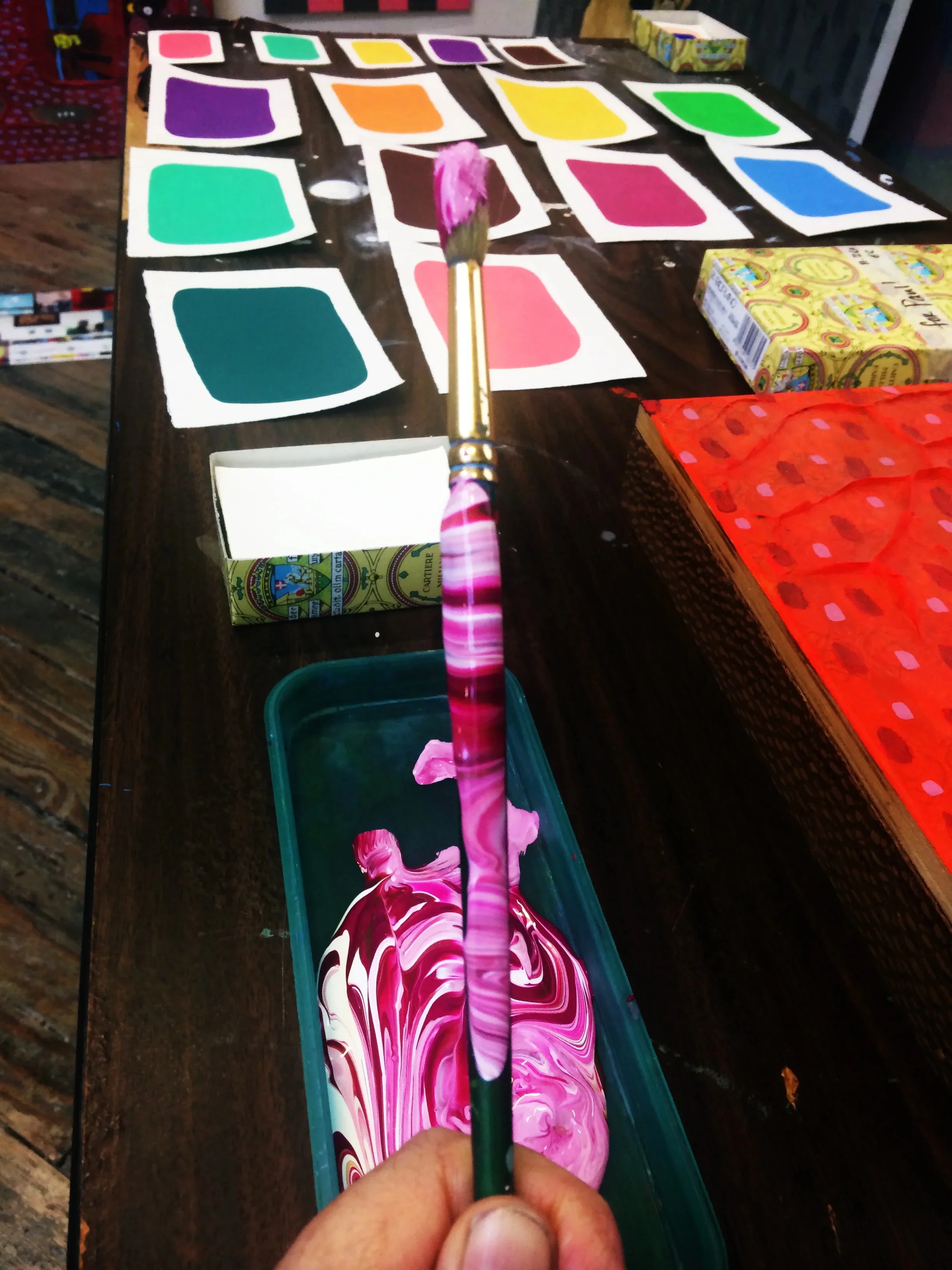
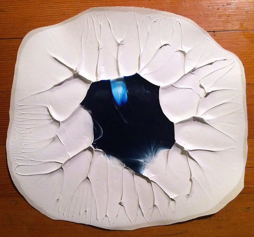
To sum it up, more or less: When choosing the next color to be applied, I have an idea, based on previous results, about which color is right for the next step in the sequence. The Flashe, as mentioned above, is either used straight from the jar, or I mix colors in containers. After the first several layers, for which I use different flat and round brushes of various sizes, the rest of the paint application is done with very small brushes, mostly “0” gauge. The Flashe paint consistency and chemistry seems to vary from color to color. This impacts my technical approach. Again, familiarity with the medium has come through experimentation and practical experience. To a degree, the medium is a determinant in the painting’s outcome.